All,
For those who are interested, here’s a detailed writeup of how I constructed my Data Challenge #16 report.
Data Storytelling - like many of the other entrants, I felt the compelling story to focus on here centered on earnings and utilization, and the relationship between the two, especially given that from the (masked) data provided BI Consult did not seem like a particularly profitable venture. My hope was that through the analysis and visualization, I could provide some findings and recommendations that the client would find valuable in improving the financial standing of the business.
Data Prep and Modeling – overall, this data set was extremely clean. The minimal cleaning required involved:
-
per Greg Philps’ outstanding best practices guidance, I renamed the initial imported data “Raw Data”, referenced that table once for the fact table and twice more for the necessary Client And Project dimension tables, and then unloaded the Raw Data table so that it would be untouched but always accessible if there were questions about the initial data import. This is the general model I follow on almost all my reports.
-
splitting datetime field into separate date and time fields
-
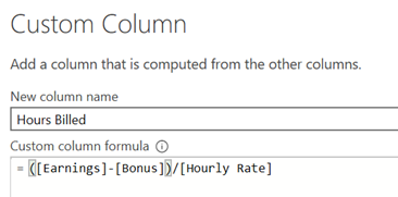
creating an hours billed field via custom column – I don’t like dealing with times and durations where not necessary, so I created an hours billed field using the formula
-
I knew I wanted to create project and client dimension tables, so I needed to do merges back from the dimension tables generated in order to place the ID field for both client and project into the fact table.
-
For the dates table, I created a holiday table in order to correctly identify Québec annual holidays over the relevant date period in order that those days not be counted as work/business days for purposes of the utilization rate calculations instructions for how I created the holiday table can be found here.
-
I also created a helper table using Enter Data for my Earnings Maximizer scenario analysis, containing the various hourly rate option titles, values and sort index for the disconnected slicer used in that analysis.
When I was finished, the data model looked like this:
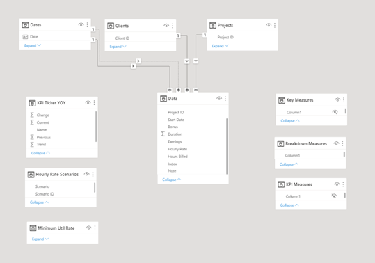
a fully compliant star schema with three dimension tables, one fact table, three disconnected helper tables and three measure tables. A word about the measure tables – I’m a huge fan of measure tables. I find it far easier to trace the logic of a report through measure tables then searching badly through each table to find the measures placed there. In this report I experimented with using fewer measure tables than usual, and instead using subfolders within measure tables created within Tabular Editor 3. In the end, while some consider that a best practice I actually hated it, finding the display of foldered and non-foldered measures confusing, and not liking having to expand and collapse folders to see things that would otherwise be at the top level. So, in the future no/few folders and more measure tables for me.
At this point, rather than breaking the report into DAX/Analysis and then Visualization, I will jump right to visualization and address the DAX issues within the discussion of each visual.
Visualization –
Theme and Style - as I mentioned in my Learning Goals for this challenge, I really wanted to develop a nice-looking, minimalist, streamlined design similar to those built by @Datazoe. There are a number of reasons for this – first and foremost is that I don’t enjoy the design phase so don’t have a lot of time or patience for the painstaking work of developing beautiful backgrounds, UI/UX features, etc. In addition, given my commitment this challenge to using visuals conditional format in never used before, I wasn’t sure how they would handle a colored background, so I chose to stick with simple white. For colors, I based them largely red, green and blue indicators around which the KPI ticker visual is built. This seemed appropriate given how important KPIs were in my analysis.
UX/Navigation - I have been heavily influenced by @MudassirAli 's philosophy of minimizing the use of slicers, which provide no additional information, in favor of cross filtering using visuals themselves. My vision for this report was to try to use no slicers at all, instead employing @Sam.McKay’s awesome technique of using invisible cards to trigger report tooltips, thus allowing the user to glide over the report activating the information they needed without having to make a single click (except in the scenario analysis to select hourly rate scenario choices). Through the extensive use of that invisible card technique, I was able to dramatically simplify the navigation structure – making it truly a single page report with no slicers, bookmarks or navigation buttons. I’m not sure how practical that is for most reports, but I was pleased how it turned out here.
“Breakdown By” Visuals - for this section, I used the new buttons with custom icons functionality contained in the September 2021 Power BI update. I then created a measure called “Transparent” that was just set to the value “#ffffff00”, which is the hex code for white with 100% transparency. I then placed cards over each of the icons and for the data labels selected “conditional formatting” and set the font color to transparent. Then in properties, I went to “Tooltip” and selected the proper accompanying tooltip that would trigger when the card was moused over. With the exception of the Recommendations and the Info/About tooltips, which were created in PowerPoint and SnagIt! 2021, I created all the other tooltips using Zebra BI custom Chart and Table visuals.
Originally, I was going to use a disconnected slicer and harvest the value to use in a conditional page navigation measure to switch between the breakdowns focusing on earnings and utilization. But in the end, I decided it would be much simpler for the user to be able to trigger a larger tooltip that included information on both metrics. This makes the interface simpler, but risks overwhelming the viewer with too much information in the tooltip. Even after making that decision looking at it for a while, I’m still not sure if I made the right decision or not. I welcome your feedback on that question.
Love the Zebra BI visuals. I think you can create remarkably detailed, insightful and attractive visuals very quickly. There’s a slight learning curve, but once you understand the general paradigm behind how these visuals are structured/organized, you can generate complex visualizations very quickly and easily. Their documentation is also excellent, so I was able to resolve my initial questions very quickly. I wrote a more in-depth review of the Zebra BI visuals in response to THIS forum post.
Gantt Chart Visual - in conceptualizing this report, I felt that making a Gantt chart the centerpiece would convey a large percentage of the critical information in one visual – the timing of each project relative to the others, the duration of each project, earnings, utilization, project and task information, bonus information, etc.
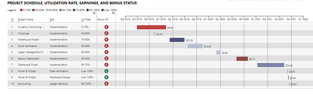
So the question revolve largely around which custom Gantt visual to use or whether to “roll my own” as I did in the Dynamic Learning Map report. Unlike in that report where none of the custom visuals met my needs, I reviewed all the Gantt visuals in the App marketplace and chose the MAQ visual. I have used MAQ visuals extensively in the past and found them to be of very high quality, which is unusual given that they are almost all entirely free. I’ve yet to find the perfect Gantt visual - MAQ comes the closest IMO, but falls down on the assignment of resources and tracking of project completion percentage – two things that the Microsoft Gantt chart does well, but has other shortcomings in the basic reporting and format control that put it behind the MAQ version IMO.
The only major work that needed to be done on this visual was to create a binning of the utilization percentages in order to assign a color to each Gantt bar associated with utilization percent for that project. This was done through a calculated column using a SWITCH construct. Usually I steer clear of calculated columns, but it was necessary here since the data needed to be in a physical column (rather than a measure) in order to be dragged into the visual.
KPI Ticker
I noticed in the September 2021 Microsoft update writeup that they highlighted the MAQ KPI Ticker as an Editor’s Choice visual for that month. I decided I wanted to learn how to use it, and incorporated it into this report. It is undeniably a catchy visual effect, and while successful in that regard it took an inordinate amount of effort to get the effect working in this case - a total of 34 separate DAX measures synthesized into a calculated table via another DAX measure nearly 100 lines long. The reason this was so difficult is that the visual is intended for a single metric with many observations, such as a stock ticker for a listing of exchange rates. It is not intended to tick through many different metrics with a small number of observations each. Here’s the calculated table that was built on all that DAX that controls the visual in this report. Each cell had to be calculated individually by a separate measure:
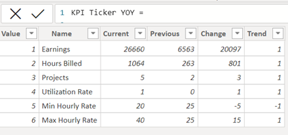
Thus, while the effect worked in this case and I think did look pretty cool, I would classify it as “not worth the effort”.
Earnings Maximizer - to analyze the effects of hourly rate choice and utilization rate separately and combined, I built the “Earnings Maximizer” scenario analysis. For hourly rate, I looked at the various choices that could’ve been made using existing rates with the fact table, as well as bringing some outside research from Zip Recruiter regarding current rates for Power BI Developers of different experience and skill levels. These were captured in the helper table discussed above, harvested through a standard SELECTEDVALUE measure and the harvested value converted to an hourly rate via a SWITCH/TRUE construct.
I chose to treat utilization rate as an endogenous variable, since I believe it can be significantly impacted by improved marketing, advertising/website, CRM implementation, and social media engagement to raise the developer’s public profile. Given that decision, I created a parameter ranging from 0 to 110% utilization and tied that to a single value slider, again harvested via a standard SELECTEDVALUE measure. This harvested value represents the minimum “floor” below which utilization rate is assumed not to fall. The calculated utilization rate and represents Max of the actual rate and the floor rate. Thus, you can use a floor rate of zero to ensure that the status quo utilization rates will be used. So, here’s the final measure for the scenario analysis Maximized Earnings:
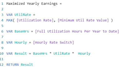
To display the results of this analysis, I thought the Zebra BI Waterfall Chart worked really well as it represented the start state, end state, the impact to each year individually, and the final raw and percentage increases attributable to the two parameter changes.
A few notes regarding the assumptions made in my DAX utilization rate measures:
I assumed a full day was 7.5 hours M-F, 15 days off per year, and 9 additional government holidays. Because the data “froze” on Sept 15, the date the challenge was posted, I created a measure called [Max Current Date] and branched that into all of my other relevant measures to stop the analysis as of that date. If you wanted to use this report in the real world, and reactivate it, you could just change the value of this measure from DATE(2021, 9, 15) to TODAY() and it again would be fully dynamic.
I think that about covers it. I hope you found something useful in this long-winded writeup. Thanks very much for your interest and engagement in the Enterprise DNA Data Challenges! And a big thanks to @HaroonAli1000 for his great work in organizing and implementing these terrific challenges.
All the best,
– Brian