Thank you @EnterpriseDNA!
For this one, I actually did look at key influencers to see if there was anything that stood out as far as a story could go, but there really wasn’t anything, so I decided to go with exploratory/process explanation report. My goal is to make these quickly as I have been a little busy lately, so there is not a lot in the way of tooltips (which I love!).
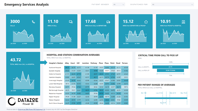
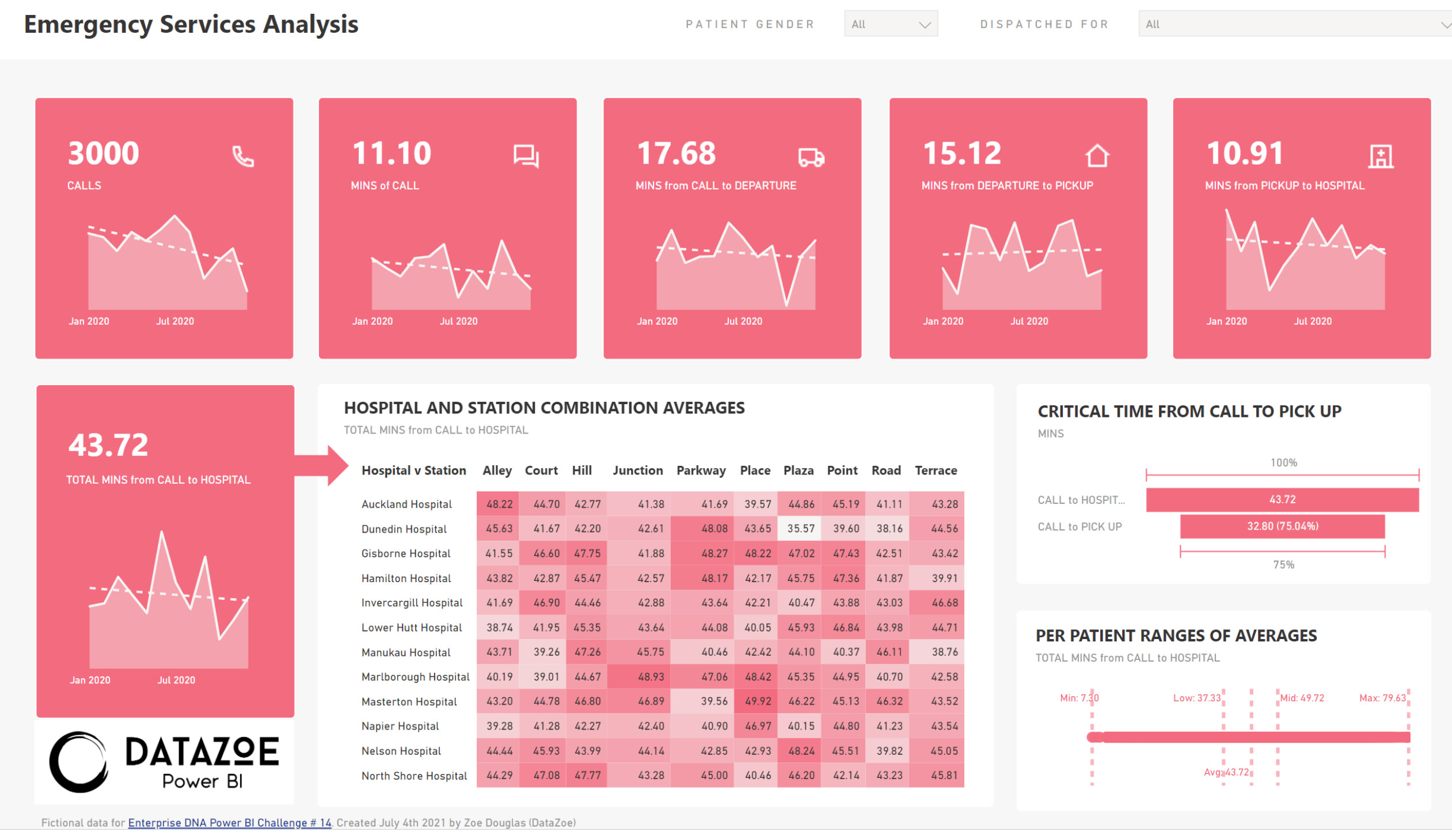
So, across the top is the breakdown from left to right of the start/end of the process.
- First the volume is explained
- Then how long the call took to get an ambulance
- Then from call to departure of the ambulance
- Then how long the ambulance took to reach the person
- Then finally, how long the ambulance took to get from pick up to the hospital.
The start being that someone makes a call to get an ambulance, and the end being they are dropped at the hospital. Showing it broken down will allow a user to see where things may be improving or declining in level of service.
Under that I then look at the total time from call to arrival at the hospital. This KPI is a bit bigger to set it apart from the upper KPIs. The arrow then shows that this is the measure that’s being used in the heatmap matrix that shows average times by station/hospital. The idea here is that people could click on higher or lower combinations to get into why.
I then identified what % of the total time was “critical” as from call to pickup. After a person is in an ambulance, they will start receiving care on route to the hospital. I liked having the conversion %'s here, so you can easily see the time and what % of the total time is in that category.
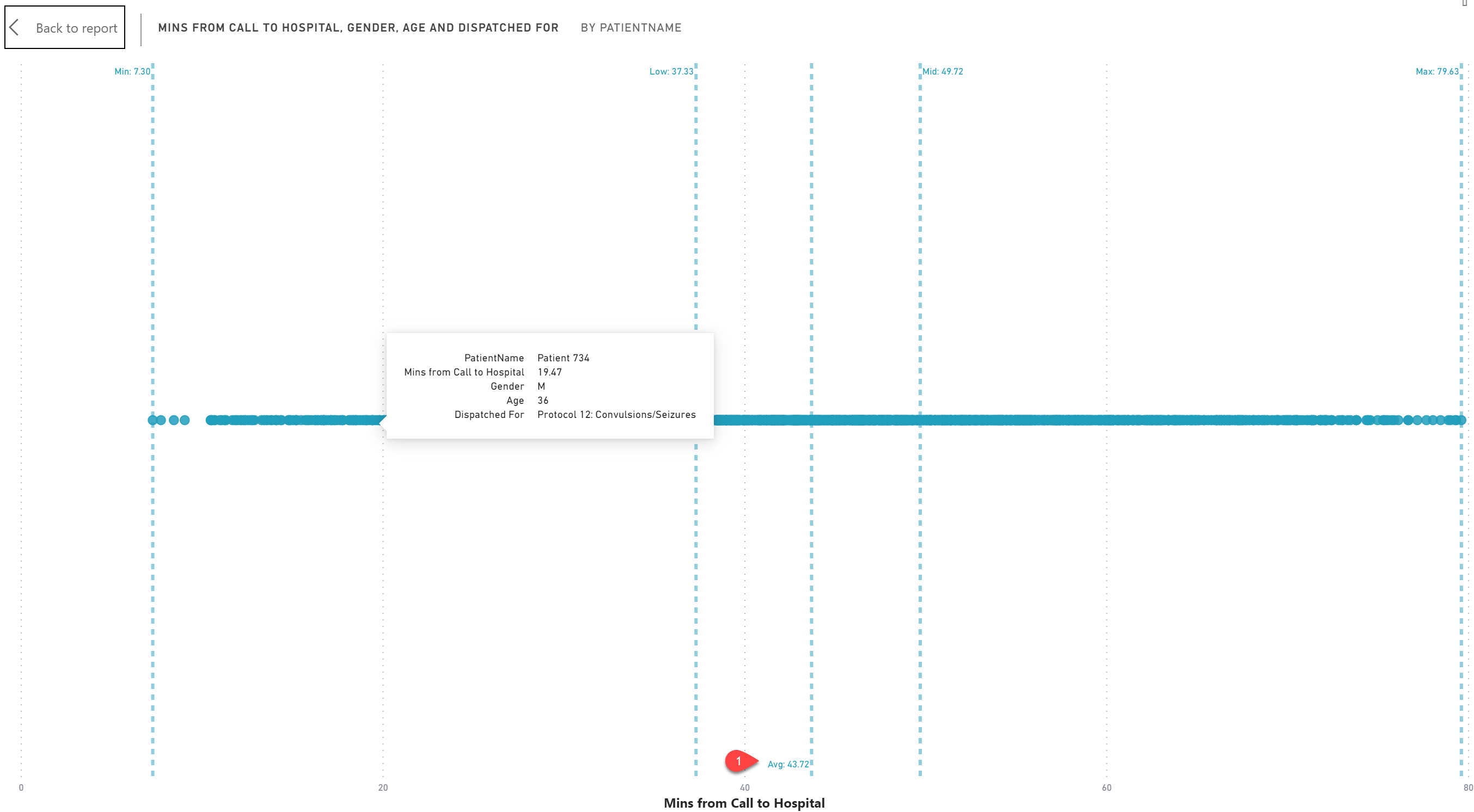
And finally, my favorite visual is actually the little one in the corner! I love box and whiskers but I find that one has been slow lately, so this is my out-of-the in-the-box solution. This is a scatter plot, and while it looks like a line, it’s actually a bubble for each patient. As all the other visuals aggregate to an average, this gets you into the nitty gritty details. And hovering will give you it in the tooltip too (it’s not the fancy tooltips I usually do!).
So the user can see all the values and where the average actually lies, as well as the min/max to show the full range. And I added in 33% and 66% percentile lines marked as Low and High, showing where the top 3rd, middle 3rd and bottom 3rd of patients actually were in terms of response time. As you can see, the data is fairly even, but if it wasn’t, this would clearly show it!
Things I would have liked to have added:
- A way to toggle different aggregations on all visuals (they use average now), to see min/max/median/thirds.
- A way to change the bottom visuals to total minute or segment of minutes.
I used numerro, as usual, haha, but it was neat to have the different colors to play with, and this was actually the first color I chose, but then changed to the pretty teal.