Here’s Wan’s entry for Power BI Challenge 14. @WanTeck, would you like to share how you built this dashboard and what your inspiration is in building it?
Here’s how Wan described it:
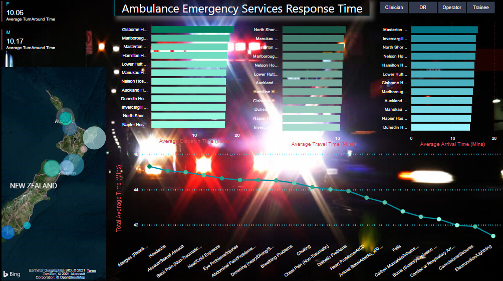
There’s many things that went through my mind with regards to the data set but Haroon’s food for thought guide
me to focus mainly on the critical aspect of getting people treated immediately as the emergency services is a
matter of Life & Death. On this note i wanted to create a Visual which shows Urgency (having been on one
myself) give me the chance to appreciate how precious time is and how stressful is the work of paramedics/hospital staff.
I wanted a dark background with Ambulance light flashing to depict that Urgency
I created a map to make users to understand the logistical challenges e.g. location/density/congestion impact on arrival time.
As what Mudassir Ali said to minimise the amount of slicers to improve real estate
as i only intend to create
only a one page report as i only had 2 days to prepare before deadline.
- I wanted to show the importance of getting treatment urgently for cardiac arrest, lightning, allergic reaction…
so that the call handlers / hospitals can benchmark against one another. How can they improve on response time.
- Lastly, I’m trying to paint a picture of the dedication or under appreciated at times, the work of health-care workers as
we can’t put a value to it.
Key take away
I could’ve created a ranking of Hospital by diagnosis response time / overall response time & which are the top performing 3 hospitals.
To learn about the real-life scenario presented for the challenge, be sure to click on the image below.
