Here’s the entry from one of our non-member participants, Vitor.
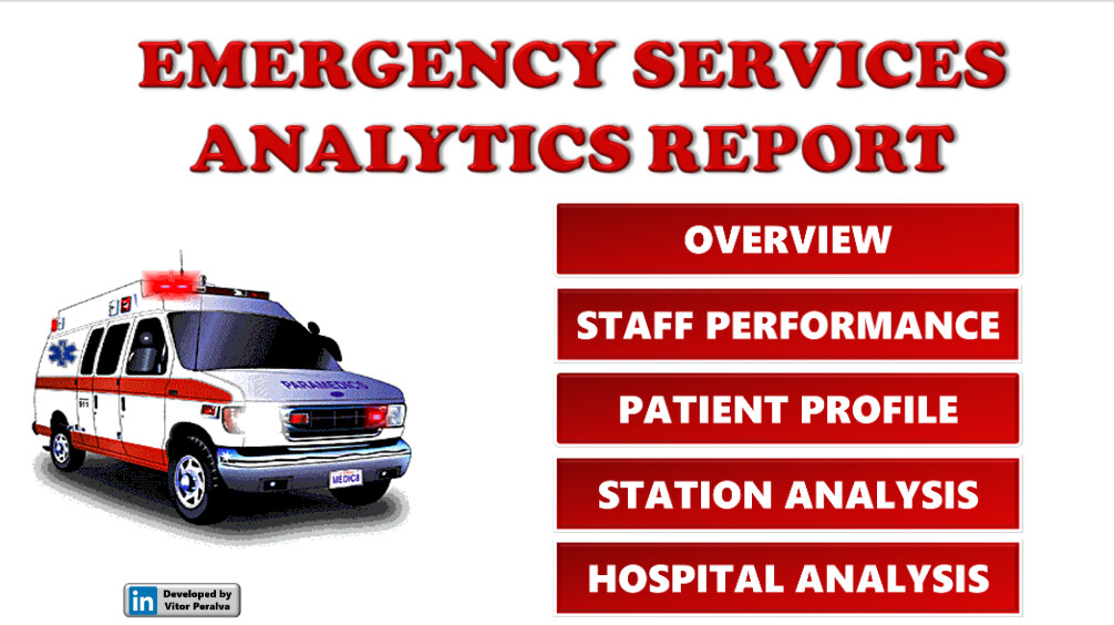
To learn about the real-life scenario presented for the challenge, be sure to click on the image below.

Here’s the entry from one of our non-member participants, Vitor.
To learn about the real-life scenario presented for the challenge, be sure to click on the image below.
This post is part of the Enterprise DNA platform improvements. Through these posts, members and non-members can showcase the resources and inspirations on how they come up with their challenge submissions. We hope all members can utilize it efficiently.
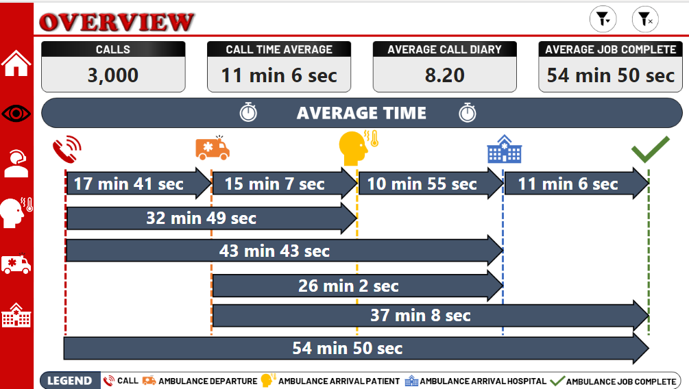
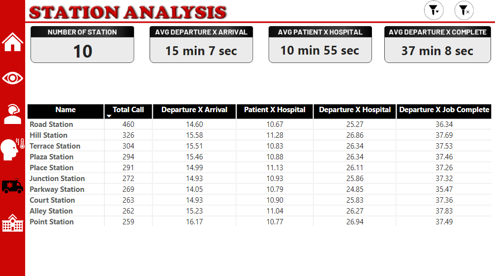
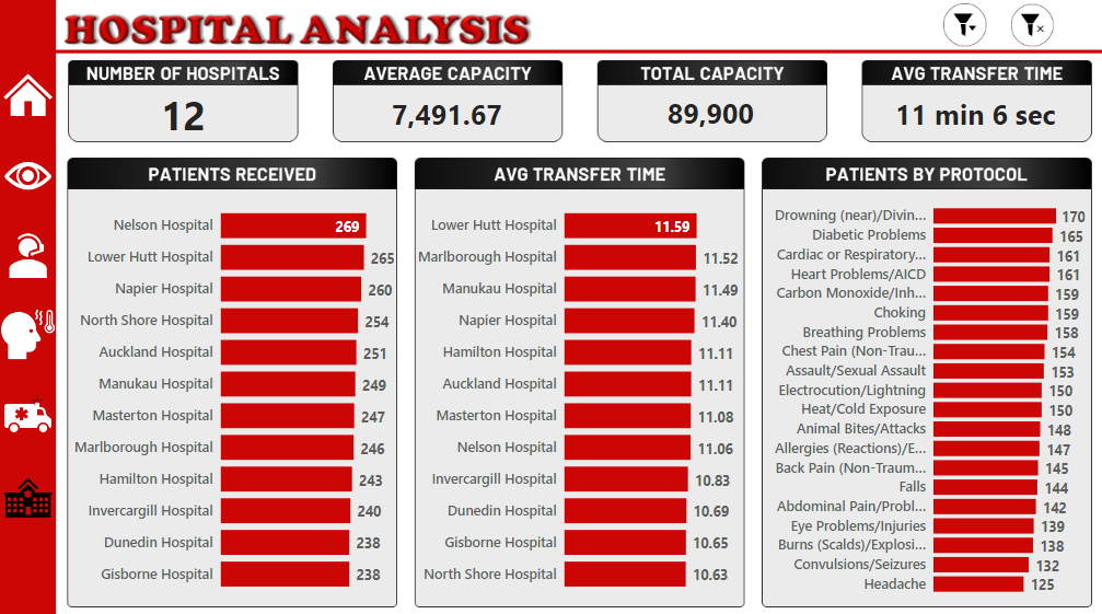
I love the Super innovative way you’ve visualized the first page. This is totally unique and not something that anyone else really did so I appreciate the thought process behind it. It doesn’t even seem like you’ve used the visualization from the standard visuals which is absolutely fine. To me you have shown the right insight in a compelling way and it’s easy for the consumer to get complete insight into what is happening.
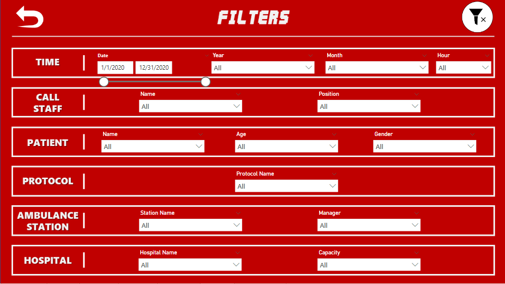
Auto see the navigation experience you have built in which I like and I think should become almost standard in a lot of reports. Because it’s actually so easy to implement now isn’t it. Just creating that simple navigation bar either on the left hand side or at the top like a menu bar you would have on a website is a super compelling way to make your report look like an application.
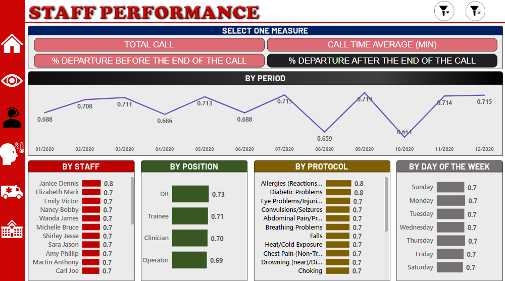
One thing definitely that is just amiss here is too many different colors. Make sure your you click using sellers and fewer colors. It just will make your report stand out just that little bit more. Because of the color variation you’ve got and a theme which is not really consistent it to me distracts from the insights. Simple fix and I know you’ll be able to do that very easily next time.
Sam