Here’s Steven’s entry for Power BI Challenge 14. @stevens, would you like to share how you built this dashboard and what your inspiration is in building it?
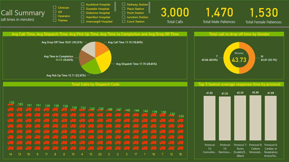
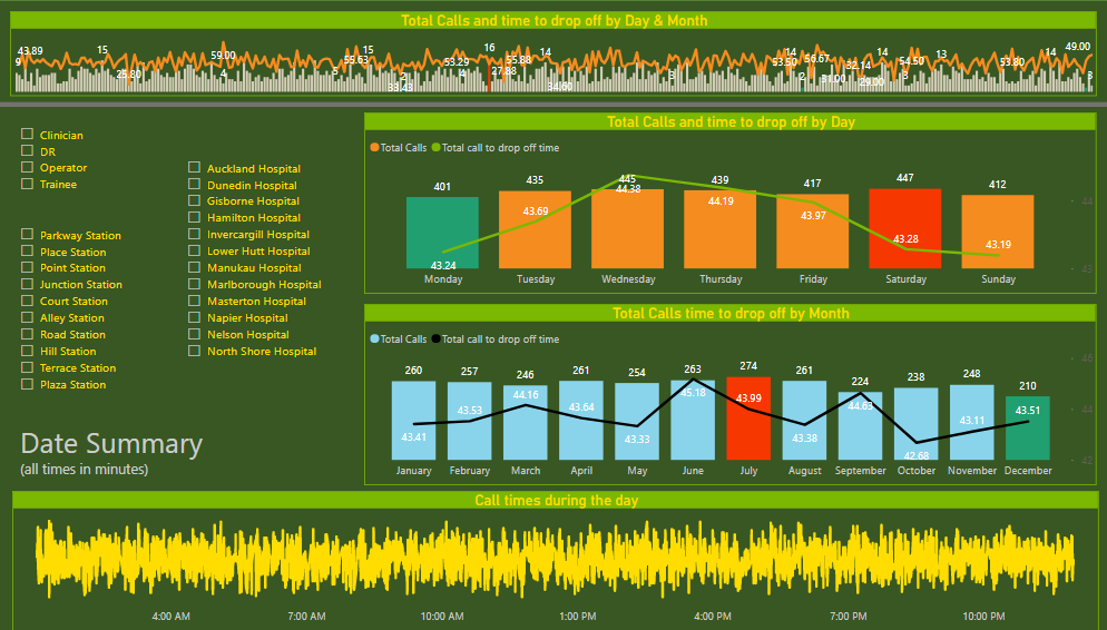
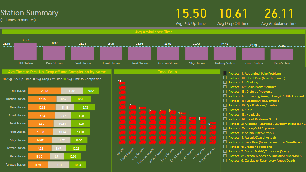
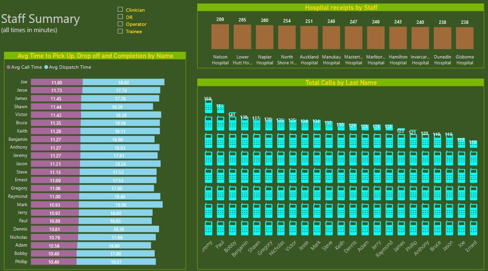
To learn about the real-life scenario presented for the challenge, be sure to click on the image below.

2 Likes
This post is part of the Enterprise DNA platform improvements. Through these posts, members and non-members can showcase the resources and inspirations on how they come up with their challenge submissions. We hope all members can utilize it efficiently.
Thanks for getting involved in the challenges. And well done on working through your submission.
A few things immediately stick up to me that are easy to fix and would make a big difference to the viability and experience when reviewing. your report
First big one is colours. To me they are not consistent enough and far too much variation. That is a simple fix to the theme and definitely something to work on next time. Also there’s some visualisation‘s which are just far too busy and it’s really difficult to showcase or even see the key insight. So do you want to make sure that you’re really highlighting what you want the user to see first. Almost like storytelling, making sure your user or consumer doesn’t miss the real story here. Think less is more.
Really take a look through some past successful submissions and look at how simple some of the designs are. They are simple but super effective and that’s what you want to aim for .
Thanks for getting involved and look forward to seeing you next time .
1 Like