Here’s the entry from one of our non-member participants, Shaistha.

To learn about the real-life scenario presented for the challenge, be sure to click on the image below.

Here’s the entry from one of our non-member participants, Shaistha.
To learn about the real-life scenario presented for the challenge, be sure to click on the image below.
This post is part of the Enterprise DNA platform improvements. Through these posts, members and non-members can showcase the resources and inspirations on how they come up with their challenge submissions. We hope all members can utilize it efficiently.
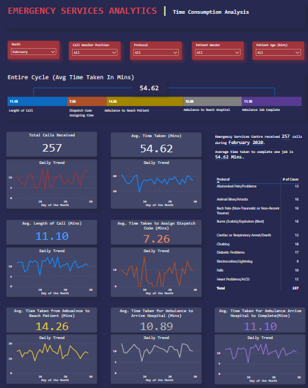
I like how this is different mainly in just the dimensions of your page. This isn’t something that I’ve personally used or dived into very much and kept it pretty vanilla with the standard dimensions. But it just show you how through using different dimensions you can showcase more insights on the same page for example.
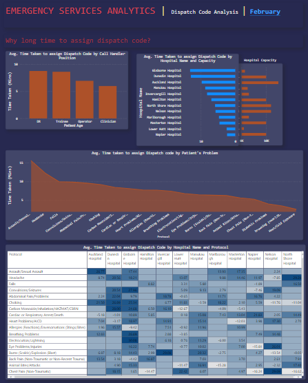
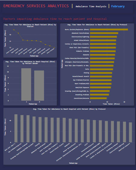
One thing I’m not that keen on is the variation in colors which is something very common from this challenge that I’ve mentioned in many people. So just making sure you use a simple color theme that uses small variations in colors but is consistent throughout all your report is all you need to change here and it will make your report look that much better.
Overall though I think that this showcases all of the insights from the brief and I can’t fault much of it. It gives me everything I need an A relatively compelling way it’s just really the colors which bug me a little bit.
Easy fix and can’t wait to see your next admission.
Sam