Here’s Sam’s entry for Power BI Challenge 14. @sacrow, would you like to share how you built this dashboard and what your inspiration is in building it?
Here’s how Sam described it:
Approach I have taken for this submission is to try and make the submission as flexible as possible for the end user/s for each hospital. So I added a slicer to break each page by hospital, so you can see only key figures for that hospital, but adding in text average comparisons and tooltips where you can get an idea of how other hospitals are doing in selected scenarios.
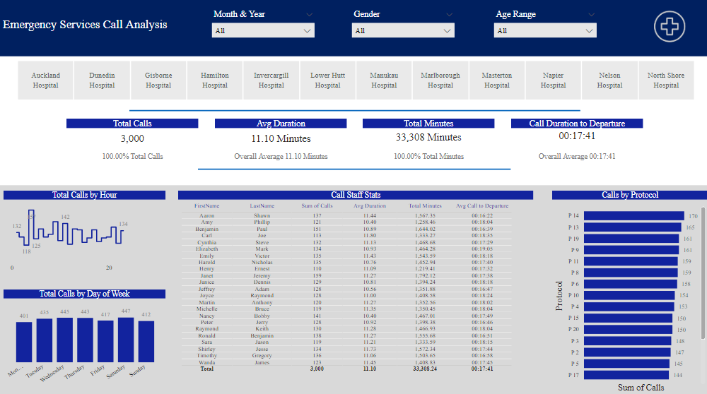
Page 1 - I focused on Call centre stats, such as volume, hours, age range, avg durations and days of the week.
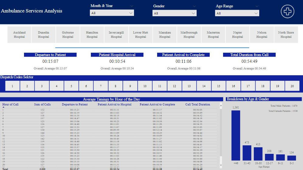
Page 2 - is focused on the ambulance service. Patients Journey from departure of the ambulance, again a breakdown in hours of the day, to identify peaks and gender and age.
Challenges I found, were coming up with relevant visuals for the measure’s created, so reverted to tables more for this challenge. Ended up using protocol numbers instead of names, but tooltips will identify the name for each P 1, P 2 etc… Time, I only saw this challenge a couple days ago, I’m sure if I had more time, I would probably take a very different approach and maybe something a bit more insightful? I think even though I don’t feel I’m reporting on much, my report feels a bit clunky, might be the fonts I decided to use, If I could redo again, I would try and make everything look a bit smoother maybe?
To learn about the real-life scenario presented for the challenge, be sure to click on the image below.
