Here’s the entry from one of our non-member participants, Mahir.


To learn about the real-life scenario presented for the challenge, be sure to click on the image below.

Here’s the entry from one of our non-member participants, Mahir.
To learn about the real-life scenario presented for the challenge, be sure to click on the image below.
This post is part of the Enterprise DNA platform improvements. Through these posts, members and non-members can showcase the resources and inspirations on how they come up with their challenge submissions. We hope all members can utilize it efficiently.
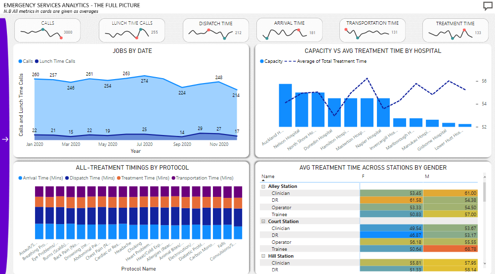
Awesome I love the sparklines that you’ve used here. I’ve always liked these from excel and I think that you have used them really effectively here in Power BI. It certainly provides a lot of information in such a small piece of real estate.
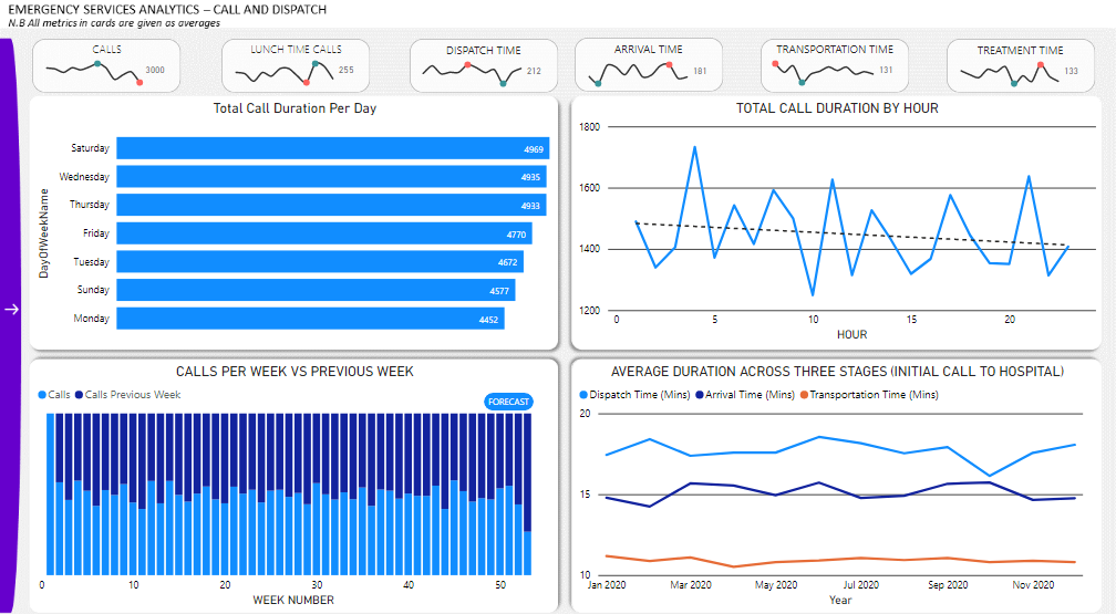
I also like the narrative feature you’ve used to tell a story on the data. And a dynamic story at that hopefully. Also some of the navigation features and layout features also are great so well done on your work there.
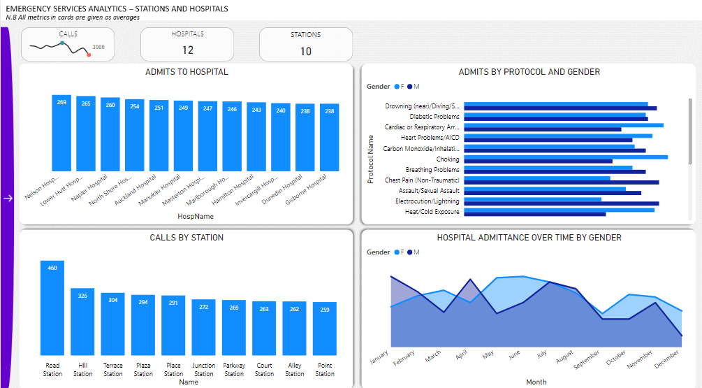
One thing I’m not convinced on is the purple on the left hand side doesn’t seem like a integrates with your color theme so it just sticks out. That should have just been a blue just like you’ve had in your visuals in my view. Creating complete consistency with simple color variations is all you need to do in reports. Simple is better in my view. Another small thing is I think a couple of these visualizations should have been bar charts instead of column charts. Particularly ones with like names and stations etc
I love the matrix visual with the conditional formatting there someone looks great.
Overall really pleased with the effort you put into your submission here with some really innovative work. Well done and look forward to seeing more.
Sam