Hi,
Finally I have submitted my first challenge entry and I really enjoyed it. I haven’t done much work with time before so it took quite some time to get my data in the right format.
I struggled a lot with the presentation, so many ideas which I found hard to condense down. I also found the data was not so easy to work with as it was very similiar, not a lot of outliers.
In the end I ran out of time and submitted as it was.
The standard of submission’s by everyone is super high and aspirational. I really don’t know how you pick a winner!
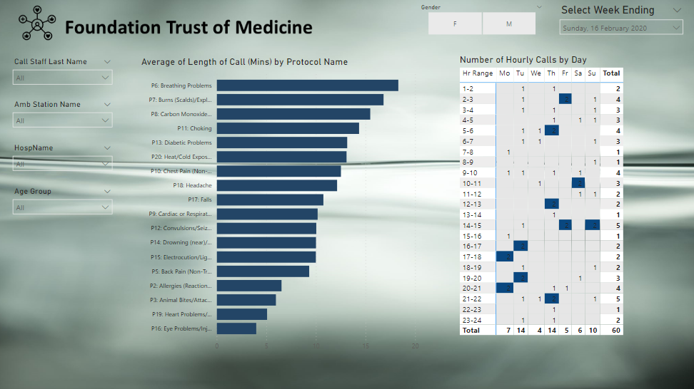
Kudos for jumping in on your first entry. Your problem of trying to condense down all the possible questions that could be addressed and visuals that could be used is one I think we all struggle with. You opening page provides a nice overall summary, and I think your matrix/heatmap is a very effective visual. One minor suggestion on that one would be to either use a lighter color for the highlighting, or add a second conditional formatting for font to change the font to white when the blue background condition is met.
Thanks for participating! Look forward to seeing your future entries.
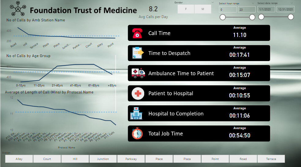
Nice work I can see your thought a little bit outside the box with your visualizations. Particularly the first page where you have really broken down the key insights around timings and have used icons quite creatively.
I definitely think some of the other visualisations though could have used some slightly different visuals. Particularly also in the first page. I think line charts for details with text our more useful in either a table or say a bar chart. Because it leaves a lot more room for the text to appear in the actual visual. If you take the bottom left hand side visual for example we can’t even read what is in the axis. So that is to me one of the big things with your report around improvement is just picking and choosing better visualizations for the insights you’re trying to show in general.
I like how you’ve tried to be creative around the background. one thing to do on top of that is to make sure that your color theme is aligned to whatever colors are in the background. So using a color palette generator based on an image is probably what you should do in this case. Really easy and you can actually find one of these in the analyst hub.
Great to have you involved look forward to seeing more.