Here’s John’s entry for Power BI Challenge 14. @JohnG, would you like to share how you built this dashboard and what your inspiration is in building it?
I’d love to share my thoughts related to Challenge 14. Before doing so, please appreciate that the grammar and punctuation in this message may be awkward. I’ve lost the use of my SHIFT key, for the time being.
This has been my first challenge. I enjoyed it very much. I’n eager to review and analyze the submissions of other participants.
I’ve been a Power BI student for about six months now. In one of the first Edna tutorials I viewed, Sam McKay presented his Four Pillars of Power BI. Based upon my background, and the fact that I don’t have an artistic fibre in my body, I’ve devoted most of my energy to date to Data Import and Transformation, Modelling and DAX formulas. I’ve written hundreds of reports over the years using COBOL, SQL and Crystal Reports. I guess we’re all captives of our experience, and mine has been that data carries the day. Certainly, I need to shift to the visual, thematic and navigation side of the house.
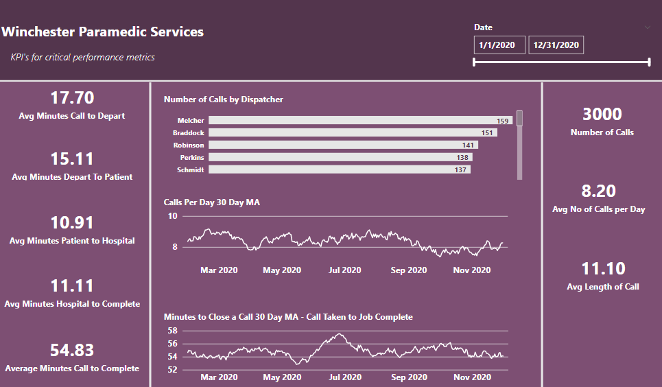
Regarding the report itself, I wanted the first page to present data that an executive could review. I wanted this page to present KPI’s at a high-level. As I analyzed the data in the Excel file, I thought that the key factors were the time required to complete each ‘node’ in the patient delivery chain. This is the data I wanted to present on the first page.
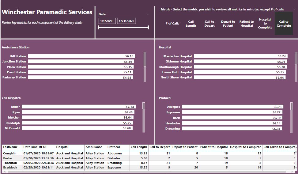
Another tutorial I’ve been very impessed by was Sam’s ‘Multi Threaded Visuals’. MTV’S allow you to pass a ton of data through a small set of visuals. I use them on pages 2 and 3. I did so to present performance insights for the four actors in the Emergency Services Process, Dispatcher, Ambulance Service, Hospital and Protocol. When I viewed the results for each of the four actors, I was of two minds. In one respect, I thought there wasn’t much variance among the individuals from top to bottom. From another perspective, these data represent life and death situations, so every second is critical. I’m eager to see how other participants analyzed performance.
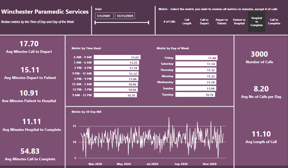
On page 3, I used the same MTV to analyze performance by Time of Day and Day of the Week. This analysis does ‘open up’ the data to identify a greater degree of variance. I thought it would be interesting to see how ToD and DoW affect KPI’S, also.
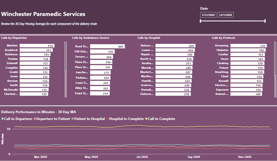
I’ve always thought Moving Averages are critical to any data analysis. On page 4, I wanted to see how each node in the network was represented by a 30 Day MA. I was struck by how flat the MA’s were until I examined individual contributors among each of the four actors. There was significant movement that might interest a decision maker.
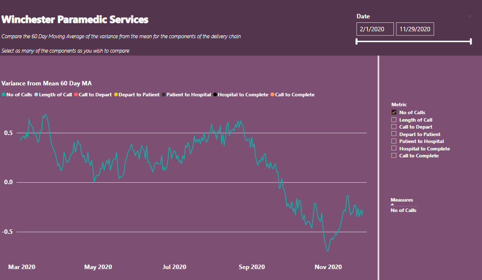
Finally, looking to identify variance in the delivery process, I developed a visual to compare the variance, 60 day MA, around the mean for as many of the nodes as you may wish. It did reveal some trends.
Ultimately, I enjoyed working on the Challenge. My own personal challenges moving forward will be to develop navigational and themetic skills, and to enhance my ‘analytical mind’.
Terrific writeup. Thanks very much for taking the time to share your thoughts.
Our backgrounds are quite similar, and one of my biggest challenges is on the artistic side as well. I would highly recommend going back through the previous challenges and finding artistic styles you like, and work through how they constructed their visuals, themes, navigation, etc. Some of the members whose styles I frequently crib from in my own reports are @MudassirAli , @Alvi , @alexbadiu , @datazoe , @Greg , @sedhosen, @JarrettM and of course, @sam.mckay (I’m sure there are plenty of others I’ve inadvertently left off this list…).
There are also some great tools out there for the artistically challenged among us. @MudassirAli has gotten me hooked on Canva, and has done a couple of excellent recent videos demonstrating its potential for easily creating really attractive backgrounds and visual elements:
Look forward to seeing more of your work in future challenges!
As always, thanks for the prompt and thoughtful response.
Actually, I beat you to the punch regarding themes, colors and navigation. I’ve spent the past few days watching tutorials on those topics, including those you attached from Mudassir. I’ve learned to pay attention to anything from Greg, Alex, Mudassir, Jarrett and yourself.
I will spend time deconstructing Diana’s, ‘Interview Insights’, and Melissa’s, ‘Optical Data’, work, also.
I will say that I’ve observed an evolution in Sam’s approach to colors, themes and navigation when comparing his recent work to tutorials from 3 - 4 years ago.
I think @sam.mckay would be the first one to tell you that his participation in the Challenges has taught him a lot as well, and resulted in some refinements and improvements in his own style. One to check out in particular is his entry in I believe Challenge #6, which is a masterwork of UX and the creative, varied use of navigational elements in PBI.
Nice work great submission. One thing that unfortunately just stands out so clearly when I look at this briefly is the odd color theme that you’ve used. If you just made a consistent theme and updated the colors to a nice theme it would have made your report stand out that little bit more but unfortunately those little things really stick out to me.
I will say though that it’s very detailed report and I love that comprehensive nature of it. I can get all of the insights as a consumer and I can get them relatively quickly which is all down to the way you have told the story through each different page in your report.
Next time I think the challenge is end to look to some of your eyes that are in fewer pages. Tritel more with less. Utilized different filters or bookmarks or selections feature to make that happen. I’m sure you can do it with a little bit of creative thinking there’s so many different ways you can build power BI reports into compelling applications.
nice effort though Ann really appreciate your participation in this challenge