Here’s Jarrett’s entry for Power BI Challenge 14. @JarrettM, would you like to share how you built this dashboard and what your inspiration is in building it?
This post is part of the Enterprise DNA platform improvements. Through these posts, members and non-members can showcase the resources and inspirations on how they come up with their challenge submissions. We hope all members can utilize it efficiently.
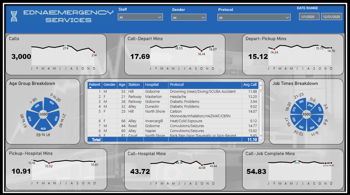
Nice one I love this. I really like some of the charts you’ve used. It’s a bit unique and something that maybe I wouldn’t traditionally do but I think that it works and it showcases all of the key insights that a stakeholder would want to know in an efficient way.
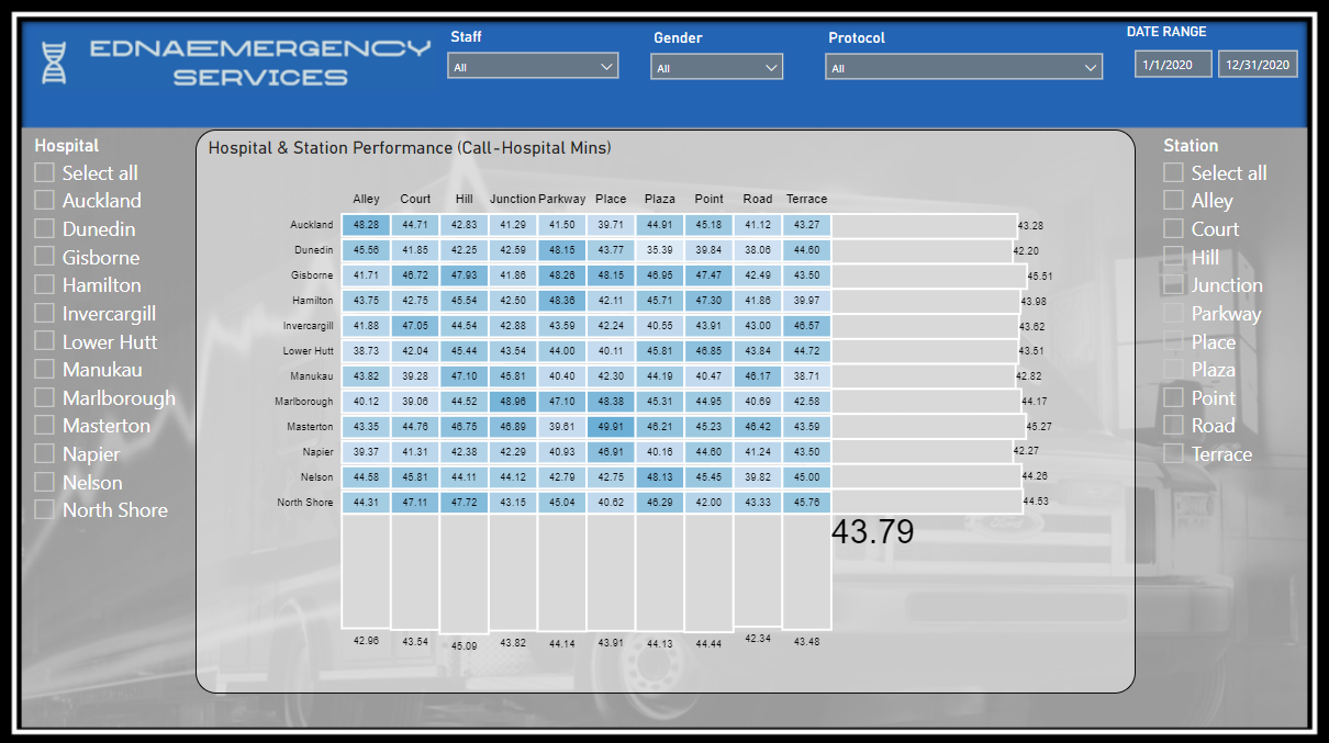
I particularly like the visualization you’ve used in the second page which to me looks like a charty culator visual. I might be wrong there but I really like how you’re exploring new ways that you can create visualizations. And to me that one really works too. It looks like it summarizes many key insights all within one visual and it’s totally dynamic with all of the filtering you can make around it.
work and can’t wait to see more from you in following challenges
Thank you for your kind words. All of the visual in this report were done in Charticulator. The visual on the 2nd page is a Heat Map with some additional features that cannot be done with the native visuals in Power BI. That was a goal of mine when I started this challenge. It took me a lot longer than usual to put this together, but well worth the extra effort.
That dynamic heatmap remains my favorite visual from this entire challenge. It would be awesome if you could put together a video on exactly how you did that.