Here’s Jan’s entry for Power BI Challenge 14. @deltaselect, feel free to add other details of your work.
Here’s the link to the report:
And here’s how Jan described it:
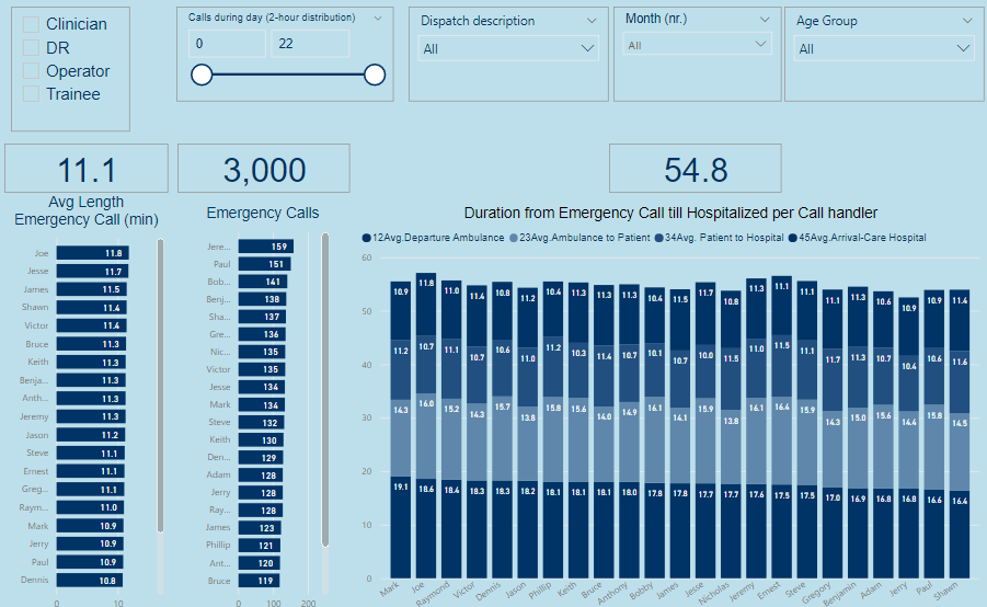
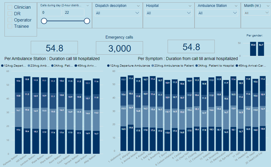
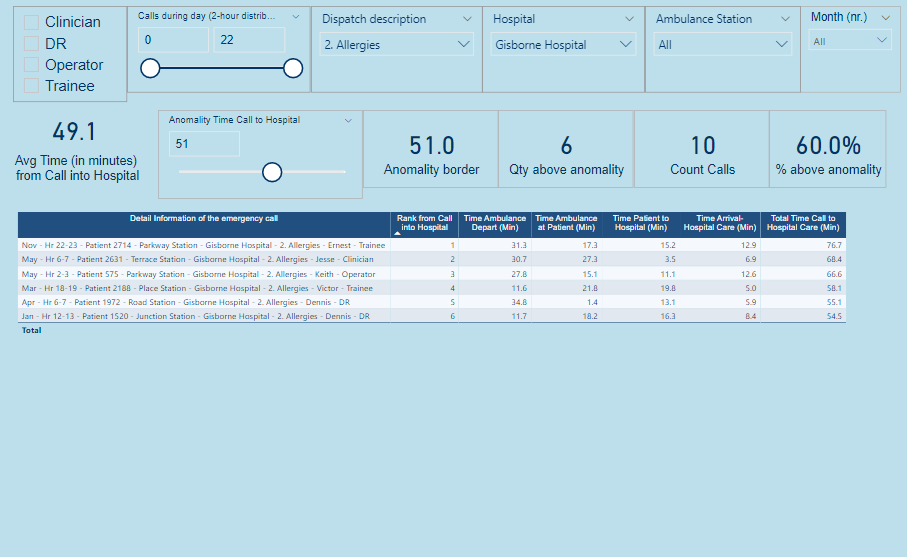
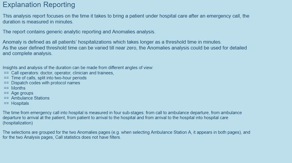
This analysis report focuses on the time it takes to bring a patient under hospital care after an emergency call, the duration is measured in minutes.
The report contains generic analytic reporting (3p) and Anomalies analysis (2p).
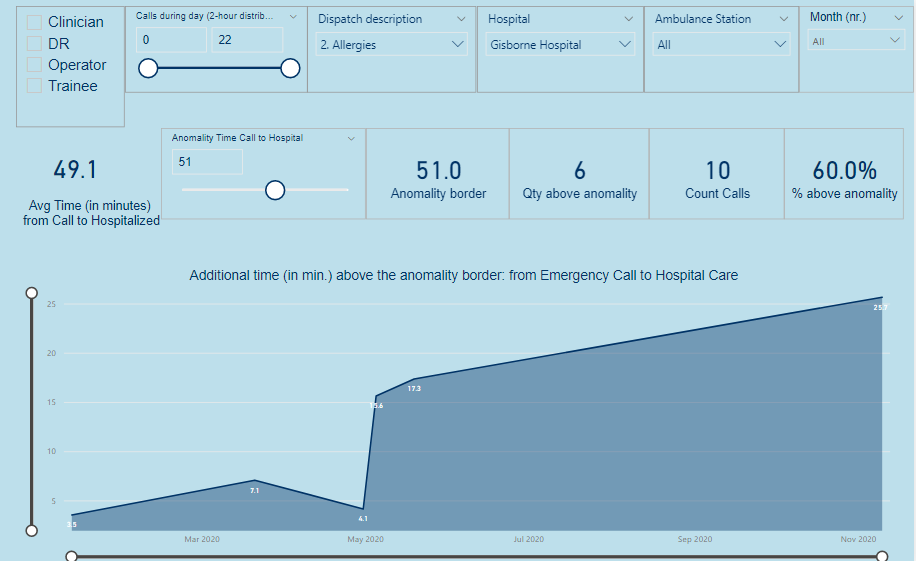
Anomaly is defined as all patients’ hospitalizations which takes longer as a threshold time in minutes.As the user defined threshold time can be varied till near zero, the Anomalies analysis could be used for detailed and complete analysis.
Insights and analysis of the duration can be made through report-filters from different angles of view.
Build up of this workout:
- Used/imported the University of Melbourne color scheme json file via Power BI View–>Themes → Browse for Themes (https://community.powerbi.com/t5/Themes-Gallery/bd-p/ThemesGallery)
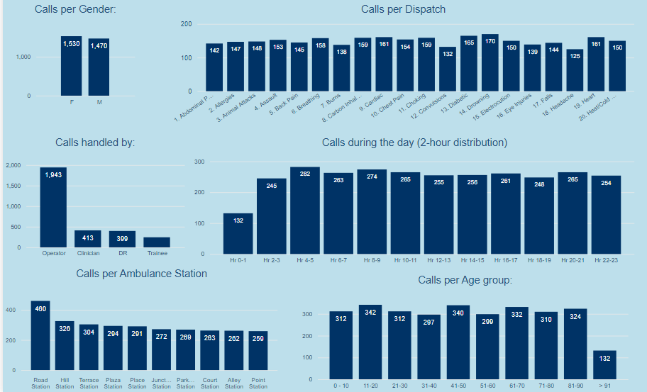
- Data is used as provided in Excel for this Challenge, the data model exists of one fakt-table CallsT of the 3.000 calls, the other data provided is used as lookup-table, I added an age group and a month lookup table (instead of the often used date table).
- Three calculated columns are added to the fakt-table CallsT:
- “Hourgroup of call”, which calculates to which two-hour group a emergency call belongs
- “MonthNr”, which calculates to which month an emergency call belongs
- “Detail Information of the emergency call”, which concatenate eight dimensions together from lookup tables, which was needed to speed up the table in “Detail-analysis Anomalies”, as a table with information from eight dimensions becomes very slow.
- A slicer “Anomality Call to Hospital Care” is added with a range from 15 till 80 (minutes) through Modeling → New Parameter What if in Power BI, whereby a user can determine what is seen as anomality; all anomalies can be analysed in the two anomaly report pages.
- Three DAX measure-groups are created:
- Base Measures
- Duration Measures, for average time calculations of different stages of hospitalization, given the filtering
- Anomality measures, set up for the anomality reporting,
- The report contains of a content page, five reporting pages, and an explanation page, see appendix.
A further development of this report might be a dashboard with required key management information. I really enjoyed this challenge.
To learn about the real-life scenario presented for the challenge, be sure to click on the image below.
