Here’s Greg’s entry for Power BI Challenge 14. @Greg, feel free to add other details of your work.
Here’s how Greg described it:
Hi all. Here’s my submission for Data Challenge 14, Emergency Services Analytics. I chose to concentrate on the technical infrastructure rather than focus on the ultimate utility of the final report, and proceeded with the following goals:
- To gain experience using two separate dataset and report PBIX files
- To evaluate all of the best practices listed in my recent Enterprise DNA YouTube series and comment on how they applied to this challenge submission
- To gain experience using JSON theme files and try to do as little formatting via the UI as possible
What I liked:
- I’m extremely happy with the use of separate PBIX files for the dataset and the report. Although their use did not serve any purpose for this challenge, I can easily see that this is an exceptional way to develop where others can make use of your dataset; I wholeheartedly recommend it for any organization that has multiple people working on a reporting project, as it both facilitates the separation of duties and the dataset endorsement process.
- I’m quite happy with the content of my YouTube series on the best practices; I was able to gain first-hand experience trying to use only those best practices and have come up with quite a satisfactory (on the surface) looking report.
- I’m quite happy with the time saved by using a custom JSON theme file, as I didn’t have to change any fonts, font sizes, font colours, or background colours during development; I plan to use this technique for future development to both save time and standardize the consistency of the output
What I didn’t like / needs more work:
- I’m not happy with the final report, and would have liked to spend much more time on creating a more insightful report, but the extra time required to flip back and forth between the separate dataset and report PBIX files consumed more than I thought, and with the technical focus of this submission, I ran out of the time I had allotted for this challenge
Findings / Notes:
- I was unable to find the correct syntax to set the custom properties I wanted for minimal shadows for visuals by JSON, so I ended-up using the UI to set the custom properties
- I was unable to find the correct syntax to set the style I wanted for matrix and table visuals by JSON, so I ended-up using the UI to set the style to “None”
- I was unable to find the correct syntax to set the default and on-hover behaviour for the “Reset Filters” button, so I ended-up using the UI to set the on-hover behaviour
- although I set the summarization to NONE in the “thick” dataset PBIX, the changes were not (not always) reflected in the “thin” report PBIX, and I needed to set the summarization again using the ribbon
Here’s the notes I kept during development:
Dataset PBIX
ensured options for “Import relationships from data sources on first load” and “Auto-detect new relationships after data is loaded” were unchecked (disabled)
- (from File \ Options and settings \ Options \ Current File\ Data Load \ Relationships)
ensured option for “Change default visual interaction from cross highlighting to cross filtering” was checked (enabled)
- (from File \ Options and settings \ Options \ Current File\ Report Settings \ Visual Options)
created parameters for source path name and file name
loaded all data from source Excel workbook as staging queries, using [parameterSourcePath] and [parameterSourceFile]
- *** NOTE: while setup with a local folder only, the use of parameters for source path and file would allow the use of online files (OneDrive for Business) and, if the dataset is deployed to DEV, TEST, and PROD workspaces, the dataset in each workspace could be easily configured in the Power BI Service to use the appropriate folder and file ***
added parameters for source path and source file
updated staging queries to use source path and source file parameters, including check for ending “”
renamed all “…ID” fields to use “… Key” suffix to improve clarity in linking
created reference for each table from staging queries
added [Dates] table from Enterprise DNA M Code Showcase (Extended Dates table):
[Dispatch Codes]:
- replaced #(tab) with empty string
- replaced #(cr) with empty string
- replaced #(lf) with empty string
- split [Protocol] column and removed left or colon; renamed [Protocol Full]
- added new calculated column in DAX to shorten the protocol description to make visuals easier to read
[Dates]:
- marked as a date table
- changed date format to dd-mmm-yyyy
[Hospitals]:
- split [Hospital] column by right-most space, renamed [Hospital.1] column to [Hospital], removed [Hospital.2] column
[Patients]:
- renamed [Gender] to [Gender Code]
- added calculated column for [Gender] (Female, Male, Other)
[Calls]:
- renamed columns:
- [DateTimeOfCall] to [Call DateTime]
- [Ambulance DepartureTime] to [Station DateTime]
- [Ambulance ArrivalTimePatient] to [Patient DateTime]
- [Ambulance ArrivalTimeHospital] to [Hospital DateTime]
- [Ambulance JobCompleteTime] to [Complete DateTime]
- used “Change Type \ Using Locale…” to change type of [Call DateTime] column from “Text” to “Date/Time” (used locale “English (United Kingdom)”)
- split [Call DateTime] by delimiter (space) into [Call Date] and [Call Time]
- created custom columns for durations in minutes (whole number) between:
- Call to Station
- Station to Patient
- Patient to Hospital
- Hospital to Complete
- Call to Complete
- created custom column for [Call Time Key] in HHmm format (24-hour clock) (for subsequent linking)
added [Times] table from Enterprise DNA M Code Showcase:
added [Last Refresh] table from Enterprise DNA M Code Showcase
- Adding a Last Refresh date to your Report
- hid [Last Refresh] table
added [Dataset Measures] measures table
- added measures for dataset identifiers: ID, Version, Version Date
- added [Last Refresh] measure
- added measures for dataset maximum and minimum date
- added measures for [Total Calls], [Response Time (Call to Patient)], [Transport Time (Patient to Hospital)], [Ambulance Time (Station to Complete)]
- used measure branching to create measures for [Call Time]
Report PBIX
General:
- ensured options for “Import relationships from data sources on first load” and “Auto-detect new relationships after data is loaded” were unchecked (disabled)
- (from File \ Options and settings \ Options \ Current File\ Data Load \ Relationships)
- ensured option for “Change default visual interaction from cross highlighting to cross filtering” was checked (enabled)
- (from File \ Options and settings \ Options \ Current File\ Report Settings \ Visual Options)
- used theme JSON file to set all font family for all visuals to Segoe, text colour to white
- retrieved Power BI dataset (to make this a “thin” report)
- added [_Report Measures] measures table to this “thin” report
- browsed PowerPoint and chose dark red abstract slide design and exported as PNG; used exported PNG as page background for PBIX
- used the “Image to Colours” function of the Colour Theme Generator app on the Enterprise DNA Analyst Hub to extract the HEX codes from the page background image; chose #481818 (dark maroon) as a “base” colour
- used the “Colours Fan” function of the Colour Theme Generator app of the Enterprise DNA Analyst Hub with #481818 to generate an 8-colour theme
- used “Just Color Picker” to grab the HEX codes of the colour theme and saved as a text file
- used Visual Studio Code to update the “dataColors” section of the JSON theme file with the extracted HEX codes
- used Visual Studio Code to update the “visualStyles” section of the JSON theme file with visual title font colour, visual title background colour, and visual background colour
- used “View \ (Themes downarrow) \ Browse for themes” and selected the JSON theme file
- edited the JSON theme file to adjust the title font size as needed, then re-applied the JSON theme file
Visualizations:
Header:
- used textbox at left for title
- used button for “Reset Slicers”
- actions the “Reset Slicers” bookmark
- altered the on-hover behavior of the button to implement button interactivity
- used date slicer
- used rectangle for background with custom shadow (bottom, grey, minimal) [theme colour 7, 50% transparency]
Body:
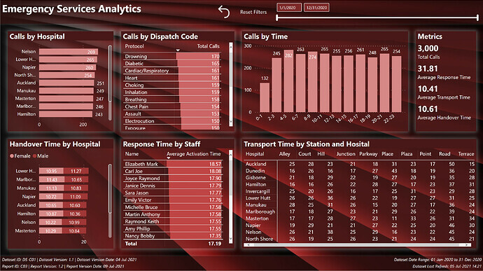
- used bar chart for “Calls by Hospital”
- used table with data bars for “Calls by Dispatch Code”
- used column chart for “Calls by Time” (2-hour intervals)
- used multi-row card for [Total Calls], [Average Response Time], [Average Ambulance Time], [Average Transport Time], and [Average Handover Time] measures
- used stacked bar chart for “Handover Times by Hospital” with gender as stacks/legend
- used table with data bars for “Response Time by Staff”
- used matrix for “Calls by Hospital and Station”; used [Matrix Spacer] measure and auto-size column width property to make matrix column width consistent
Footer:
- used textbox at left with measures for dataset admin (id, version, version date) and report admin (id, version, version date)
- used textbox at right with measures for dataset date range (to, from) and dataset last refresh date
- used rectangle for background with custom shadow (top, grey, minimal) [theme colour 7, 50% transparency]
To learn about the real-life scenario presented for the challenge, be sure to click on the image below.


 File into a Dataset and Lean Report File")
