Here’s Federico’s entry for Power BI Challenge 14. @FPastor, feel free to add other details of your work.
Here’s the link to the report:
And here’s how Federico described it:
About my “Emergency Report” and inspiration.
- Inspiration: EDNA Showcases, Canvas Theme and the next.
- I have tried to keep it simple but at the same time use a few tricks and hacks to show case some of the possibilities.
- Measures are nothing of the complicated sorts. Some Averages, Calculate and Time Intel. Enough to answer, more or less, the Challenge’ brief.
- The Intro Page has been given a website/app themes with a Navigation menu at the top, Title, Senior Management pics, contact information (Tooltip descriptions) and Burger Menu at the top right….”I leave this to be opened by you”.
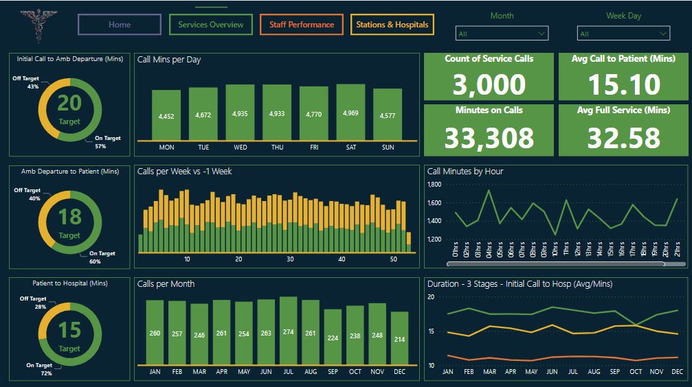
- The Services Overview provides an general inside into the Operations of Emergency Services.
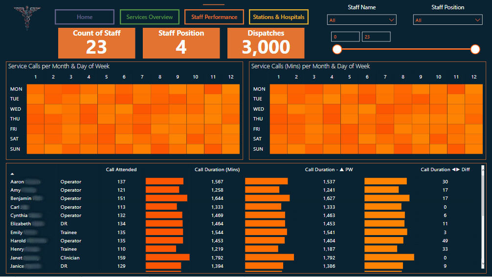
- Staff Performance refers as per the title to Staff’s metrics with a couple of interesting heatmaps using Conditional Formatting Ranking. Credit to Antriksh Sharma. Also provides the end user with a table measuring Calls, Minutes on Call and some Time Intel on this attributes. Couple of hacks the use of whitespaces in some of the columns with some bar conditional formatting and the use of symbols from the window ‘s emojis short cut.
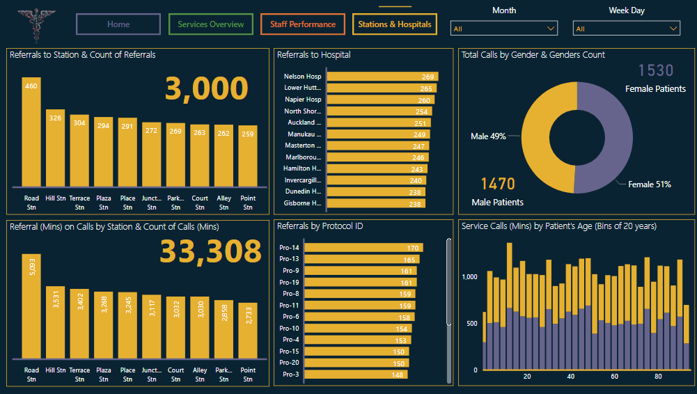
- And the final Page, Stations/Hospitals & Patients give also a good views on Calls and Minutes on Call over Stations & Hospital and briefly summarizes Patients Gender & Age groups.
To learn about the real-life scenario presented for the challenge, be sure to click on the image below.
