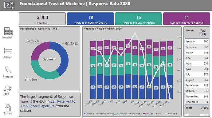
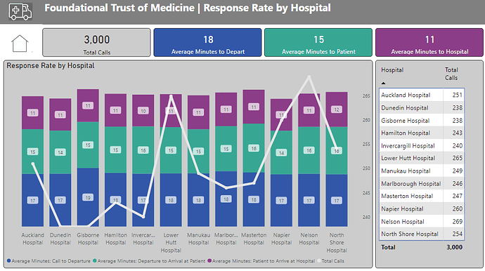
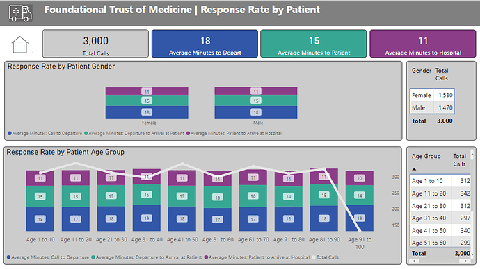
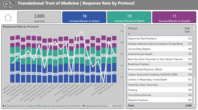
Here’s Diana’s entry for Power BI Challenge 14. @DianaWill, feel free to add other details of your work.
Here’s the link to the report:
Here’s how Diana described it:
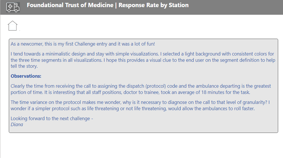
As a newcomer, this is my first Challenge entry and it was a lot of fun! It is also the first time I was able to view a PBI report I created on PowerBI.com I will handle the navigation icon tool tips differently, in the future.
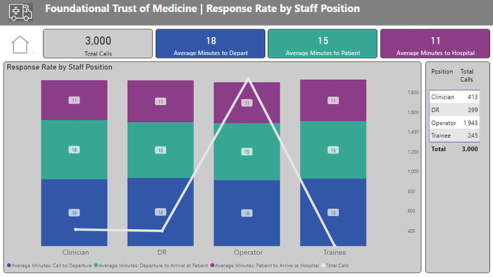
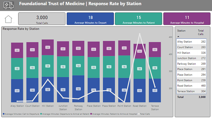
I tend towards a minimalistic design and stay with simple visualizations. I selected a light background with consistent colors for the three time segments in all visualizations. I hope this provides a visual clue to the end user on the segment definition to help tell the story.
To learn about the real-life scenario presented for the challenge, be sure to click on the image below.

This post is part of the Enterprise DNA platform improvements. Through these posts, members and non-members can showcase the resources and inspirations on how they come up with their challenge submissions. We hope all members can utilize it efficiently.
Nice one I really like how you put together this report. I like the colours, the navigation experience and also the story that it tells to those that are viewing at and making decisions.
It’s really comprehensive with a lot of information really spelled-out and a number of visuals across the whole range of pages. One of the things that I would consider for next time as working out how you can maybe summarise this on fewer pages. Sometimes it’s just about working out how you can build some dynamic filtering into the consumer experience. Maybe even use tool tips or bookmarks to bring more information into a consolidated space .
Congrats on a great effort though really impressed .
Sam
1 Like
