Power BI Challenge 14 - Emergency Services Analytics from David (Newcomer)

Here’s David’s entry for Power BI Challenge 14. @DavieJoe, would you like to share how you built this dashboard and what your inspiration is in building it?

Here’s the link to the report:

To learn about the real-life scenario presented for the challenge, be sure to click on the image below.

power-bi-chal-1

3 Likes

Will be delighted to, will need a few days to organise.

DJ

Inspiration

My inspiration for the challenge was @MudassirAli entry for Challenge No 10 in terms of the colours, some of the visuals, layout & interactivity. Mudassir put forward the suggestion to minimise or have zero slicers on his report (apologies if I’ve misconstrued his words in any way, I think this was a general thought of his and not specific to his Challenge No 10 entry) and only use the visuals on the page as method of slicing & dicing your data.

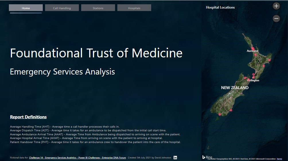
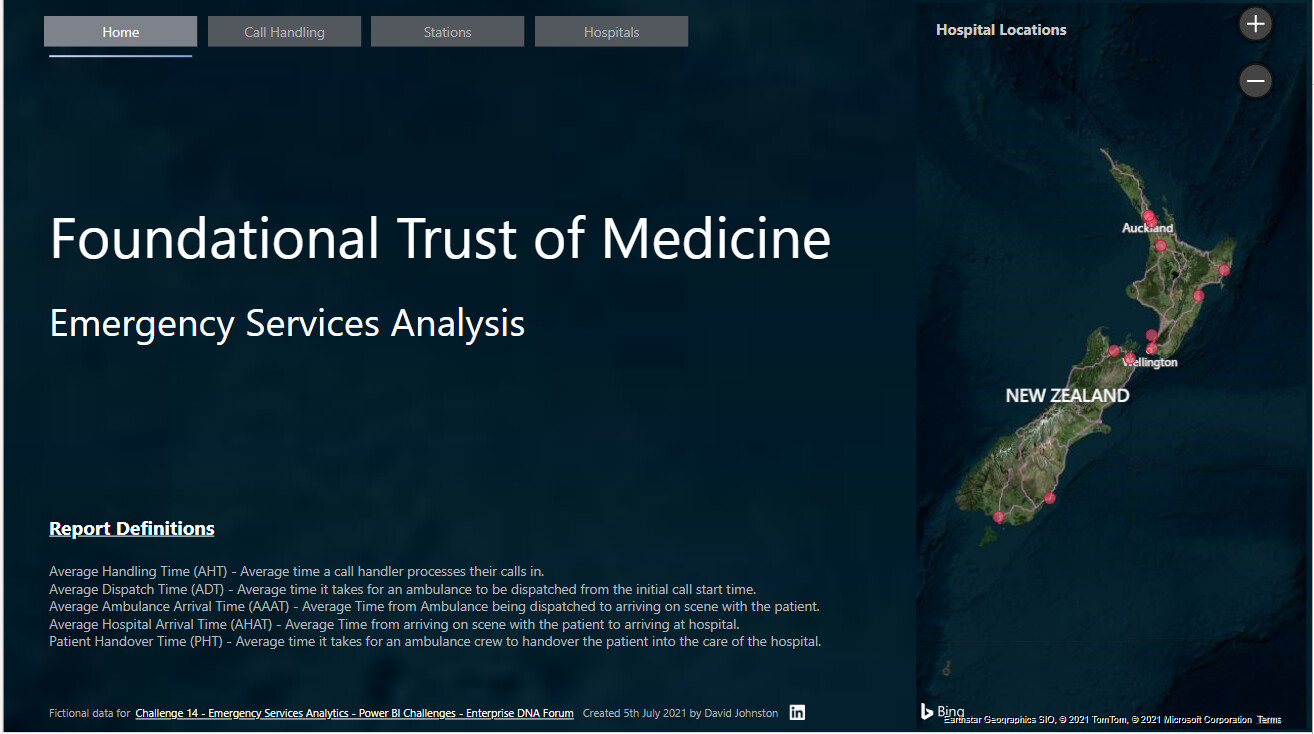
Mudassir’s front page gave me inspiration for my navigation in my own report. I also used it to introduce the key definitions in my report such as AHT & AAAT etc. Added a map onto my front page with a minor tooltip element, I had wanted to improve the tooltip in terms of looks & additional info but I ran out of time.

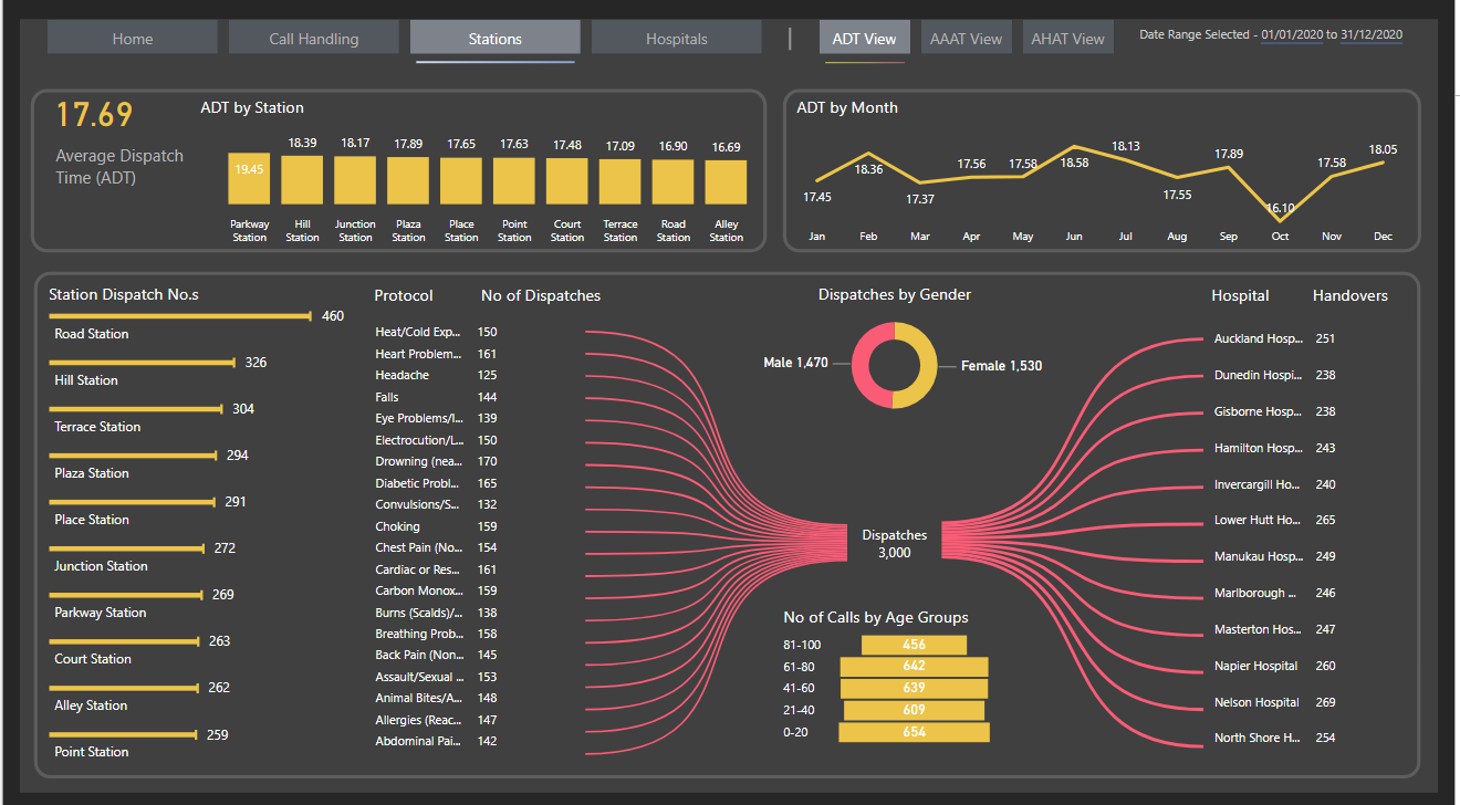
Really love the visuals with the Hammerhead Graph/Header Option (they are the thin line bar graphs at the bottom of the picture below, great for categories on your axis with long names. I also “borrowed” the yellow & pink colours for my report

Date Table

I created a single data column in the Call Timings table by extracting date only from the date/time field of when a call was received.

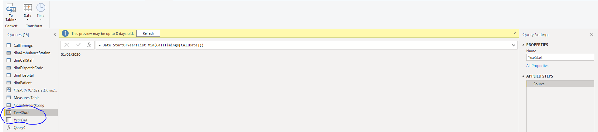
I then used the techniques that @Melissa has demonstrated for creating dynamic date tables in conjunction with her awesome Date Table. Created separate Min & Max queries in a blank query
image
image

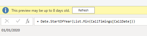
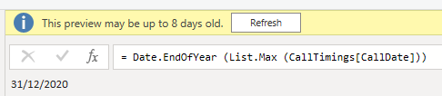
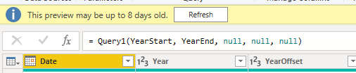
And then use these in the Date Table function to create my date table. I realise the data range in this challenge was only 1 year but I wanted to practice this technique so it becomes second nature and I also wanted to display good technique “under the hood” too.

image

Setting Up A Dynamic Startdate And Enddate For Power Query Date Tables - Query Editor Tutorial (enterprisedna.co)

Power Query

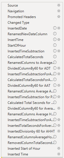
As much as possible I’d rename the steps and put in some commentary around my steps

Background

Created my background in PowerPoint and imported it to my report.

Navigation

Tried to make my navigation obvious but subtle, so by having it at the top of the page I’m introducing it to the report reader/user straight away. Reading from left to right, using a different colour button and a thin bar with some colour gradient underneath the “active” page button I hope I achieved this.

I added in the link to the EDNA Challange as a footer, a small Linkedin icon which the user can click to connect with me on Linkedin, the icon will take you to my profile. My inspiration behind this footer on my page came from @datazoe

My page navigation was consistent so kept the buttons, their position, size & theme the same across the report.

Bookmarks & Toggles

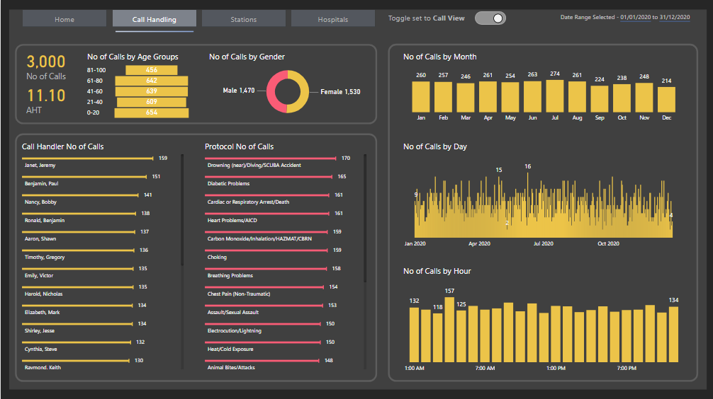
I’d never created a Toggle/Switch button before so I thought this was the perfect opportunity to try and use one while teaching myself something, picked it up from Reid Havens video. This allowed me to have one page for Call Handling to show No of Calls and AHT (Average Handling Time) which are both very important metrics, it also allowed me not to “cramp” the page by trying to jam too much information onto one page. I’ve learnt that while it’s great to cram lots of stuff onto a page, it can lead to “cognitive overload”…TOO MUCH FOR THE EYES…so I try and give my visuals a bit of space and try and tell a story from Top left down to bottom right (if I can)

Creating Sliding Toggles With Native Buttons in Power BI — Havens Consulting

Design Thinking

I wanted to use my different visuals to allow the user to slice & dice the data, also tried to keep my visuals consistent across the pages. The Bowtie custom visual was fun to use and was a great way of showing relationships between Dispatches & Hospital Handovers. It made a nice visual impact on the page too. One drawback is that the ability to sort by ascending & descending did not seem to work on the Bowtie chart…either that it was user error on my part.

As I had several different types of metrics I wanted to show I used some on page bookmarks to allow more data to be viewed. I also had a date range selected Smart Narrative in the top right of each page to dynamically display the date ranges being shown once a user starts slicing & dicing the data with the visuals.

image

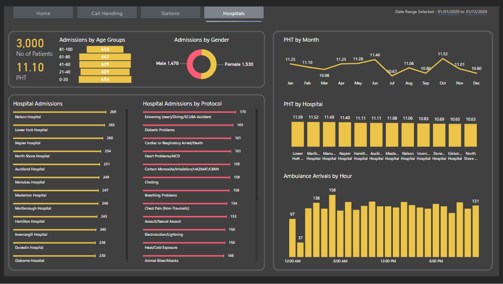
I tried to keep “key categories” visuals on each page so the user could slice and dice the data so Age Range (which I put into bins of 20 year groups) & Gender and delve into the impact or non impact these have on the variation different stages of medical emergency treatment.

Measures

Measures were really simple, just counts and averages.

Thanks

David

8 Likes

@DavieJoe,

Outstanding writeup. Thanks very much for taking the time to share your thoughts and insights in detail. I think these entrant writeups are one of the things that distinguishes the EDNA Data Challenges from the others, and provide a huge amount of long-term value and learning for members and non-members alike.

  • Brian
5 Likes

Happy to do this @BrianJ, I’ve learnt from so many of the other write ups, in this challenge and previous. If anyone picks up anything valuable from my submission or write up then I’ll be delighted.

David

4 Likes

@DavieJoe
Awesome report brother.
I really love how you have laid out your report giving summarized information on the front page. Also the map on the front page really stands out in this report.

Talking about my favorite part - Slicers. Great job using visualizations as slicers especially the donut chart just on top of bowtie chart looks both elegant & gives the user the added benefit of filtering the report at the same time.

Honestly, I really love the Hammerhead bar chart as it doesn’t occupy a lot of real estate & looks neat & compact. Moreover, you tried to limit the # of colors in your report which is a great challenge & you did it perfectly.

Offer : If you need any help in setting up the theme or deciding on a story, I would be very happy to help.

Great job again.
See you in the next challenge.

3 Likes

Hey @MudassirAli I really appreciate the kind words & feedback. Adding the doughnut chart on top of the Bowtie chart was a late moment of inspiration.

I’ll definitely take you up on your kind offer of setting up a theme or deciding on a story.

David

2 Likes

DJ,

I continue to look at your report.

With repeated viewings, I’m even more impressed by…

  1. Your decision to view Calls, Stations and Hospitals separately.
  2. The Bowtie visual is inspired. It allows the user to Stations to Hospitals effortlessly, and vice-versa.

The entire report is something to aspire to.

John Giles

4 Likes

Morning John, I’m humbled by your kind words, really pleased you like my effort.

I worked for The London Ambulance Service for a couple of years and it made sense to me to split out Calls, Ambulance Dispatches & Hospital Handovers.

David

2 Likes

Fabulous report once again and like how many innovative features you’ve built into it. Love the map visual not many others actually went down this path as well and I think you executed on it the best here particularly how you embedded the map visual into your background which can sometimes actually be quite difficult.

Also like the color theme and the grid layout that you’ve used throughout your pages with all of your detail. Also really like the innovative bar charts that you’ve used. I haven’t actually seen those before so I need to find out how to use those also. Maybe it’s something simple but I’m missing it. Also love some of the other innovative features you’ve built in around visualizations particularly on the dispatches visual.

This highly commendable work here and one of the best reports I’ve seen in a few challenges. Definitely up there and really commend you on all of the creative work that you have built into this.

Can’t wait to see more in the near future to see what you can come up with and also different ways that you challenge yourself going forward.

Sam

2 Likes

Thanks @sam.mckay really appreciate the feedback, delighted to have finally taken part in a challenge, was quite nervous about it so breaking through that barrier was pleasing.

With regards to the map visual, I took a picture of part of the ocean space on the map visual and stretched it out to fill a PowerPoint page and imported it as my front cover background, helped my map blend in.

The Bar Charts were also used by @MudassirAli in his amazing report for challenge 10. It’s a custom visual and you set the bar type to Hammerhead (it’s even got a cool name). Link is below, it does have some issues when cross filtering down to smaller numbers as it can get a bit “weird”.

https://appsource.microsoft.com/en-us/product/power-bi-visuals/wa104381230?tab=overview

2 Likes