INTRO
Hello everyone! Another month another interesting challenge proposed by Entreprise DNA !
I found this topic really interesting, useful and challenging. It is an example of the potential impact of data analysis in real life.
I found this round challenging because I could not find in my research to much information online concerning the metrics to follow and felt somehow a bit unprepared. There were many requirements in terms of data analysis, and the data was so well anonymized that it was difficult to draw conclusions & propose recommendations.
My inspiration comes usually after the data exploration. This round took me off once again from my comfort zone.
DATA STORY & USER JOURNEY
After some thought I decided to create a main overview page that will resume the main information. I decided I will analyze the performance of the call staff, ambulance & hospitals all together. I wanted to provide information about the whole process.
I wanted the user to understand the big picture and explore the report by using interactions between the different visual elements on the page.
I created an exploratory report that will help the user find insights and also help the user ask new questions. I wanted also to give the possibility to drill down and see more details.
The simplified mind process is the following:
Overview ==> Interactions for more insights & limited but meaningful filters==> Drill down to more details ==> Benchmark between hospitals.
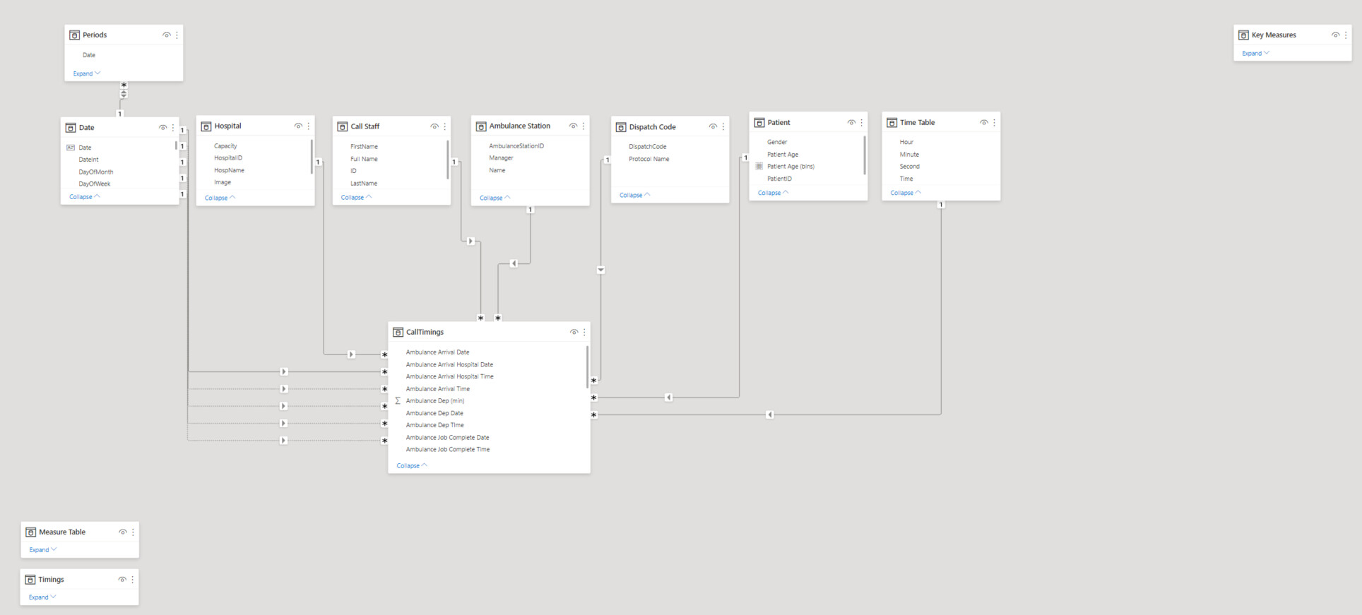
DATA MODEL
Time Table - I used the same TimeTable as the one available in POTW #10 organized by @haroonali1000 . I knew I will need it one day, so I saved it in my Analyst Hub documents.
Time Table =
VAR HourTable = SELECTCOLUMNS(GENERATESERIES((0), (23)), "Hour", [Value])
VAR MinuteTable = SELECTCOLUMNS(GENERATESERIES((0), (59)), "Minute", [Value])
VAR SecondsTable = SELECTCOLUMNS(GENERATESERIES((0), (59)), "Second", [Value])

 RETURN

ADDCOLUMNS(

CROSSJOIN(HourTable, MinuteTable, SecondsTable),

"Time", TIME([Hour], [Minute], [Second])

)
Measure Table -
I created a Measure Table in order to optimize the information shown on the page. It improves the UX and allows the user to be more engaged with the report.
Call Timings I calculated inside PQ all timings minutes needed for my report.
DATA VIZ
Overview

I was inspired by the supporting tables usually used for P&L, CashFlow etc but wanted to build something easier with Tabular Editor. My main idea was to have a table that summarizes the main KPIs.
I placed this Calculation group Table on the top Left for maximum visibility on page.
What can we see?
- Total number of calls and the total number of call staff available for the selected time frame
- % of Operators in charge of those calls
- The average length of the calls
- I created a chronological split of the intervention:
- Average Time to departure in minutes. I rounded to whole minutes, (19,77 for ex is less confusing than 20)
- I pushed forward the information concerning the calls where the ambulance is mobilized before the end of call. I think it was an interesting insight. I also calculated the numbers in %
- Avg trip to patient is another important kpi I added in my summarized table
- Avg trip to Patient is both the time needed to mobilize the ambulance and arrive to patient. This KPI is very important. I completed with information related to the longest arrive to patient and shortest arrive to patient to show the spread and make the user decide if this is acceptable or not. If it doesn t look right, the end user will have the possibility to drill down inside the data for more information.
- Avg Patient to Hospital, Total time mobilized for the ambulance and handover time ends up the intervention journey.
Now that the user sees the average numbers, maybe they will want to see how this information varies for each Protocol and maybe see more details. For this reason I added a matrix right after the Summarized Calculation Group.
Through background color (the same blue color under Calculation group and Matrix) I indicate to the user that these two visuals should be considered together).
The Overview Page also contains in the right side of the screen 2 visuals. ( 2 Clustered Column Charts) These visuals are showing the split by gender & age group and also shows their evolution by quarter.
Last but not least, I used the measure table as filter. The user will choose the information they want to follow with the split by protocol, age, gender, evolution & still have the summarize KPIs available on the screen.
The filters available give more flexibility to the user to choose a specific time frame , month, working day or not, ambulance station or staff position.
Through the selected interactions and only several visual elements on the page I answer to almost all the requested analysis for this challenge. For the few requests that are not covered (related to hospital perf) I created a Benchmark page.
Benchmark

Here, I tried to be consistent with the Overview page and kept the dynamic menu, and the measure table filter.
For the visual elements I chose line chart small multiples.
The red line shows the selected timings for each hospital. The blue line shows the lowest monthly hospital average. There is a cond formatting for the background showing the hospitals that have the worst timings for the selected metric.
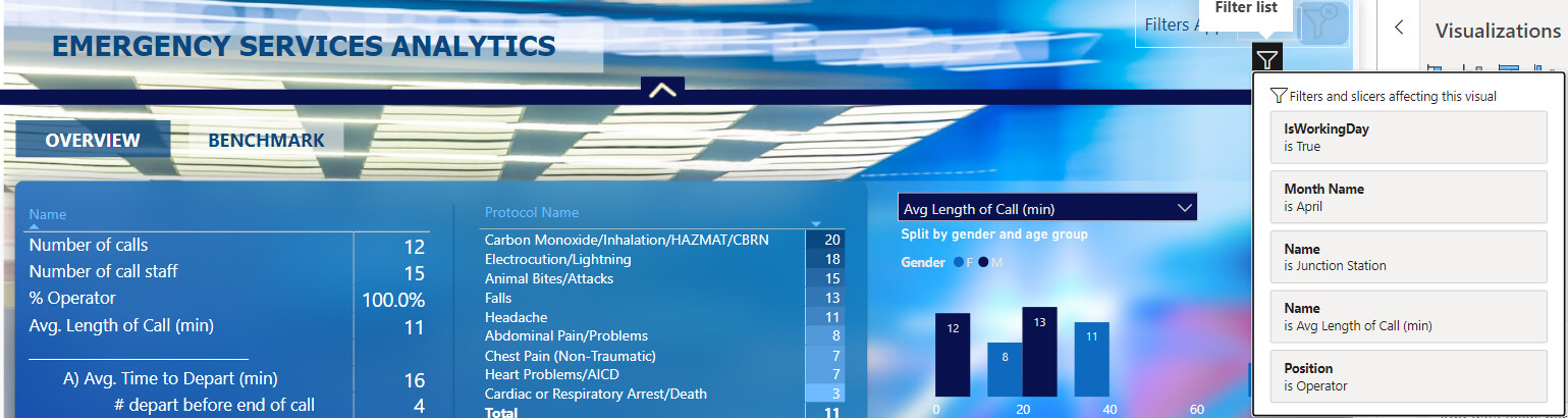
Special UX/UI experiment
I try in every challenge to test new techniques to improve the user experience. I created for this report a new dynamic navigation.

When the user selects multiple filters and closes the dynamic menu he/she needs to be aware of the filters being activated. This time I did not want to overcomplicate my screen, I did not want to dedicate to much space for this. I therefore created a button and a card that will count the number of activated filters and with the help of visual header (Filter Icon) give the possibility to the end user to see the filters without opening the filters menu. If there is no filter selected, no information will be displayed
I also created a reset all filters directly in the page.
I think that this technique works very well.
See you next time,
Best regards,
Alex Badiu