Here’s Luca’s entry for Power BI Challenge 10.
Here’s how Luca described it:
The Brief
I am working with a manufacturer who receive and order a number of raw materials which are then used in production or for general maintenance.
Currently there is no procurement system in place and no way for the companies to validate which suppliers are providing us with quality goods and which are not.
There is also no consistency between different plants and the vendors we are purchasing from.
The programme management team have identified the need to centralise and understand supplier quality as a priority.
There has been a major effort in recent weeks to consolidate the data.
The team have now managed to gather data from across the plants with information around the material, defect and vendor.
They have also managed to get the number of defected materials and also provided a value for the minutes of downtime caused by the defected material.
The management team are now looking for some help to visualise and extrapolate the findings from this data.
Enterprise Manufacturers Ltd are slowly adopting Power Bi within their organisation as such one of the analysts has made an effort at starting to model the data.
Given the importance of the project and urgency management have decided to enlist the experts to get this over the line.
Some key questions the business want answering are;
Which vendors/plants are causing the greatest defect quantity?
Which vendors/plants are causing the greatest downtime?
Is there a particular combination of material and vendor that perform poorly?
Is there a particular combination of Vendor and plant that performs poorly?
How does the same vendor and material perform across different plants?The business are hoping that you can help answer these questions and maybe even provide some insights that they may have overlooked.
Introduction
Is understood that the data provided is the first-time extraction from the ERP system, and that may need to be optimized for future analysis that may embrace more controlling parameters.
The tool developed in Power BI, will enable the Senior Management to perform the required analysis and take actions to improve the areas felt that need improvement.
The tools have been developed keep in mind to maintain the higher possible drill down capability, in order to identify correlation that were not defined in the original questions by the Senior Management.
During the development of the tool the following assumption and constrain have been identified:
Data Structure – the data have been provided in tabular format, with a data table (dimension)
and several facts (attributes). However, the dimension table is felt that have been manipulated. The various field relating to the facts are reporting the facts values rather than the Index as a database structure will require.
Unless the structure of the ERP system has to be revised, is believed that the user that extract the information, already lookup the values for the facts (typical process when working in MsExcel). With this structure the linking to the facts table will not bring any additional advantage, with one exception, for the Plant location, that will be introduced later on; Plant Location – The plants are all located in the United States. Been confirmed with the company. Some of the plant location, such as Florence may have several locations worldwide.
In order to identify in unique way, the plants location and been able to use them in a map the
following amendment have been made to the “Plant” table, prior the import of the data into
Power BI. Added four columns for: Country, State, Longitude and Latitude. The Longitude and
Latitude been extracted from Google Map web site have been for the geo localization of the plant into the map. The latitude and longitude format is the one with negative longitude and both in decimal; Performance Definition – The Client did not define the “Performance” and was not available for further questioning. The Data set provide two parameters on which the Client required specific analysis (Quantity of Defect, Downtime). It has been assumed that the Performance is the ration between the Downtime and the Defective Quantity. This assumption to be validate and if necessary, amend the DAX parameter calculation accordingly.
As mentioned, the data set provided contain the following dimensions:
Quantity Defect – Representative of the quantity of material found defective, that impacted or had to be rejected; and
Downtime (min) – Representative of time on which the manufacturing process was hold due to the defect or the lack of the raw material that was rejected. Assumed the plant logistic system is working on a “Just in Time” approach.
During the development of the analysis has been felt that the following dimensions would have bring a valuable contribution to the Senior Management analysis and decision-making process: Quantity Delivered;
Manufacturing process time – even if this parameter may be difficult to determine as several
material may contribute to it. Therefore, a cross relation to the various manufacturing
processes and the materials used need to be studied and controlled;
Cost of the Downtime;
Manufacturing process cost – see the discussion on the “manufacturing process time”.With those further dimensions the analysis can be enhanced with insight such as:
Ratio been delivered and defective quantities. 5.000 unit of defective material have a
difference incidence if the overall quantity delivered was 6.000 or 600.000 units;
Ratio between process time and downtime;
Ratio between cost of downtime and overall cost of the manufacturing process; and
Similar analysis.A quick note on the interpretation of the “Defect Type” dimension.
The interpretation of this dimension is:
Rejected: the material has severe defects that could not introduced into the manufacturing process and have to be sent back to the supplier. The lack of material, assuming the manufacturing process work on material arrive just in time, impacted the overall process flow (time to complete the finished product from the raw material) of the downtime quantity;
Impact: the production line has to stop due to the discovered defect and had a time impact on the overall completion of the manufacturing process (time to have the complete finish material from raw status); and
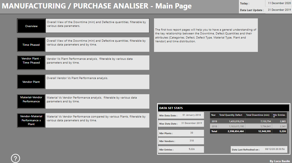
No Impact: even if the material was defective and the somewhere in the production line the process was hold of the downtime quantity (in minutes) due to other parallel processes that are driving the final production time, they did not have an impact on the overall completion of the manufacturing process.The tool developed in Power BI, is articulated over 1+6 pages, the first page is the “Main Page” from which with a button approach can access the other 6 pages, each of which present a parametric, drill down analysis option for each of the business key requests.
In the “Main Page” can found also few high-level statistics on the data set provided.
Let’s now briefly introduce each analysis page.
The “Main Page” is organized in 3 areas:
1- Headers, reporting also the current date and the latest data of the data set loaded into the tool;
2- Selection zone, from which can navigate to the various analysis page, clicking on the black buttons;
3- General statistics on the data set and the last date when the data was refreshed; and
4- Help on the use of the page, showing the brief at the basis of the tool development.Overview Analysis
From the “Main Page”, and the “Selection Zone” button, can access the “Overview” analysis page.
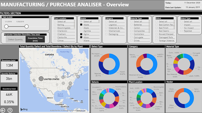
The “Overview” page is organized in 6 areas:
1- Headers, reporting also the current date and the latest data of the data set loaded into the tool;
2- Filters zone. Filters does include a time filter to narrow specific period of analysis and the analysis parameter to be displayed in the various visualization of the page (Defect Quantity or Downtime Time). Those filters are responsive on all visualization of this page;
3- Tiles reporting the overall Defect quantity and the amount (defect quantity or downtown) based on the applied filters and its incidence in percentage against the overall amount;
4- Geospatial localization of the Plants. Plants been locate using the longitude and latitude
attributes. The location markers (circle) size is function of the downtime (relative at the selection done) and color grading to the defective quantities (relative at the selection done) with darker
color for higher quantities;
5- Donut Chart visualization, of the selected parameter and based on the applied filter of the page on the six dimensions. This visualization helps to identify the higher contribution among the various dimension based on the applied filtering; and
6- Navigation button to return at “Main Page”.Selecting the “Defect Quantity” or “Downtime (min)” from the “Parameter Selection” filter the various visual will be updated accordingly, see below snapshot.
Time Phased Analysis
From the “Main Page”, and the “Selection Zone” button, can access the “Time Phased” analysis page.
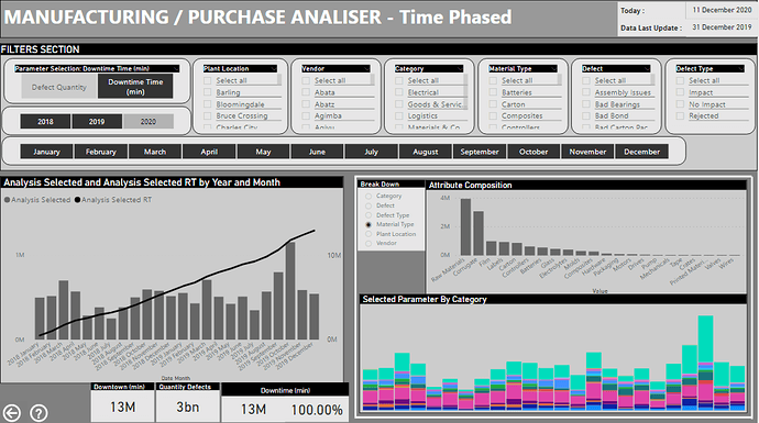
The “Time Phased” page is organized in 6 areas:
1- Headers, reporting also the current date and the latest data of the data set loaded into the tool;
2- Filters zone. Filters does include a time filter to narrow specific period of analysis and the analysis parameter to be displayed in the various visualization of the page (Defect Quantity or Downtime Time). Those filters are responsive on all visualization of this page;
3- Combined histogram on monthly value of the selected parameter (Defective quantity od
Downtown) and the cumulative line curve;
4- Histogram time phased view of the selected parameter, breakdown by the chosen dimension as well as the parameter breakdown by dimension values;
5- Tiles reporting the overall Defect quantity and the amount (defect quantity or downtown) based on the applied filters and its incidence in percentage against the overall amount;
6- Navigation button to return at “Main Page”; and
7- Help button to open a page with a brief explanation of the “Time Phased” page.Selecting the “Defect Quantity” or “Downtime (min)” from the “Parameter Selection” filter the various visual will be updated accordingly, as well as choosing any filter combination from the Filter Section of the page.
Time phased Vendor Vs Plant Analysis
From the “Main Page”, and the “Selection Zone” button, can access the “Vendor Plant - Time Phased” analysis page.
The “Time Phased Vendor Vs Plant” page is organized in 7 areas:
1- Headers, reporting also the current date and the latest data of the data set loaded into the tool;
2- Filters zone. Filters does include a time filter to narrow specific period of analysis and the analysis parameter to be displayed in the various visualization of the page (Defect Quantity or Downtime Time). Those filters are responsive on all visualization of this page;
3- Tables showing for Downtime and Defective Quantity the Ranking and the relative quantities, based on the selection within the filter section of the page;
4- Cross matrix, with plant in rows and Vendor in columns and reporting the relative ranking of downtime and defective parameters;
5- Tiles reporting the overall Defect Quantity and Downtime compared with the amount for the applied filters;
6- Navigation button to return at “Main Page”; and
7- Help button to open a page with a brief explanation of the “Time Phased Vendor Vs Plant” page.Selecting the time phase of the analysis (Start and Finish) date will filter the values between those dates and visuals updated accordingly, as well as choosing any filter combination from the Filter Section of the page.
To be noted that if a selection is made on the section 3, for example of the top three Vendor – Plant downtime the defective quantity table for the selected combination show the ranking on the Defective Quantity and the cross matrix in section 4 is updated as well with the selected combination showing the separate relative ranking for the two parameters.
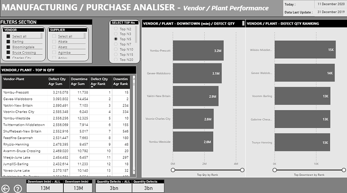
Vendor Vs Plant Analysis
From the “Main Page”, and the “Selection Zone” button, can access the “Vendor” analysis page.
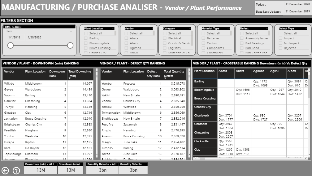
The “Vendor Vs Plant Performance” page is organized in 8 areas:
1- Headers, reporting also the current date and the latest data of the data set loaded into the tool;
2- Filters zone. This section does include only Vendor and Supplier dimension1. Those filters are responsive on all visualization of this page;
3- Tables showing for combination of Vendor and Plant the relative amount of downtime and
defective quantities and their relative ranking. This table does show all combination of Vendor and Plant for which data have been provided in the data set;
4- Top N filter to be applied for the section 5 (top N chart representation). There is also the option for all values (implemented reefing to a value of 1E+28);
5- Chart showing the Top N, with N selected in section 4, of downtime and defective quantities for the Vendor – Plant combination;
6- Tiles reporting the overall Defect Quantity and Downtime compared with the amount for the applied filters;
7- Navigation button to return at “Main Page”; and
8- Help button to open a page with a brief explanation of the “Vendor Vs Plant Performance” page.Material vs Vendor Performance Analysis
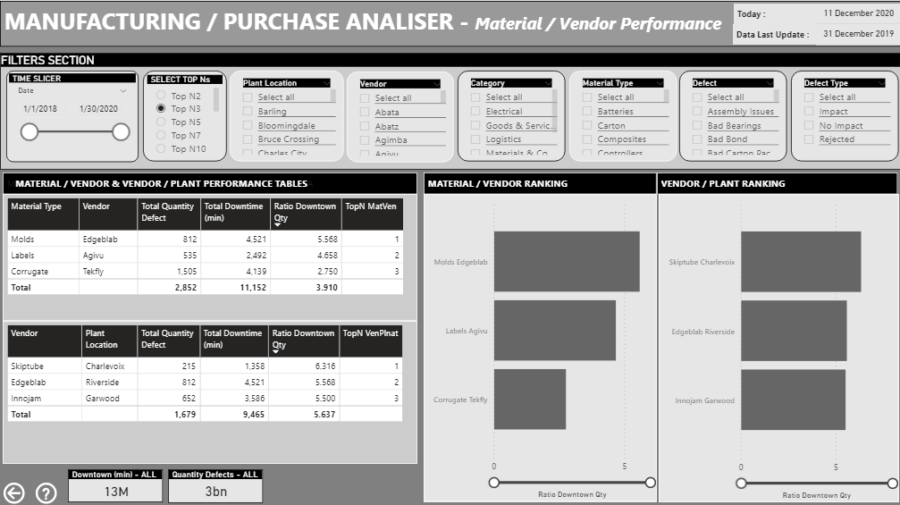
From the “Main Page”, and the “Selection Zone” button, can access the “Vendor” analysis page.
The Client did not define the “Performance” and was not available for further questioning. The Data set provide two parameters on which the Client required specific analysis (Quantity of Defect, Downtime).
It has been assumed that the Performance is the ration between the Downtime and the Defective Quantity.
This assumption to be validate and if necessary, amend the DAX parameter calculation accordingly.
The “Vendor Vs Plant Performance” page is organized in 7 areas:
1- Headers, reporting also the current date and the latest data of the data set loaded into the tool;
2- Filters zone. Filters does include a time filter to narrow specific period of analysis and the analysis parameter to be displayed in the various visualization of the page. Those filters are responsive on all visualization of this page;
3- Tables showing respectively the aggregate defective quantities, downtime and calculating the performance2 and ranking the Top N, for the Material Type Vs Vendor and Vendor Vs Plant combinations;
4- Chart showing the Top N selected combination of Material Type Vs Vendor and Vendor Vs Plant;
5- Tiles reporting the overall Defect Quantity and Downtime;
6- Navigation button to return at “Main Page”; and
7- Help button to open a page with a brief explanation of the “Material Vs Vendor” page.Note that the filtering on a dimension that is part of the cross analysis (Material Type-Vendor or Vendor-Plant) will blank the respective table.
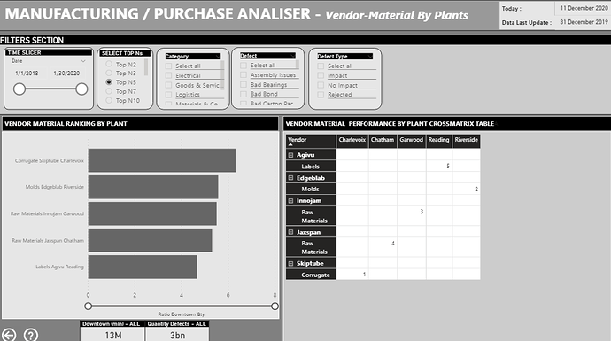
Vendor Vs Material Performance Analysis by Plant
From the “Main Page”, and the “Selection Zone” button, can access the “Vendor-Material Performance x Plant” analysis page.
The “Vendor Vs Material Performance by Plant” page is organized in 7 areas:
1- Headers, reporting also the current date and the latest data of the data set loaded into the tool;
2- Filters zone. Filters does include a time filter to narrow specific period of analysis and the analysis parameter to be displayed in the various visualization of the page. Those filters are responsive on all visualization of this page;
3- Chart showing the Vendor – Material Type and Plant combination ranking based on the
performance factor as defined above;
4- Cross matrix showing in row Vendor and Material Type against Plant in Column with the relative ranking;
5- Tiles reporting the overall Defect Quantity and Downtime;
6- Navigation button to return at “Main Page”; and
7- Help button to open a page with a brief explanation of the “Vendor Vs Material Performance by Plant” page.
