All,
Below please find my submission for Data Challenge #4. I took quite a different tack on this one, so hopefully it provides some interesting food for thought. My approach has four major components:
-
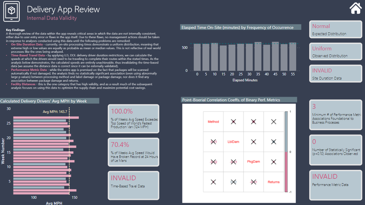
Data Validity - I started with a detailed statistical analysis examining whether the data in the app meet basic thresholds of reliability and validity (spoiler alert: 75% NO), and thus whether they could/should serve as the basis for management decision-making.
-
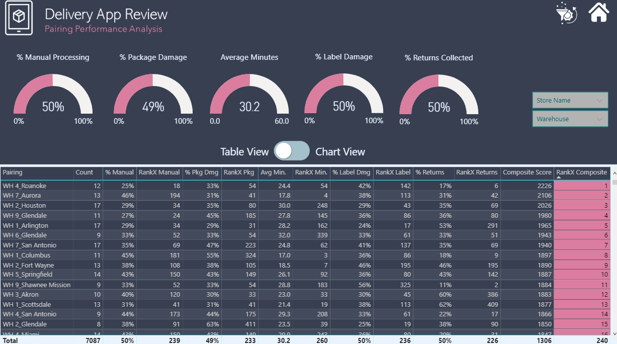
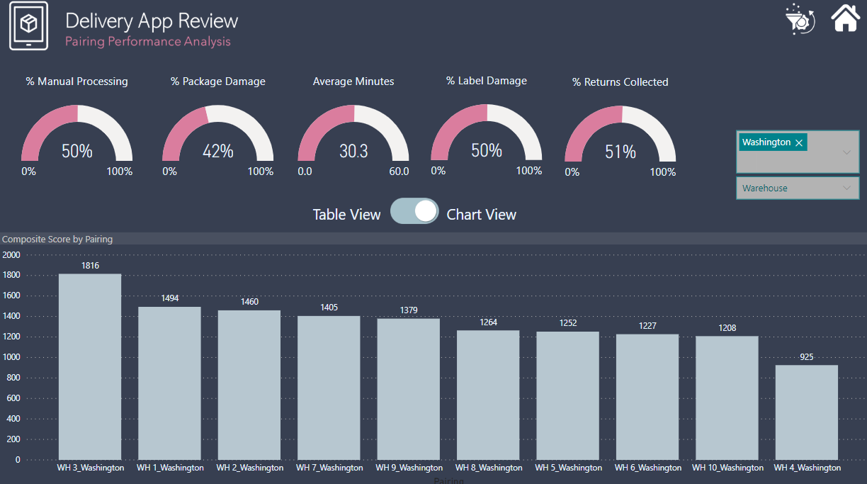
Performance Analysis - Despite the concerns generated in 1. above regarding the validity of the performance metric data (e.g., label damage %, package damage %, return %, etc.), I wanted to provide a proof of concept for how a dynamic, composite metric based on combined ranking across the five performance metrics could be done.
-
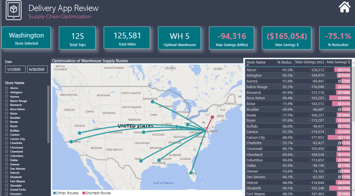
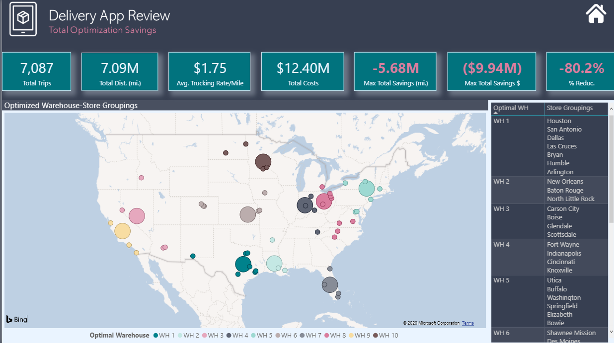
Supply Chain Optimization - This is really what I view as the focal point of my analysis. Seeing that all stores are served by all 10 warehouses seemed grossly inefficient to me, so I wanted to see if with the addition of latitude-longitude data for each city and warehouse whether we could use the data in the app to analyze the supply chain and create efficiencies by rerouting supply chains through more proximate warehouse-store pairings.
-
Cost Reduction - Once the supply chain analysis was complete, it was a simple matter to add a single parameter (current US trucking cost per mile) to convert the distance savings realized through the supply chain optimization to monetary savings.
There are definitely some major simplifying assumptions embedded above that would be explored more fully in a real-world analysis (for example, I’m assuming that each store could be fully serviced by its most proximate warehouse, and thus the distance and cost savings are framed as “maximum potential savings”, given that real-life considerations probably would prevent complete implementation of such a simple decision rule).
If there’s interest, I can definitely do a more detailed post on the specific analyses summarized above. Here are my screenshots along with a published a web link if you want to play with the live report. One other note, on the data validity analysis, my R script runs fine locally but throws an error when I publish it to the service. Thus for the live report, I replaced the dynamic chart with an image. For those interested I have attached a copy of the R script to this post.
Very interested to hear your feedback.
Finally, thanks to my friends @paul and @JarrettM, the first for his generous guidance and phenomenal forum posts on all things GIS, without which I couldn’t have done #3 or #4 above, and the latter for the entertaining and enlightening Skype chats while we were both up late working on our entries.
- Brian

Final R Script – Brian Julius – Data Challenge #4.R (1.4 KB)