Power BI Accelerator Week #5 is Live!

Thank you, Steven. Much appreciated.

Hello Brian:

Here is my second submission for Accelerator 5.

I decided to pass on the “bonus points” section. I thought my time would be better spent addressing Challenge 16.

A few comments:

  1. Thanks to stevens for his advice regarding:
    a. grouping the Genre Breakdown donut and card so the card won’t disappear when the donut chart is clicked.
    b. pointing out an error in my measure that calculated the Budget Moving Average. I’ve used MA’s
    several times, but managed to butcher the expression in this instance.

  2. Regarding previous and next years lines to highlight the highest average budget: I wrote the
    expression fairly quickly. I had trouble devising a means of displaying the lines themselves. I finally looked the Analytics section in the Visualization pane. The Axis Constraint functionality looked interesting, so I did some research and figured it out. However, I couldn’t come up with a way to shade the area between the lines.

I think it bears repeating, the Accelerators are a terrific means to learn practical applications of what you learn in online tutorials.

Regards,

John Giles
Enterprise DNA Power BI Accelerator – Week #5 John Giles.pbix (17.1 MB)

The Review for Accelerator 5 will be tomorrow afternoon at 5:00 PM(eastern US time)?

Will we receive a notice and link?

Thanks.

John Giles

All,

My apologies – we’re going to need to bump the Live Solution Session for Accelerator Week #5 out another week. @sam.mckay has a very busy training week this week, and an unresolvable conflict with our planned Wednesday time. I really don’t want to move forward without him, especially on this topic where I know he and I have somewhat different but equally valid approaches and I think you will benefit from seeing both of them.

I’ll work with the Enterprise DNA team tonight to get the registration link up for the session next week. In some respects this may work out well, because it provides even more of a clear path for those working on Data Challenge #16. I also have a number of questions above to respond to that I will try to get to later tonight, tomorrow at the latest.

As always, thanks for your participation and also for your insight on the recent survey. I will talk about the results at the solution session, but they’ve been very helpful in gauging the proper time and difficulty of the problem sets.

More to follow soon…

– Brian

1 Like

Thanks, Brian.

Apropos of nothing, but are you a native of Baltimore?

My brother-in-law is a native of the Charm City, and their accent is similar to yours.

Regards,

John Giles

@JohnG ,

Wow – good ear! I’ve lived in the DC/Baltimore area for the past 31 years, so to the extent I’ve got a noticeable accent, that would be the one…

– Brian

All,

Per my message last night, the registration link for the Power BI Week #5 rescheduled Live Solution Session (Wed, Sept 29 at 5pm EST) is now available at:

Hope to see you there, but as always, if you can’t make it or if the time zone difference doesn’t work for you we will record the session and post it to the portal site soon after we conclude.

  • Brian

All,

Recording of Accelerator #5 live solution session and @sam.mckay’s and my solution files, along with the original problem set file and copies of my slides from the live event are posted here:

Really had a good time on the live event with Sam exploring the very different paths we took to getting to our respective solutions on this problem set.

As always, thanks very much for participating. We will be back late next week with Accelerator Week #6. After our three-week DAX deep dive, we are going to take a right turn into visualization and focus on how to build a great user experience with buttons, bookmarks, page navigation, drillthrough and tooltips.

Microsoft gifted us with some amazing new button capabilities in the September 2021 PBI update, so there will be lots to discuss.

See you then…

– Brian

All,

I had planned to have the Accelerator Week #6 problem set out by the end of this week. However, I’ve been dealing with a family emergency that has required a lot of time and attention, and set my schedule back a bit. Expect to see it toward the middle or end of next week.

Sorry for the delay.

– Brian

Hi @BrianJ ,

Don’t worry about it, family is the most important and you should be worrying about that. We all understand that.

Thanks for lets us know about Accelerator Week #6 problem that its going to late.

Take care of your family and yourself.
All the best.
Keith

2 Likes

Thanks,@Keith. Really appreciate that.

Have a great weekend.

  • Brian
1 Like

Hi @BrianJ

I’m playing catch up. Hope you’re still answering questions for this challenge.

I’ve managed to create all the charts for the non bonus section except how to conditionally format the highlighted box in the Moving Average chart and the max and min bars in the YOY% chart.

I can’t work out how to bring up any conditional formatting box.

I’ll keep trying but if you see this, some hints would be much appreciated.

Thanks

Here is your hint for conditional formatting - these settings are found in Data Colors section of the formatting pane:

click on the fx button next to the color bar to set conditional formatting options.

image
you will get options for:
Color Scale - colors shading from low to high values
Rules - if value is greater than X then this color
Field Value - writing a DAX formula that returns a color based on a condition (personal favorite)

Hi @Heather

Thanks. I’m trying to find where Brian set his conditional formatting but just can’t seem to find it.

My guess was it was below for the ‘YoY% - Total Worldwide Profit’ but there’s nothing there.

Did he set each year’s colour bar manually?

@KieftyKids ,
looking at @BrianJ 's solution file, he has a conditional format under Data Colors, using a measure under field value.

image

this measure tells the visual what color to apply, based on the conditions set in the measure, with different color values for Min, Max and above or below 0 values.

Thank you!

1 Like

@KieftyKids ,

Yup, @Heather nailed it. @JarrettM was the one who initially got me using Field Value as the way to do conditional formatting, and I would say now that 99% of the time that’s what I use. It’s great because once you set the field relationship, you can tinker with named colors and hex codes till you get the look just right without ever going back into the conditional Formatting menu. You just change your DAX, hit enter and it automatically updates.

– Brian

1 Like

What a neat trick. Definitely adding this to the toolbox.

Thanks @BrianJ

@KieftyKids ,

If you like that, check this out - many users know that instead of hex codes in your DAX measures that feed into conditional formatting field values, you can also use color names - e.g., “Red”, “Yellow”, “Black”, etc.

But what is not commonly know is that you can also use “Papaya Whip”, “Moccasin”, “Medium Violet Red”, “Medium Spring Green”, etc. Here’s a sample:

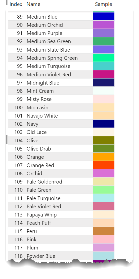
And attached is a PBIX file containing nearly 150 color names that work in Power BI.

Pretty cool…

  • Brian

Named Colors in Power BI.pbix (24.7 KB)

3 Likes

another nice option with conditional formatting using a measure is that this is currently the only way to set a transparent color.

So if you want to completely hide visual’s background based on a condition, you can just add a couple of zeros to the end of the HEX code to make a color transparent.

Example =
VAR _color = “#4D4DFF
VAR _transparent = “#00000000
RETURN
IF [Value] > 50, _color, _transparent)

1 Like