My pleasure!
@stevens clearly a “go bold or go home” guy when it comes to color theme. Love it!
Keep 'em coming!
- Brian
1 Like
Nice PBIX @stevens
1 Like
I’d like some clarity, please.
Regarding the '“Top5” products, these would be the 5 top sellers over the period 2018-2020, correct? And the matrix would show the sales of the top 5 for each Quarter from 2018-2020, correct? Implicit here is the notion that any of these top 5 products may not have been the top 5 sellers in certain quarters. Correct?
Regards,
John Giles
1 Like
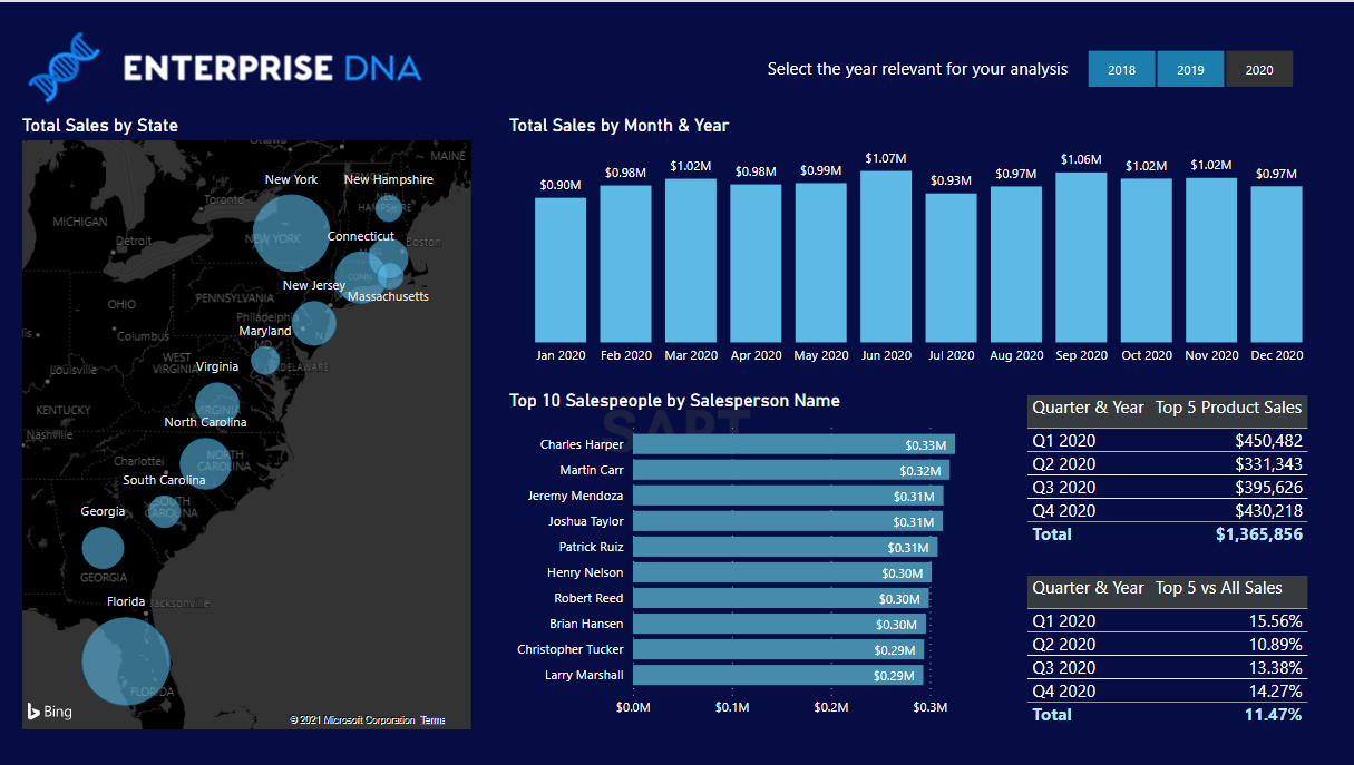
Here is my submission.
I’ve tried to find a way to display the color scheme I used in the map to group Sales Dollars by state as a legend. I couldn’t find one.
Power BI Accelerator -Week 1 Problem.pbix (8.6 MB)
This text will be blurred
2 Likes
John,
Good question. My intent was for the top five to be determined based on total number of sales. For the matrix, that would be guided by the slicer selection on year, so if no year was selected, the top five would be based on the full period 2018-2020. If a year was selected, the top five would be based on total number of sales that year.
So, yes you are correct that a top-five product might not be top-five in every quarter of the selected year(s).
– Brian
1 Like
@JohnG ,
Awesome job challenging yourself by taking the hard road on the Top 5/Top 10! The one thing I think you’ll want to revisit is your matrix calculation – Total Sales Quantity is not equal to Total Number of Sales.
With regard to adding a legend to a map in Power BI that doesn’t have that as an option, it’s definitely doable with a creative “cheat”. If you want to give that a go, here’s a couple of videos that should help:
- Brian
1 Like
thanks @DavieJoe 
1 Like
Hi Brian
OK. I’ve had a stab! Not sure if ‘enjoyed it’ is the word. I had to ‘think’! But I think I’m pleased with the result! Not sure if I post it or what?
2 Likes
I think the idea is to post your effort @Ericadyson come and join in the fun! 
This text will be blurred. OK. I think I’ve grasped what to do re posting my file so no-one can see it… but trust that you can!
Enterprise DNA Power BI Accelerator -Week 1 Problem EricaDyson.pbix (8.7 MB)
I wasn’t so keen on the map visual because it required extra clicks to get to the data. It would be more relevant I think if it were world sales and you wanted to see that visually. Just a thought.
3 Likes
Great! - thanks for jumping in and giving it a go.
There’s certainly no requirement for anyone to post (I think if Power BI Accelerator had a motto it would be “Do What Works for You”), but for those who are willing to do so, I think we can all learn from each other. In addition, I review every posted submission and if I see where someone has gotten an incorrect result, I can point them to issues to examine to correct the problem.
- Brian
1 Like
Thanks for organizing the data and assignment. It was a good one… Not too over-facing. So nice to work with data that can be posted without concerns!
3 Likes
Really loving this new initiative. Well done to Brian for setting this all up.
I’ve worked through my solution and decided to create a live video as I worked through it! Maybe this would be great to release once this all wraps up. Don’t want to give away the solution too early!
One thing I found great about this example is that to get results just requires a solid understanding of context, and maybe one or two ranking formula techniques…and very quickly you can already showcase some great insights.
I’ve decided to add an image of my end solution so you can see where I got to
Look forward to seeing everyone’s solutions, and the live training workshop aligned to this one.
Thanks all
Sam
3 Likes
Outstanding interpretation of the original problem. Visually striking redesign, and I particularly like what you did with the map.
Your point here is exactly why we chose this as our first problem:
There’s sometimes the mistaken impression that producing a quality Power BI report involves a high level of expertise and an extensive understanding of DAX. However, with just a good fundamental understanding of context, the basic report for this week can be produced with two lines of simple DAX by someone at the beginner level, and yet have it provide fully dynamic and valuable insights.
– Brian
1 Like
Hi Brian
I’m posting my solution but have failed to calculate the top and bottom sales for the year.

You’ll see my attempted measures and the cards I put them in. However, no matter what I tried, I couldn’t get the highest sale and lowest sale to change when I chose a different year. Is it something to do with granularity?
Thanks
Jonathan
2 Likes
LOL. The reason you can’t find the problem is that your measures are working perfectly.
It just so happens that the highest and lowest sales are exactly the same for all three years.
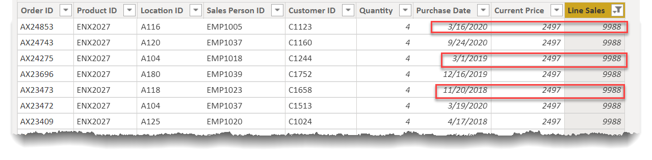
If you do the same filtering on $35, you’ll see the same result.
As you can see, relative to the different approaches you took on MAX and MIN, the simple approach for MIN works just fine.
Very nicely done. ![]()
- Brian
1 Like
I started looking at this too and couldn’t work out why it wasn’t working… 
Excellent job on this solution - I like how you critically evaluated the visual choices presented in the mockup and went a different way on some of those. I think in terms of real-world application, that’s frequently how it goes - client says, “I want this” but as value-added you suggest a better approach. I also like the cards you added as supplemental info to the main visuals, and kudos for challenging yourself on the tougher DAX road you took on the Top 10 salespeople.
A couple of additional points:
-
You may want to revisit the top 5 products result. Your top 5 is based on Total Sales $, but the brief requirement is number of sales.
-
I agree with you that the map visual may not be the most effective choice (I was trying to demonstrate the variety of ways that the same measure could be used in context to generate different visual presentations). However, instead of the line chart, I would choose a bar chart. The line chart implies interpolation between points (as in a time series), whereas the bar chart doesn’t.
Thanks for participating and for sharing your solution!
- Brian
1 Like