Measure for above chart: MAT Sales = CALCULATE( [Sales Total], DATESINPERIOD('Dates'[Date],LASTDATE('Dates'[Date]),-1,YEAR) ) // To get the Moving Average Total Sales TY
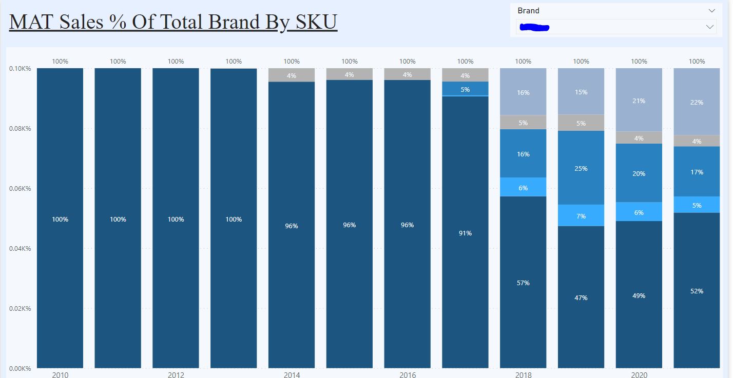
For example, in year 2020, the bottom column (dark blue) label is showing as 49% rather than 1,351K
And this is without the column chart displaying like a 100% stacked column chart:
I’ve seen some solutions around that involve creating a measure and putting it in as a tooltip but this is not what I’m after.
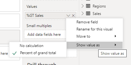
I’m not sure this is possible as the data label is reflecting the actual value and the value, if used converts the chart to a 100% stacked.
MAT Sales % Of Products Within Brand = DIVIDE( [MAT Sales] , [MAT Sales ALL Products Within Brand] , 0) // % of total MAT Sales within the selected brand
Hi @Timmay, we aim to consistently improve the topics being posted on the forum to help you in getting a strong solution faster. While waiting for a response, here are some tips so you can get the most out of the forum and other Enterprise DNA resources.
Use the forum search to discover if your query has been asked before by another member.
When posting a topic with formula make sure that it is correctly formatted to preformatted text </>.
Use the proper category that best describes your topic
Provide as much context to a question as possible.
Include the masked demo pbix file, images of the entire scenario you are dealing with, screenshot of the data model, details of how you want to visualize a result, and any other supporting links and details.
Hi @Timmay, did the response provided by @Heather help you solve your query? If not, how far did you get and what kind of help you need further? If yes, kindly mark as solution the answer that solved your query. Thanks!
Hi @Timmay, we’ve noticed that no response has been received from you since the 14th of March. We just want to check if you still need further help with this post? In case there won’t be any activity on it in the next few days, we’ll be tagging this post as Solved.
Hi @Timmay, a response on this post has been tagged as “Solution”. If you have a follow question or concern related to this topic, please remove the Solution tag first by clicking the three dots beside Reply and then untick the check box.
We’ve recently launched the Enterprise DNA Forum User Experience Survey, please feel free to answer it and give your insights on how we can further improve the Support forum. Thanks!