Hello - I watched Sam’s great tutorial on creating Pareto charts. So clean and simple. There are several other videos showing how to do this but Sam’s was the most straightforward. I do seem to have one issue though. Using some of the other techniques from other videos, I was able to go into the data color area and use the formula button to color code my bars. So, anything below the 80% threshold would orange, and anything above, grey…as an example. With Sam’s technique for some reason I cannot seem to get that to work. I set up the rules, but nothing happens. Any ideas?
Hello @richmont,
Thank You for posting your query onto the Forum.
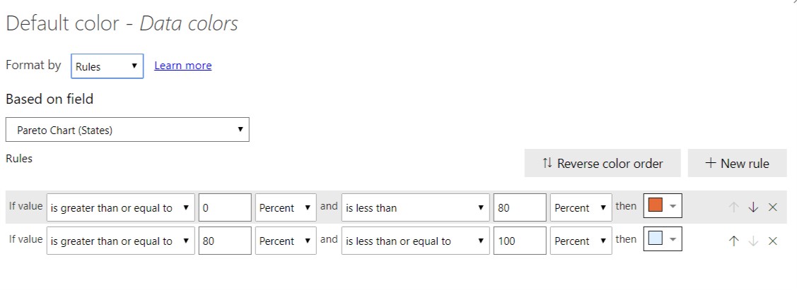
Below are the screenshots attached where I was able to color code the chart as per the requirements which you’ve mentioned and also achieved the results.

I’m also attaching the working of my PBIX file which I’ve used while practicing from the Sam’s resources.
Hoping you find this useful and meets your requirements. 
Thanks & Warm Regards,
Harsh
Pareto Chart.pbix (1.3 MB)
1 Like
That worked, thank you!
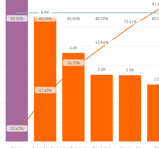
However, I now have another issue with this Pareto. You can see that the color gets applied to the very first column…when it should be actually orange for the first columns up to 80%…then change to purple.
1 Like
Hello @richmont,
I would be a bit difficult for us to judge the results just by observing the screenshot because as you might have noticed that in my PBIX file I didn’t encountered any such problem.
It would be really helpful if you can upload your PBIX file so that members of our forum can assist you in a much better and efficient manner.
Thanks & Warm Regards,
Harsh
1 Like
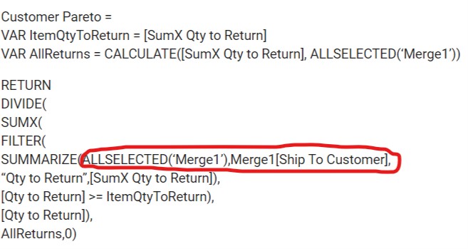
Sorry I not able to upload our information. But here is the formula being used which might help:
I have the customer on the shared axis. I have the Sumx measure in the column values.
Customer Pareto =
VAR ItemQtyToReturn = [SumX Qty to Return]
VAR AllReturns = CALCULATE([SumX Qty to Return], ALLSELECTED(‘Merge1’))
RETURN
DIVIDE(
SUMX(
FILTER(
SUMMARIZE(ALLSELECTED(‘Merge1’),Merge1[Ship To Customer],
“Qty to Return”,[SumX Qty to Return]),
[Qty to Return] >= ItemQtyToReturn),
[Qty to Return]),
AllReturns,0)
Hello @richmont
Since you’re not able to upload your file. This will just be a guess work. But what I see in your formula is you’ve retained/brought back the context from the same table itself. Below is the screenshot provided for the reference -
Now, since you’ve brought back the context from the same table I’m forced to presume that you don’t have the “Ship to Customer” column in your dimension table.
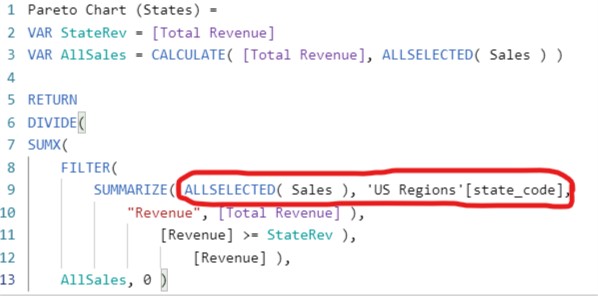
Because if you see my formula, you’ll observe that I’ve retained the context from the Sales tables by applying “ALLSELECTED()” function and then have brought the context from the another table i.e. US Regions table (Dimension Table) by selecting the State Code column from it. This is because I don’t have the State Code column in my Sales fact table. Below is the screenshot provided of my formula for the reference -
Now, if you’ve the “Ship to Customer” column available in your dimension table then please change your referencing in your formula to that table instead of referring the column from the fact table itself.
As I said, due to unavailability of the PBIX file my judegment is very much limited to the scenario that you’ve presented. If possible you can mask your data and then upload the PBIX file. I’m providing a link of a video about “How To Mask Sensitive Data In Power BI” which was created by one of our expert member @BrianJ.
Hoping this helps you. ![]()
Thanks & Warm Regards,
Harsh

Hello - I just wanted to follow up on this and update the resolution. In the end, it was a mistake I was making to not put the actual Pareto measure in the conditional formatting area. In that area, it ask what you want to use for the rules, and I was putting the incorrect measure there. Now it’s fixed and works great.