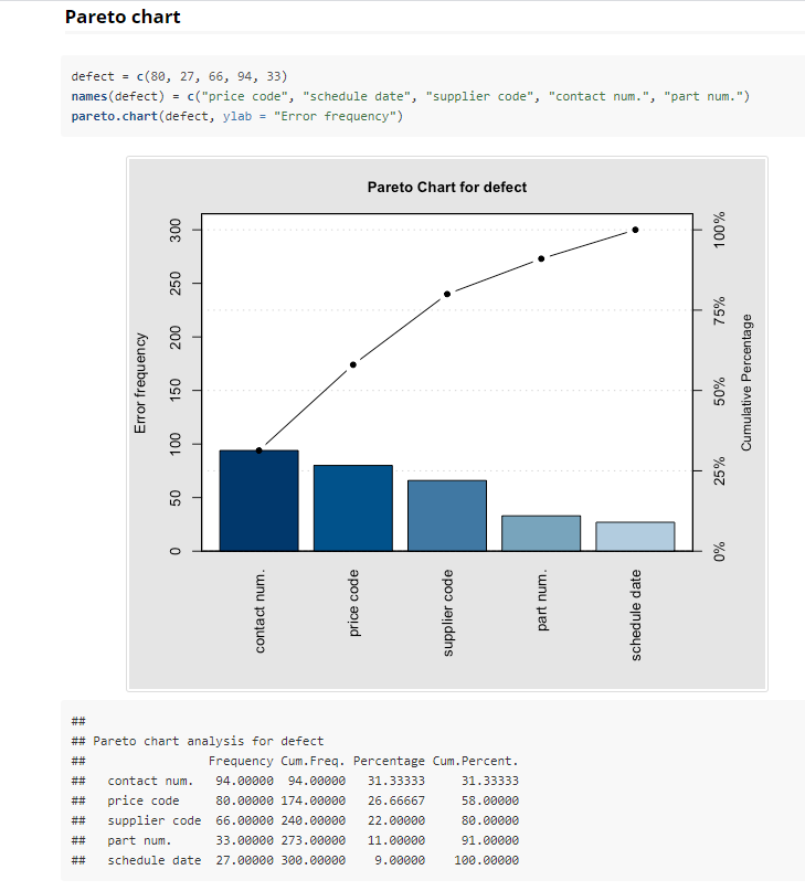
Rather than create a Pareto chart myself I was hoping that perhaps the R or Python standard libraries have one. Has anyone got one in perticular to suggest?
Nice to Have
Of (visual) importance I would like to be able to “bucket” the long tail of my dataset. For example, if show the customers where 80% of my sales ones from but group the remaining into one bar… don’t worry if I’m not making sense. It’s a nice to have anyhow.
Thank you for your reply. Goodness this chart is a blast from the past back in my Minitab days! For the dotplot, it was a side little project and I put it on hold. I’m hoping to get back into it toward the end of next week. I haven’t forgotten and the thread is book marked right at the top of my list for sure! I’ll put back there as soon as I have the answer.
Jeez, MInitab! I haven’t used that in 30 years - didn’t even know it still existed.
I was talking with @bradsmith yesterday, and he mentioned that the Plotly package in R and Python produces graphics that look better in Power BI than the ones produced in ggplot2 or other packages like QCC. Definitely worth taking a look at.
Yes, yes Minitab is alive and kicking. I still read their monthly newsletter. Seems to me everything Minitab can do has now been coined “Machine Learning.” Haha, who would have ever thought statistics would become all the rage.