I am trying to achieve this result but I got stuck and I would need some help.
This is my business case: I am comparing m-o-m % change in Ads spend and m-o-m % change in new acquired users from that said Ads spend. What I wanna see if in any specific month, there was an anomaly / outlier meaning that the % change in Ads spend increased but % change in users acquired decreasing in order to identify if we have been spending efficiently or not really.
I have already calculated all the basic measures and I have imported a supporting grouping table from Excel that I wanna use to loop thru, developing this logic:
if m-o-m & Ads spend Variance is > 0 but m-o-m % Users paid variance is < 0, then outlier;
else non-outliers.
So I would need some help to create this logic a 11. Marketing Funnel Dashboard.pbix (119.5 KB)
nd then visualize it into a scatter chart using these two categories in it.
In order to achieve the solution based on the scenario that you’ve mentioned - “If M-o-M Ads Spend Variance is > 0 but M-o-M % Users Paid Variance is < 0 then outlier; else non-outliers”.
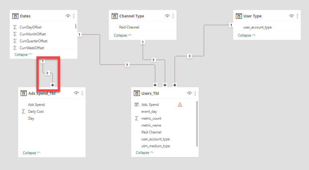
Firstly, the “One-to-One Bi-directional Relationship” which you’ve created between the tables “Ads Spend_Tbl” and “Dates” needs to be converted into “One-to-Many Uni-directional Relationship” where the relationship flows from “Dates” table to “Ads Spend_Tbl” table. Otherwise, you’ll not be able to achieve the “Outliers V/s Non-Outliers” analysis and scatter plot chart will throw the error. So, first I changed the relationship status between those two tables. Below is the sccreenshot of the revised data model provided for the reference -
Once we change the relationship status, one of your calculated column inside “Users_Tbl” will break. You can fix that column by writing the below provided DAX formula and it’ll yield the same results as before -
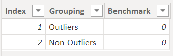
So now, moving onto the “Outliers V/s Non-Outliers” analysis part. Since the benchmark for Lower and Top intervals are one and the same i.e., 0%. The outliers table will be created like this -
Once the table is created then we’ll write the below provided measures to achieve the “Outliers V/s Non-Outliers” results -
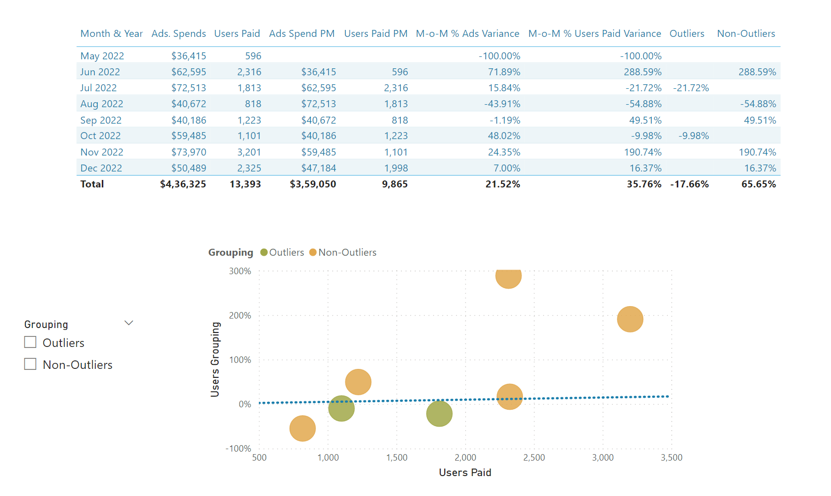
Once you complete the above listed process, you’ll be able to see the results of “ Outliers V/s Non-Outliers ” analysis. Below is the screenshot of the final results provided -
I’m also attaching the working of the PBIX file as well as providing the links below on the resources pertaining to the “Outliers” topic for your reference purposes. Also you can check out the additional videos by visiting the EDNA education portal, if required, feel free to do so.
Hoping you find this useful and meets your requirements that you’ve been looking for.
Important Note:- In the PBIX file, inside a scatter plot chart, I’ve renamed the measure “Users Grouping” as “M-o-M % Users Paid Variance” so don’t get confused with the original measure of “M-o-M % Users Paid Variance” that measure is not placed inside the visual. Only the name of that measure has been used for “Users Grouping” measure inside a visual.
Yes, I watched all the videos related to this topic and I was familiar with this technique already.
I got stopped by the logic you wrote for me because it is sightly different by the ‘standard one’, if you like, that Sam goes thru in his videos.
But, as always, awesome job and thanks so much for the help.
Happy Xmas or whatever else you celebrate or do not celebrate
Diego