Has anyone got suggestions on data story telling for a company on its Customer Survey data
There are 4 surveys
Each Survey has different set of topics & related questions(Open Questions with free text fields)
Pre , Covid and Post ratings for each question except free text fields
Any suggestions of Data Story telling inspirations to project this kind of data where we need to plot avg of ratings and text data to be able to reveal insights.
I am struggling to be able to plot this data visually appealing and to convey a story
So far I have used Vertical Bar Chart and Scatter charts to plot the avg ratings of Topics and I am stuck with what to do next
Hi @Archer, we aim to consistently improve the topics being posted on the forum to help you in getting a strong solution faster. While waiting for a response, here are some tips so you can get the most out of the forum and other Enterprise DNA resources.
Use the forum search to discover if your query has been asked before by another member.
When posting a topic with formula make sure that it is correctly formatted to preformatted text </>.
Use the proper category that best describes your topic
Provide as much context to a question as possible.
Include the masked demo pbix file, images of the entire scenario you are dealing with, screenshot of the data model, details of how you want to visualize a result, and any other supporting links and details.
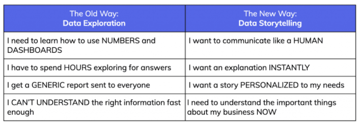
Data Storytelling is a shift in the normal way we think about reports.
Below are a couple of links that I have read through (multiple times) to help me shift my mindset.
I have also included a screenshot that really sums this idea up in a few steps (image is from the narrative science link below):
since you specifically mention a number of free text fields, I’m assuming that pulling out the most used words in a word cloud might be helpful - so you may want to take a look at this custom visual (it is certified by Microsoft): https://appsource.microsoft.com/en-us/product/power-bi-visuals/WA104380752
This is a difficult one for me as well! Especially the “Free text”.
What I would do:
I woud want to compare pre-covid and post-covid so I would put those values net to eachother in a bar chart. The score would be on the Y-axis, the topics would be on the X-axis.
I would add the 4 surveys on one page if that makes sense. Otherwise I would make a seperate page.
Besides the graphs I would create 2 tables next to eachother: One with pre covid data, one with post covid data. It is hard to visualize this data, but that is mainly beause it is hard to guess what you want to get out of this data? From my experience, open ended questions are very hard to analyze, regardless of the tool. The data is too unique to to summarize, combine, compare etc… without some sort of sentiment analysis.
Hi @Archer, we’ve noticed that no response has been received from you since the 8th of December. We just want to check if you still need further help with this post? In case there won’t be any activity on it in the next few days, we’ll be tagging this post as Solved. If you have a follow question or concern related to this topic, please remove the Solution tag first by clicking the three dots beside Reply and then untick the checkbox. Thanks!
Hi @Archer, a response on this post has been tagged as “Solution”. If you have a follow question or concern related to this topic, please remove the Solution tag first by clicking the three dots beside Reply and then untick the check box. Thanks!