@JohnG ,
Oh, boy - I kind of wish you’d put a page limit on responses to this question. ![]()
Here goes:
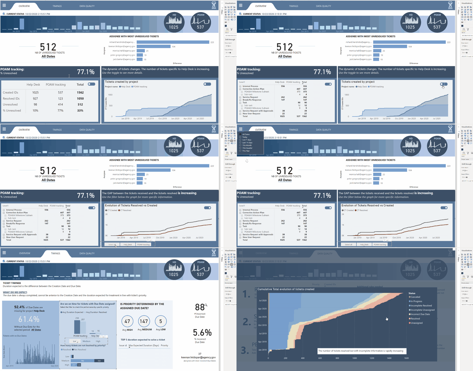
Native Visuals - I feel that the native visuals get a bad rap. Yes, Power BI’s native visuals are well behind Tableau’s, but I think some of the complaining you hear belies a lack of creativity. You can create magnificent reports using nothing but native visuals. Here’s an example from @alexbadiu from Challenge #8 that I think illustrates this point perfectly:

You also never have to worry about updating them, the developer dropping support for them, your IT department not letting you use them, etc.
Custom Visuals - I’m a pretty vocal fan of custom visuals, and there are a few that I really couldn’t live without (SmartFilter Pro, Icon Map, Mapbox, QueryOn Timeline). A few “buyer beware” points though:
-
Generally stick with the name brand, established developers - you don’t want to become reliant on a custom visual that then stops being supported by the developer, or becomes incompatible with the current version of PBI and is not updated promptly.
-
Be prepared to do some additional work - unlike native visuals, for which updates are just nested within the monthly PBI updates, you will need to actively maintain updates for your custom visuals.
-
Cost - while some amazing custom visuals remain free (particular shout out to James Dales’ incredible Icon Map custom visual, which provides high-end GIS features in a completely free custom visual), many of the best ones are not. SmartFilter Pro, for example, provides exceptional enhancements to filters and slicers, and is priced very fairly IMO, but it’s not a trivial cost for a midsize to large organization.
-
Uncertainty/Risk - even when the custom viz developer does absolutely everything right, they are still at the mercy of Microsoft, which can create risk and uncertainty. I have been very vocal about my love for QueryOn Timeline (QT). However, recently Microsoft made the sudden decision that they were not going to permit certified custom visuals to call external image URLs. This broke QT. Soon after, they issued an update which required you to convert all of your URL images to binary 64 to be stored within PBI. This approach is chockablock with problems, but the only choice they had to remain compliant. They also then provided a non-certified version which still allowed the URL calls. But had I been in an organization that only allowed certified custom visuals, this would have been a real problem that I hadn’t at all anticipated.
Charticulator - the annoying constraint of only 24 hours in a day has limited my ability to develop more than a rudimentary knowledge of Charticulator, but watching our Charticulator maestros @MudassirAli , @datazoe and @JarrettM , I think it has great utility in two respects:
- “Mad Scientist Mode”, where you can generate some really creative visuals that aren’t replicable in any other way. Here’s @Mudassir in absolute peak Mad Scientist mode on Challenge #8
- “Subtle Mode” - as a way of tweaking the native visuals to use space more efficiently, or change attributes not directly modifiable in the paint roller options. @Heather speaks to this really well above.
R Visuals - okay, I know you didn’t ask about these so I’ll stay off my soapbox for the most part. However, I think when looking to expand your visuals toolbox, this is a great route to take. Once you get the gist of R’s “Grammar of Graphics” (this is going to be a big part of my R course rolling out this August), it provides a pretty easy way to create an enormous range of almost infinitely customizable statistical and technical charts without having to go the custom visual route. Check out the gallery below for examples:
Okay, that’s probably more than you asked for or wanted, so I’ll stop here. Great question though…
– Brian