I just completed Mudassir’s two part “Advanced Visualization Techniques”.
I’m curious to know how Enterprise DNA members feel about using Native Power BI Visuals vs. Custom Visuals vs. Charticulator.
Regards,
John Giles
I just completed Mudassir’s two part “Advanced Visualization Techniques”.
I’m curious to know how Enterprise DNA members feel about using Native Power BI Visuals vs. Custom Visuals vs. Charticulator.
Regards,
John Giles
Personally, having spent the last several days doing a ‘deep dive’ into Charticulator, I feel that it is a great tool. That being said, like so many other things in PowerBi (or really in any Microsoft product), it is a great tool that has a proper place.
Example - if I want a standard bar chart, and I don’t need to do anything fancy with it - there is no reason for me to take the time to design it in Charticulator. Particularly because the app version is still in preview and I’ve had times that it won’t load properly (but restarting PBI Desktop fixed that). To me, that is inefficient use of my time.
Example 2 - if I know of a Custom Visual that will do the job (and that I consider ‘safe’ in terms of data exposure or performance speed), again I see no reason to waste time recreating the wheel.
However, if I really need something done a particular way - it is probably well worth the time.
Example - I had a report the other day that needed to have a column chart showcasing the past 3 years of customer purchases, last year due to the pandemic they had a single month with an extremely large expenditure that is not likely to be repeated in the next 3 years. This caused my chart to look very odd, with a single month that spiked over 12 times the customer’s normal buying pattern, which caused some month sales to not even really show on the chart.
Solution - I dove into Charticulator, recreated the column chart, but with a max value used in place of the normal dollar amount (basically, if SlsAmt > MaxAmt, show MaxAmt, else show SlsAmt). And then ONLY for the colum that maxed out, I showed as a text value the true Sales Amount. This would not have been possible in a standard visual (without a lot of manual intervention) - but now I have a solution that won’t have to be updated in 3 more years to remove a work-around.
So in my final example, Charticulator was more than worth the time spent on it now, because that will solve a problem that occurs in other reports as well.
I’ll pull out the “It depends” line, @Heather articulated it beautifully.
Why spend more time on Charticulator if a native viz gives you exactly what you need.
If a Native Viz doesn’t quite fit but a Custom Viz does (and there isn’t a Custom Viz cost involved) then use a Custom Viz.
If Native or Custom doesn’t fit your need then go to Charticulator. Sliding scale I guess.
If you think you can give some added value or an extra bit of visual impact through Charticulator (and you have the time) then go to Charticulator.
Which reminds me, I need to complete that course too!
David
@JohnG ,
Oh, boy - I kind of wish you’d put a page limit on responses to this question. ![]()
Here goes:
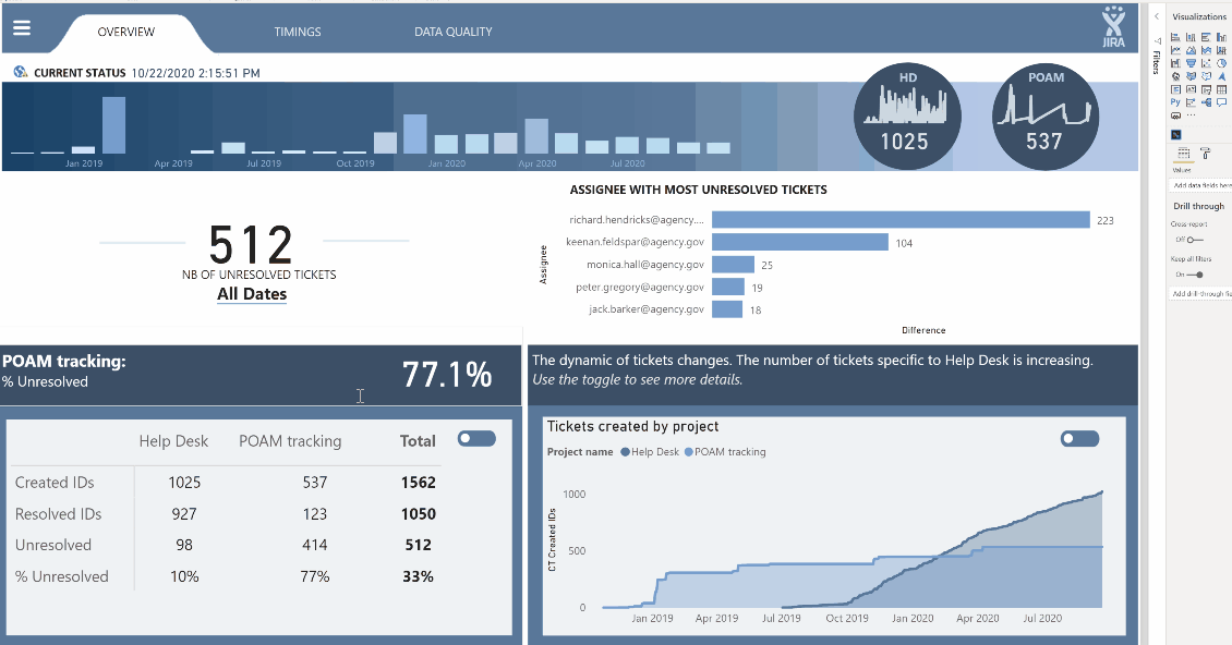
Native Visuals - I feel that the native visuals get a bad rap. Yes, Power BI’s native visuals are well behind Tableau’s, but I think some of the complaining you hear belies a lack of creativity. You can create magnificent reports using nothing but native visuals. Here’s an example from @alexbadiu from Challenge #8 that I think illustrates this point perfectly:
You also never have to worry about updating them, the developer dropping support for them, your IT department not letting you use them, etc.
Custom Visuals - I’m a pretty vocal fan of custom visuals, and there are a few that I really couldn’t live without (SmartFilter Pro, Icon Map, Mapbox, QueryOn Timeline). A few “buyer beware” points though:
Generally stick with the name brand, established developers - you don’t want to become reliant on a custom visual that then stops being supported by the developer, or becomes incompatible with the current version of PBI and is not updated promptly.
Be prepared to do some additional work - unlike native visuals, for which updates are just nested within the monthly PBI updates, you will need to actively maintain updates for your custom visuals.
Cost - while some amazing custom visuals remain free (particular shout out to James Dales’ incredible Icon Map custom visual, which provides high-end GIS features in a completely free custom visual), many of the best ones are not. SmartFilter Pro, for example, provides exceptional enhancements to filters and slicers, and is priced very fairly IMO, but it’s not a trivial cost for a midsize to large organization.
Uncertainty/Risk - even when the custom viz developer does absolutely everything right, they are still at the mercy of Microsoft, which can create risk and uncertainty. I have been very vocal about my love for QueryOn Timeline (QT). However, recently Microsoft made the sudden decision that they were not going to permit certified custom visuals to call external image URLs. This broke QT. Soon after, they issued an update which required you to convert all of your URL images to binary 64 to be stored within PBI. This approach is chockablock with problems, but the only choice they had to remain compliant. They also then provided a non-certified version which still allowed the URL calls. But had I been in an organization that only allowed certified custom visuals, this would have been a real problem that I hadn’t at all anticipated.
Charticulator - the annoying constraint of only 24 hours in a day has limited my ability to develop more than a rudimentary knowledge of Charticulator, but watching our Charticulator maestros @MudassirAli , @datazoe and @JarrettM , I think it has great utility in two respects:
R Visuals - okay, I know you didn’t ask about these so I’ll stay off my soapbox for the most part. However, I think when looking to expand your visuals toolbox, this is a great route to take. Once you get the gist of R’s “Grammar of Graphics” (this is going to be a big part of my R course rolling out this August), it provides a pretty easy way to create an enormous range of almost infinitely customizable statistical and technical charts without having to go the custom visual route. Check out the gallery below for examples:
Okay, that’s probably more than you asked for or wanted, so I’ll stop here. Great question though…
– Brian
First, thank you all for your prompt responses.
At this point, I’d like to steer the conversation in a slightly different direction.
As I review Power BI visuals, I’m very impressed by the reports and dashboards that can be developed.
At the same time, however, I think of all the persons for whom I’ve developed software applications and reports over the years (many years). I can’t help but think of what their response would be to the reports and visuals I’ve seen. In many cases, I can hear them saying something like, “That’s nice, but it’s more than I really need”, or “couldn’t you have just given me a simple table?”. I think you know what I mean. Now, many of these persons have retired or passed away, and times have changed. Has anyone had these some thoughts?
John Giles
actually - this is a challenge I deal with regularly, I have some members of our team that prefer a ‘simple table’, while others want more flashy ‘dashboard style’ reports - limit the text and make sure the visuals are all interactive.
I’ve learned (as we all do) of those people who need the table style reports, and those who need the dashboard style - and I try to keep their preference (and the report’s future use plan) in mind as I design. Frequently I have a tab on the report that will take them to a detail table, it can be used as a drill-through option for further insights from the flashy charts, or it can be the detail table that others may prefer. Generally if I provide a detail table, I allow it to be exported.
I have found that a couple of my ‘table only’ users have recently complimented a nicely presented summary chart.
@JohnG ,
Given the relative newness of modern BI tools, there’s a fine line between listening to the client and recognizing that the client may not have enough experience/context to know what they want (I liken it to asking someone in the 1800s how they want their private jet configured).
Thus, my initial conversations almost always focus on a thought experiment – “if you had a magic box that could tell you absolutely anything you wanted about your data, what questions would you ask it?” Based on the answers to that question, plus an understanding of their available data, business rules, etc. I typically generate an initial report that uses the visuals that I think most effectively convey the answers to those questions. They then provide feedback, and if they still want basic tables and matrixes, I provide that whether I think it’s the most effective visual or not, because IMO the best report is the one that people will actually use.
– Brian
PS – in thinking more about this, I would also make the point that there are tables and there are tables. Meaning a big block of black-and-white numbers versus a conditionally formatted table with data bars, dynamically colored fonts or backgrounds, and/or KPI icons, etc. I think the latter are some of the most effective visuals in Power BI if done well.
Have you found that the opposing sides in this debate are chosen along generational lines?
In my situation - no, they are not. They also do not seem to fall along power lines within the organization I have some managers who really like tables, others who really like charts, and the same for executives.
Most of my sales people generally prefer charts unless they are using a PowerBi report as a lookup tool for our database. (Our database is rather confusing for the general user, so that is one of the things we have done with PowerBi is to make lookup of invoice line history more accessible.)
To an extent, but it’s more nuanced than this:

I find that the real Excel-heads just really like and are comfortable viewing and analyzing data in pivot tables, and that the hardcore Excel users tend to be older, so there is some correlation here. For example, when I was in grad school in the 80s, the first course we were required to take was a semester-long Excel intensive. I doubt anybody does that anymore. Back then, the only real choices for data analysis were Excel and SAS/SPSS/Minitab. Now, the tool set is so much more varied that I think there’s not as strong a tie to any one tool or way of doing things.
Thanks for starting this discussion @JohnG and to all contributors on this post. We appreciate users sharing varied updates and infos relevant to Power BI.
We are tagging this post as “Solved” due to the inactivity if the thread. For further questions related to this post, please make a new thread.
As an older member of this group, (helped load data into excel when it first became a business tool!) I can categorically say the visualisation products of today “combined” with a solid table layout are excellent. Older clients have an instinctive distrust of a visual when they cant see the data behind it… “In God we trust, all else bring data”