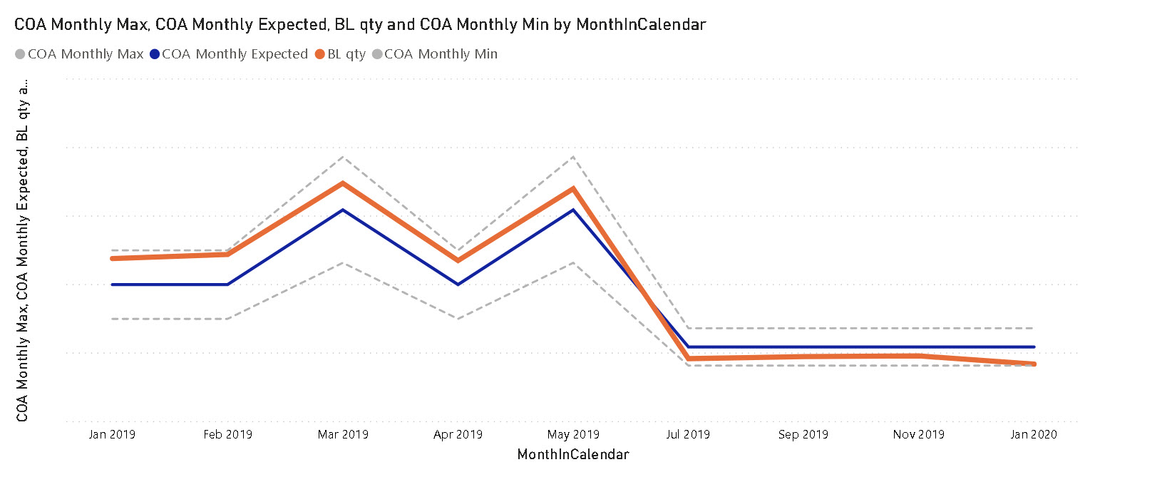
The business scenario is that contracts guarantee a minimum and maximum volume per month. New contracts start, old ones are renewed or are lost. The attached is dummy data generated in Excel with the grey area showing the overall min and max volume per month, the yellow line is the central/average and blue the actual volume showing the undershoot of volume in June & July.
In Power bi I have been able to do this with an area chart overlaid with a line chart but aligning, scaling and duplicated axes makes this solution very fragile. Does anyone have better alternatives ?
Hello MudassirAli, many thanks for wanting to take a look. In the pbix attached, you will see a version looking similar to my Excel mockup. The pbix version is an area chart and a line chart one on top of the other. At present the legends and axes names are overlapping. Removing these results in the scaling of one chart changing. So my question comes down to whether any one knows of another visualisation that provides lines over areas natively. FYI I started looking at Charticulator and while that can produce much more sophisticated results, there looks to be a significant learning curve. thanks again, Nick
Hi @Nickj, we aim to consistently improve the topics being posted on the forum to help you in getting a strong solution faster. While waiting for a response, here are some tips so you can get the most out of the forum and other Enterprise DNA resources.
Use the forum search to discover if your query has been asked before by another member.
When posting a topic with formula make sure that it is correctly formatted to preformatted text </>.
Use the proper category that best describes your topic
Provide as much context to a question as possible.
Include the masked demo pbix file, images of the entire scenario you are dealing with, screenshot of the data model, details of how you want to visualize a result, and any other supporting links and details.
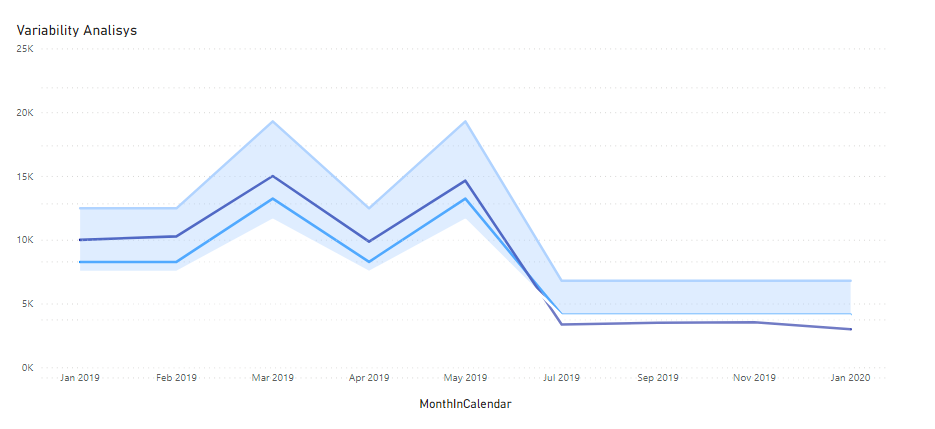
I do agree with Nickj solution on line chart but if you want to use overlaid charts switch off the X and Y lables title, as well charts titles and add only one with the content you want to show
Hi @Nickj, did the response provided by @LucaB72 help you solve your query? If not, how far did you get and what kind of help you need further? If yes, kindly mark the thread as solved. Thanks!
Hi @NickJ, we’ve noticed that no response has been received from you since the 18th of December. We just want to check if you still need further help with this post? In case there won’t be any activity on it in the next few days, we’ll be tagging this post as Solved. If you have a follow question or concern related to this topic, please remove the Solution tag first by clicking the three dots beside Reply and then untick the checkbox. Thanks!
Hi LucaB72, Thank you for thinking on this. We are in the same place, to get the desired result, overlay the charts. But that leaves me concerned with ongoing support worries so I will stay with a simpler line-only version for now :-(. That area/line charts are not available is quite a surprise, even a little goggling brings up examples of this format being used.