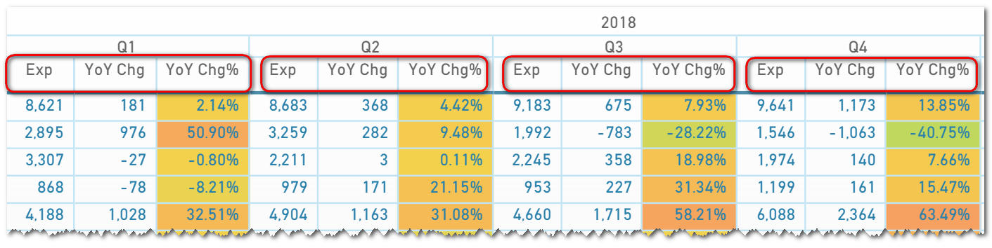
In an excel pivot, this is doable like shown below.
In Power BI matrix, I am only able to have it like shown below. Is there a way to show it where Exp for Q1-Q4 are altogether followed by 2018 total, then followed by YoY Chg for Q1-Q4 altogether then 2018 total, then lastly, followed by YoY Chg% for Q1-Q4 and then 2018 total?
Regards,
Ferdinand
It’s quite interesting.
I’m actually not sure you can do it exactly like that right now.
I’ve done some testing myself and couldn’t get to that exact look.
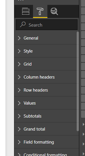
You can change a number of things here
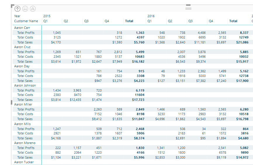
I got it to look like this
But this was the closest I got.
See if there’s any combination of things you can do in the formatting area
Thanks Sam! I think showing the measures as rows might be a good alternative. My manager might like it.
Best regards,
Ferdinand