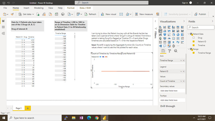
I am trying to show the Patient Journey in a Line Graph with one line for each Patient with all the Drugs he/she has taken over a period of time where ‘Drug B’ is drug of interest. First time a patient is taking Drug B, is it flagged as Timeline (T) = 0 and other Drugs timelines are calculated based on T = 0 for the respective Patient. I want also want to show each Drug Name as a different shape plotted on the line (Ex: Drug A as Triangle, Drug B as Circle, Drug C as Square)
Issue 1 : PowerBI is applying the Aggregate function (Ex: Count) on Timeline values when I want to see the each Timeline data plotted as separate value.
Issue 2: How to show the Drugs as different shapes on the Line Graph?
I have attached the respective PBI file for reference and the screenshot as reference material. Hope the request is clear but if not, please let me know.
Patient Sample.pbix (31.2 KB)
Hi @brjeeth,
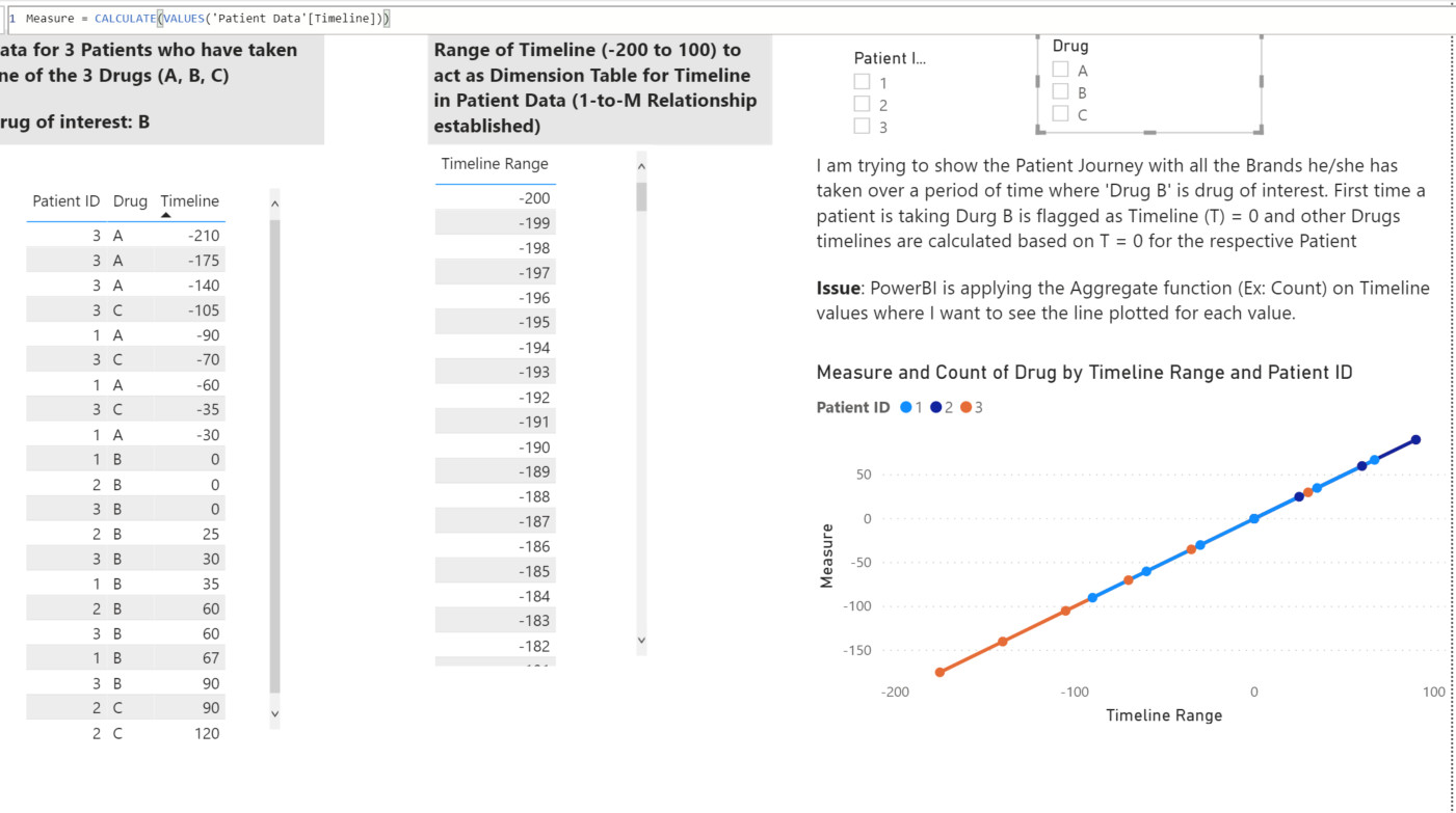
Thanks for posting your question. For your first question, if you use measure like I used, you can get individual values of timeline. Here since timelines are similar, that is why lines are on top of each other.
For your 2nd question, I am not sure as Power BI allow to put different shape based on the legend and in your case, legends are patiend ID’s instead of Drug. Someone might be able to assist you but I am not sure about this case.
Kind Regards,
Hafiz
Hi @brjeeth, did the response provided by @hafizsultan help you solve your query? If not, how far did you get and what kind of help you need further? If yes, kindly mark as solution the answer that solved your query. Thanks!
@hafizsultan: Thanks for your response!!
Since the data has overlaps and the user will not be able to discern one line with the other, I have a taken a different route by keeping Start and End Dates instead of computing the duration and then used the “Timeline Storyteller” visual.