Hi All
Does anyone know if there’s a line chart visualisation available that allows you to set the Y axis (or X axis I guess) start, scale and increment values?
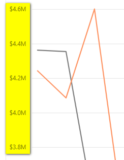
I have a specific need to show different data sets in separate charts but all with the same Y axis scale and increment values. By increment values, I mean the Y axis labels - so, $200,000 increments for example as per the screenshot below.

Thanks
Hi @t.irani, we aim to consistently improve the topics being posted on the forum to help you in getting a strong solution faster. While waiting for a response, here are some tips so you can get the most out of the forum and other Enterprise DNA resources.
-
Use the forum search to discover if your query has been asked before by another member.
-
When posting a topic with formula make sure that it is correctly formatted to preformated text </>.
-
Use the proper category that best describes your topic
-
Provide as much context to a question as possible.
-
Include demo pbix file, images of the entire scenario you are dealing with, screenshot of the data model, details of how you want to visualize a result, and any other supporting links and details.
I also suggest that you check the forum guideline https://forum.enterprisedna.co/t/how-to-use-the-enterprise-dna-support-forum/3951. Not adhering to it may sometimes cause delay in getting an answer.
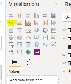
Hello you should be able to use this control

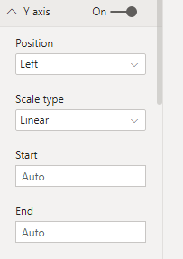
you can set the value and range by going into the “Format” tab

You can also have dual Y axis with different ranges
set y2 axis to On
Does this help?
Hi C9411010
Thanks for your feedback.
That’s the chart I’m currently using and have explored the formatting options. Unfortunately, whilst you can adjust the start value, you cannot set the axis scale and increments which is what I’m looking for.
Thanks
unfortunately setting the start and end value is the only way I know…
pls vote on the requirement to move it up on the priority list
https://ideas.powerbi.com/forums/265200-power-bi-ideas/suggestions/12304389-dynamic-axis-scaling
