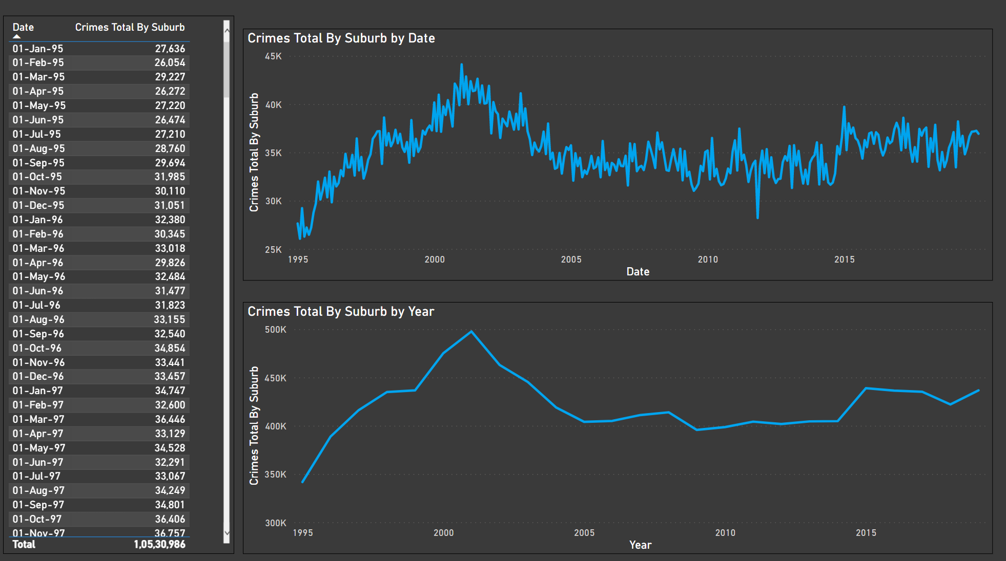
This one’s easy to spot. The top line chart I have used the continuous [date] field from the date table. The line chart below I have used the [year] field from the date table.
Notice on the chart below (where I have circled in red with a question mark) the gap. Don’t know why this is happening, any ideas?
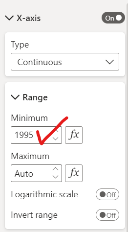
I’d like to show the chart starting at year 1995, when the data starts but only by year, not with the lines up and down like on the chart on top that you get with the continuous date range.
Never seen this issue before, it’s a big data set, this may have something to do with it?
Well, since the X-Axis is set to a “Continuous” type, Power BI broke out the axis in the multiples of 5 years, in this case. So if you see, you had a last data on “1st Dec, 2019” still it showcased end year as 2020 and same happened with the start year as well.
And it’s a simple fix. Just select the chart and go to the X-Axis option. And under the range section, input the minimum value as 1995 i.e., the starting year of the first data point. Below are the screenshots provided for the reference -