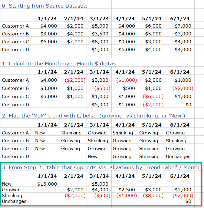
From the below simple data source of Revenue by Customer by Month (pivoted format), calculate month-over-month deltas and create a set of trend labels – depending on whether the MoM trend is negative, positive, or a ‘new’ customer (no prior history). Then support creating visuals by the shown Trend labels … the final table below would presumably be based on a tabular style table. Also do same, but at a Fiscal Quarter level (results would differ). Source file and .pbix file are attached, so if the below views are not very legible check out the 2nd tab in the Excel file. Thanks!
Power BI data model _ Revenue trends by Month.pbix (435.7 KB)
Fact File - Revenue by Month.xlsx (18.6 KB)