I’m trying to come up with a solution for the following:
So bascially, I would like to have for two specific dates (dynamic based on current date) to return a number of values for specific measures in a matrix like table.
Things I have tried:
Using Matrix table and set measures as rows (that works but can’t get a delta from this).
Creating a custom table and define each row (measure) and column. Problem there is that it seemed to lose certain context and the columns couldn’t be set dynamically.
This is the one for the custom table (which loses context of the current project: it automatically displays values for all projects regardless of the current page being filtered on a specific project):
Financial KPIs =

UNION(
    ROW("KPI";"Revenue at completion";"LM-1";[Revenue At Completion LM-1];"LM";[Additional Expected Revenue LM];"Delta";[Revenue At Completion %]);
    ROW("KPI";"Additional revenue to nego";"LM-1";[Additional Expected Revenue LM-1];"LM";[Additional Expected Revenue LM];"Delta";[Revenue At Completion %]);
    ROW("KPI";"Budget at Completion";"LM-1";[Revenue At Completion LM-1];"LM";[Additional Expected Revenue LM];"Delta";[Revenue At Completion %]))
Hi @Wlknsn. Before diving into this, could you please provide a small sample dataset (in Excel) and a screenshot mockup of what your expected outcome? As well, you mentioned dynamic dates: how might these be determined? (The end of the previous 2 month? The end of the two previous months based on a selected date? Other?). Thanks, Greg
Thanks for posting your question @Wlknsn. To receive a resolution in a timely manner please make sure that you provide all the necessary details on this thread.
Here is a potential list of additional information to include in this thread; demo pbix file, images of the entire scenario you are dealing with, screenshot of the data model, details of how you want to visualize a result, and any other supporting links and details.
Including all of the above will likely enable a quick solution to your question.
So put some sample stuff together. I believe there are two approaches:
Using matrix and applying “show on rows”. That would be quite dynamic, but not sure how those column dates could by dynamically set for example to show difference between last quarter and last quarter -1. Also not seeing how the delta would be calculated between the two dates using this approach
Creating a custom table with measures. This seems this could potentially be a solution, although the column header dates wouldn’t be dynamically set (but can live with that), yet when I try to set it up, it seems to lose the context of which case is being selected. It just calculates for all data.
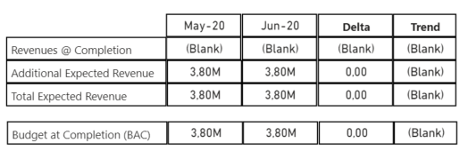
So the point is: I’m looking to have display a table with measures between two dynamic dates, the delta of this, for each measure.
(I ended-up diving into this anyway before I saw your follow-up post, and have a generic example that might help.) I created a disconnected table to use as the basis for a table visual (which gives you more options, I find)
Then, [2LM] and [LM] measures can be used to set the values that will be shown, something like:
and as well you can use conditional formatting to choose icons, which perhaps can be used in lieu of the “Trend” column. Another option to allow the setting of (fake) column headers is to add your header of choice into row 0 and use conditional formatting to set the background and font colour. You can then add “text” versions of your measures to get the column headers you want.
I think you could use the selected date approach I used in the generic example I posted earlier to get the date of interest and the 2 previous months.
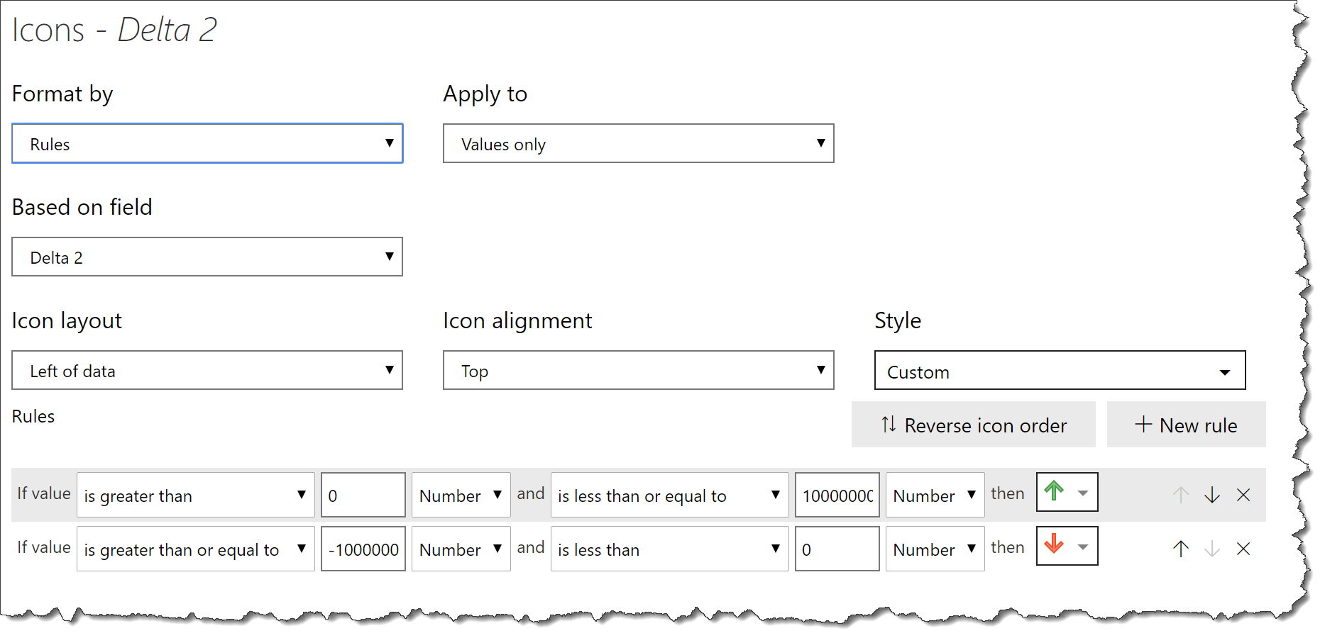
How to get delta?
First off, don’t use “Values \ Show on rows”. You can then add 3 measures into the values of the matrix and use the conditional formatting option “Icons” for the [Delta] measure to illustrate the trend.
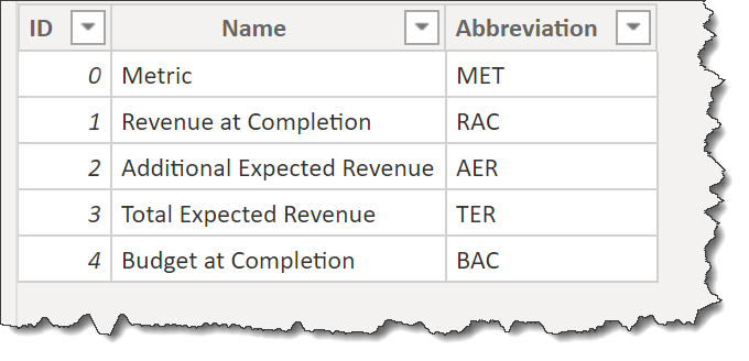
I’m not sure where you got your [KPI] measure from, but that was the issue. Replace it with the 3 measures.
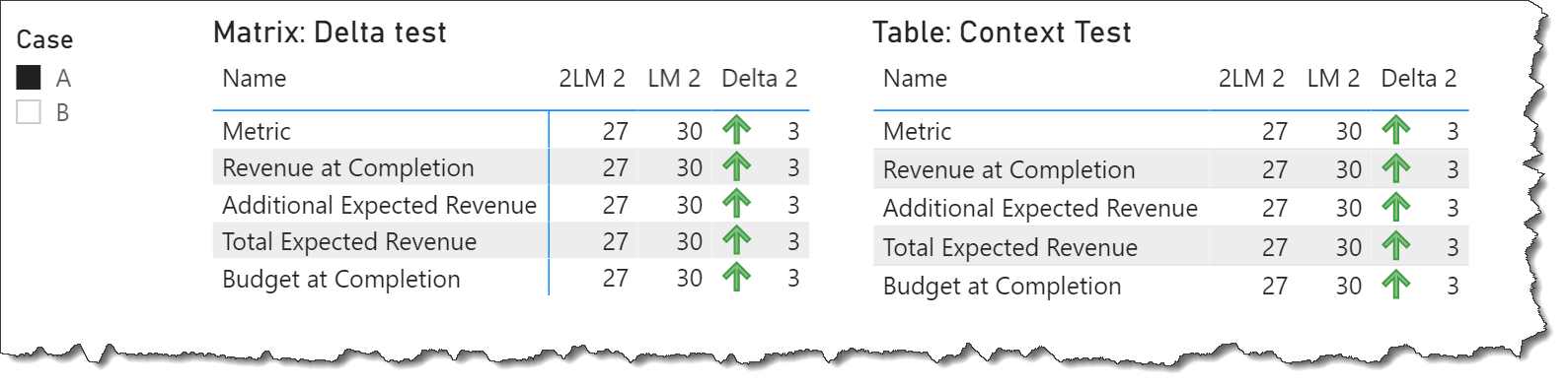
SUMMARY:
The disconnected table approach from the generic example posted earlier was copied into your file, and then you can use either a matrix or a table; both will respond to context and both can display trend icons.
Hi @Wlknsn, did the response provided by @Greg help you solve your query? If not, how far did you get and what kind of help you need further? If yes, kindly mark the thread as solved. Thanks!