Hi,
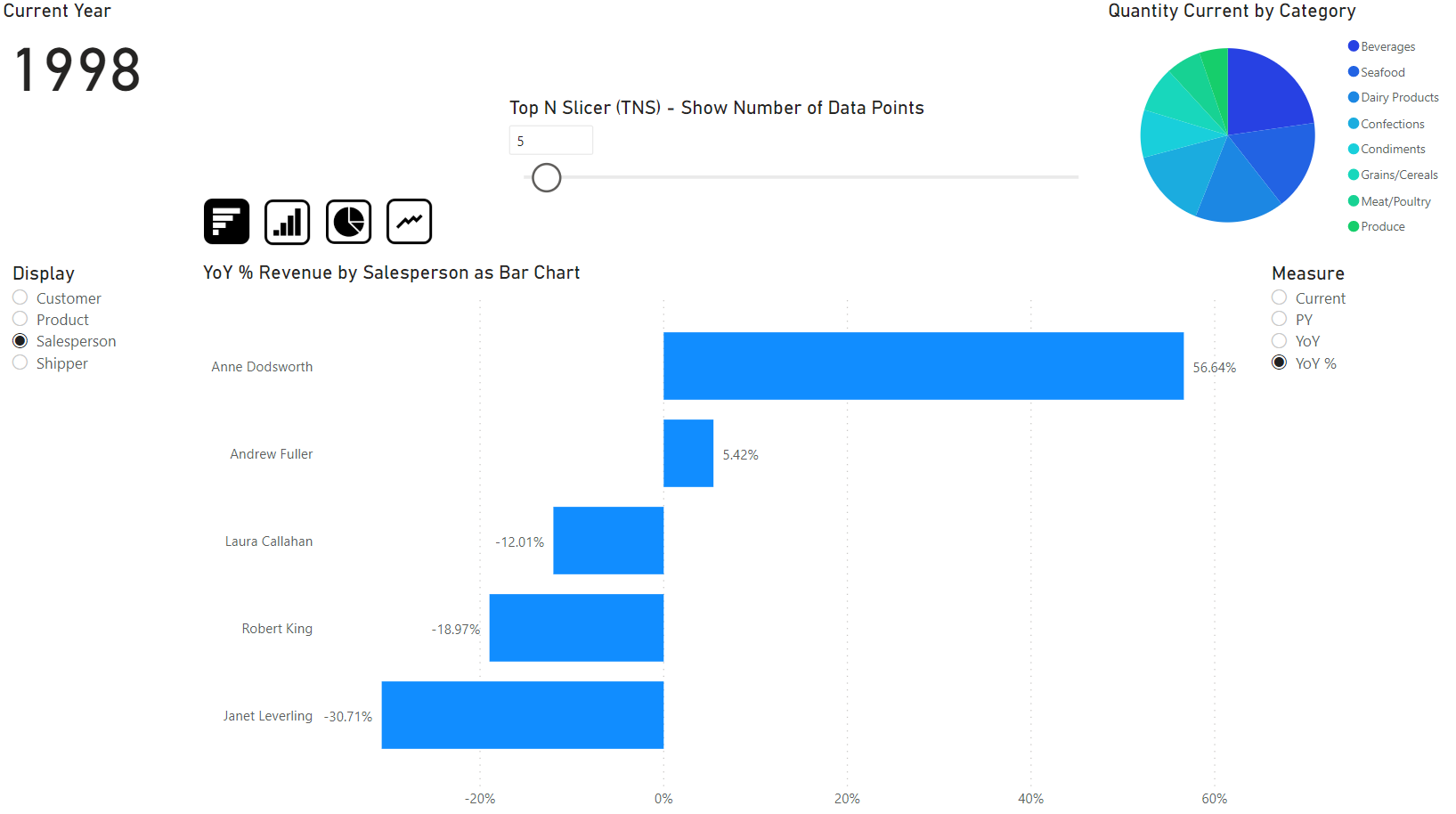
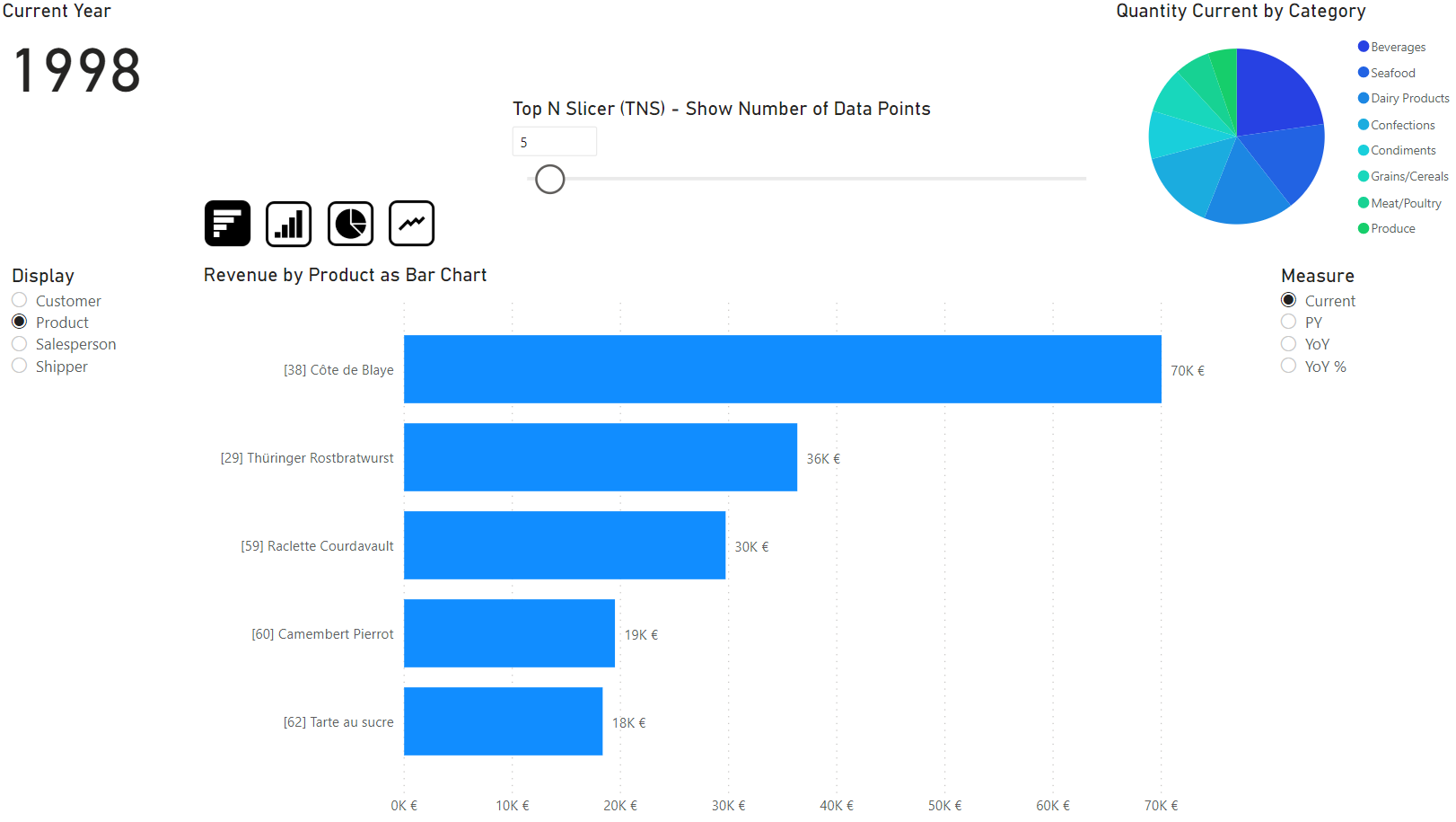
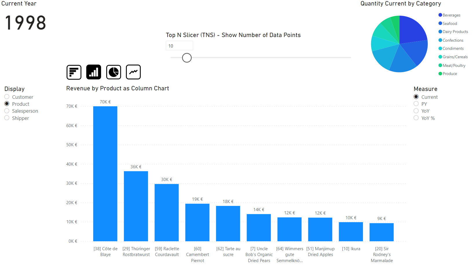
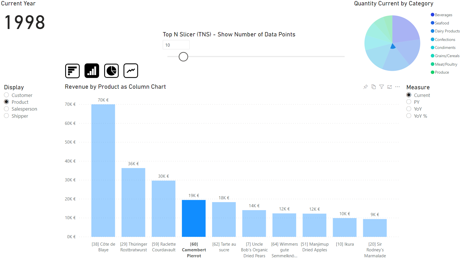
I’d like to share with you a technique that I’ve developed for pitching agains a Qlik solution that showed this feature: You can put a visual on a page, e.g. bars for revenue, and then select from a slicer the dimension from which the categories come for drawing the bars.
Ultimately I came up with a fully dynamic chart area Dynamic Diagrams.pbix (509.4 KB). You can:
- Change the dimension for the categories from a slicer, e.g. by product, by customer, by salesperson etc. in the same chart. I call this technique Dynamic Category Axis (DCA).
- Change the number of bars/data-points shown from a slicer. I call this technique Top N Slicer (TNS).
- Change the measure shown from a slicer, e.g. revenue current period, revenue previous period, YoY variation, etc. with correct data format like currency, percentage, etc. fully functional.
- Change visualization type between bar chart, column chart, pie chart, line chart etc.
- Chart title dynamically adjusts to what you actually see
- Cross-filtering with other charts fully functional
- Pin to Dashboard fully functional
You can play around with the file to experience the effect. Remember: In Power BI Desktop you need to Ctrl-click on the buttons to change the chart type, in the web-browser it’s a normal click. If this is usefull for you, please share the use cases and user feedback. Of course, in a real-life scenario it’s not always usefull to combine all these techniques on the same page. Let me know if you are interested in more detailed steps how to apply each of these techniques.
Thanks to @Melissa for the extended date table!
BR
Martin
