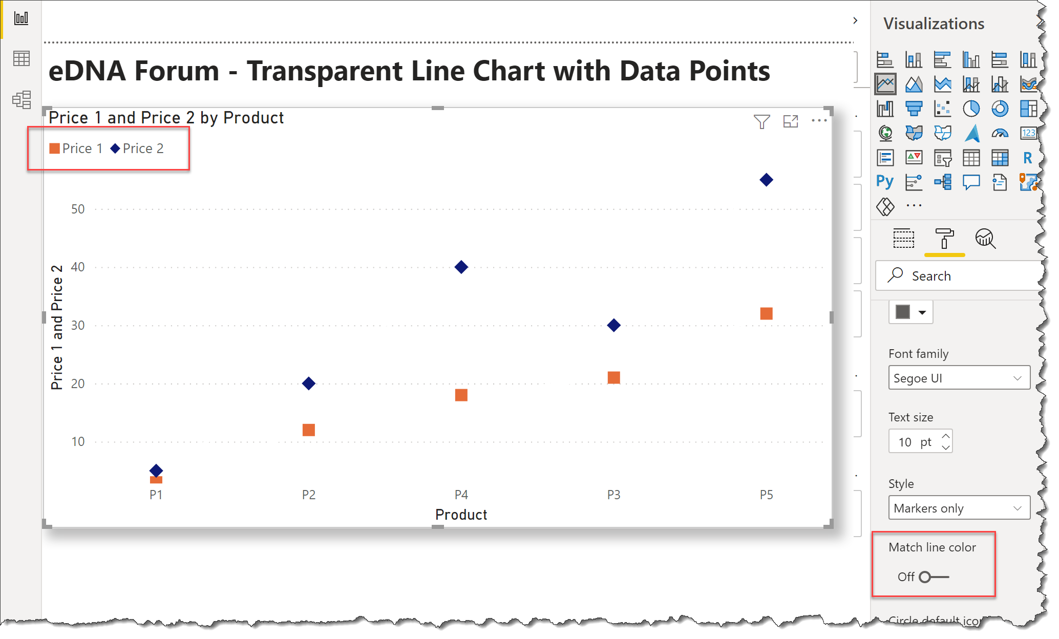
@SamSPAIN do you mean how to create a line graph with dots/markers and no line ?
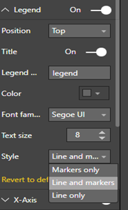
To change marker and line style, please drag a column to “legend” and switch to format->legend->style like below:
Another option that you could use is Charticulator. If you post some sample data, and a brief explanation of what it is you want, I could put something together.
Hi @SamSPAIN, did the response provided by the users and experts help you solve your query? If not, how far did you get and what kind of help you need further? If yes, kindly mark as solution the answer that solved your query. Thanks!
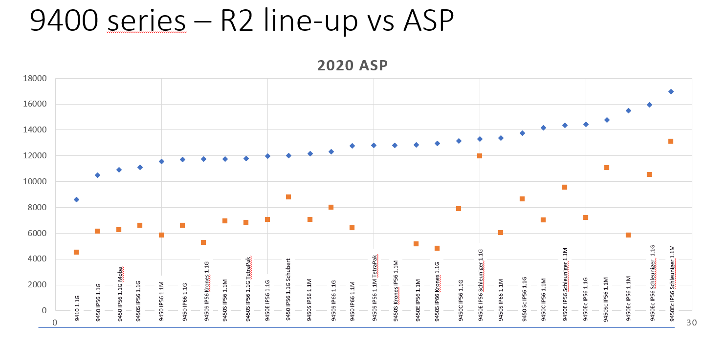
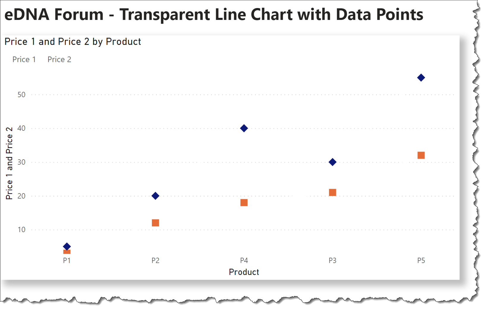
How did you make the lines transparent for both? which option did you execute to accomplish that? as shown above I only could it make it work for one element of the visual.
Hi @SamSPAIN. The lines are not transparent; I merely chose the same colour as the background (in this case, white). If you wish additional assistance, please upload your work-in-progress PBIX along with a marked-up screenshot of your visual of interest noting the desired outcome.
Greg
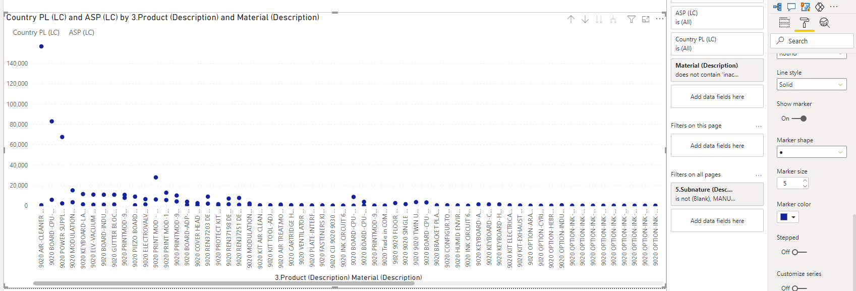
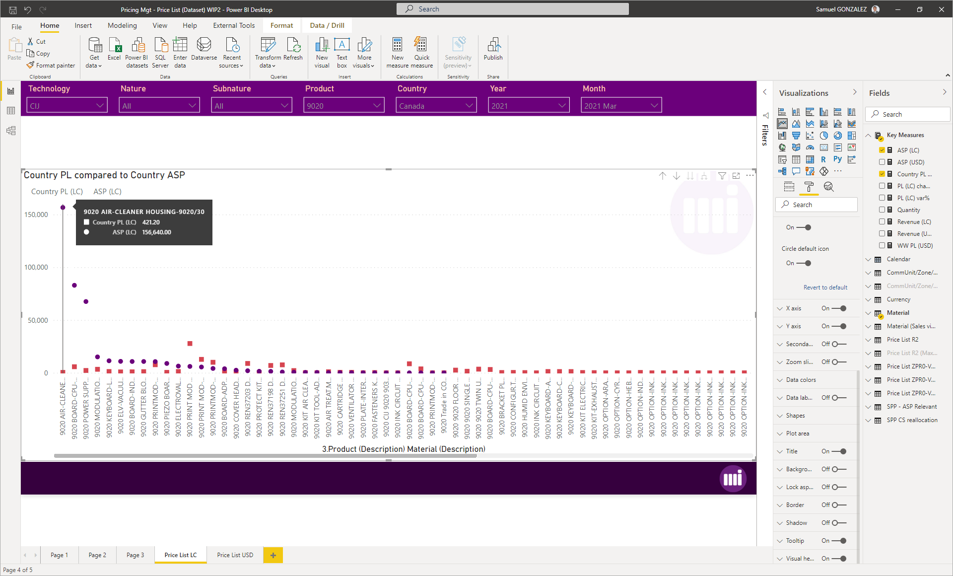
I you still have issues, can you make a copy of your file, then perhaps you can filter-out enough rows to make the file smaller, then upload your work-in-progress PBIX?
Awesome @Greg!! it’s ridiculous how a little thing like this can make such a big difference - provided of course that you know what you’re doing (like in your case). Massive thanks!!
Hi @SamSPAIN, did the response provided by @Greg help you solve your query? If not, how far did you get and what kind of help you need further? If yes, kindly mark as solution the answer that solved your query.
I hope that you are having a great experience using the Support Forum so far. We’ve recently launched the Enterprise DNA Forum User Experience Survey, please feel free to answer it and give your insights on how we can further improve the Support forum. Thanks!