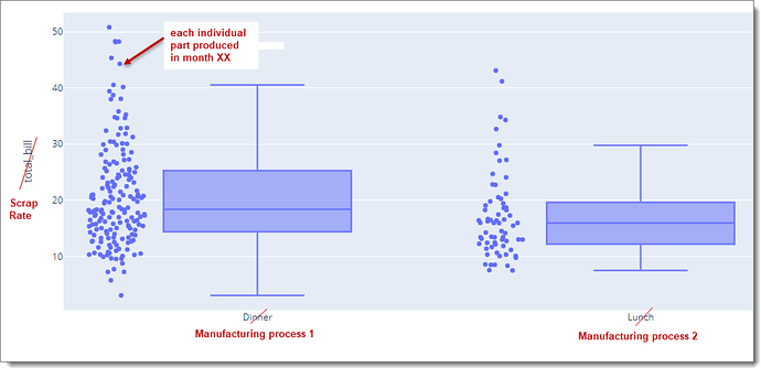
Better late than never, my visualisation is due 11th January. So no more procrastinating on jumping into unfamiliar waters (namely R / python)! I’ve chosen this histogram chart from the (power bi supported) Plotly library for R. I’m visualising scrap rates - - at the movement we just report on scrap rates as one big monthly (weighted) average. So this will add a lot insight, update to follow…
3 Likes
