hello,
how is it possible to improve the look and the ease of reading of this visual?
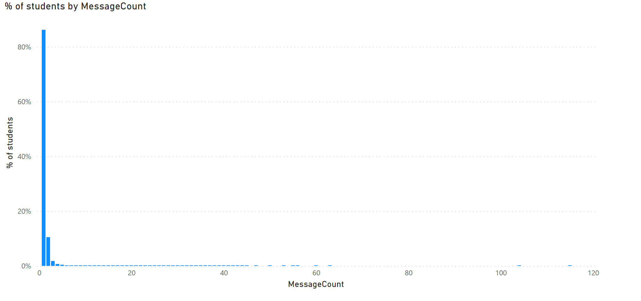
for example, looking at it, only the first few bars are shown as they have high % but the rest on the x axis are tiny and not shown well. Although the tiny bars are still important but not easy to read as they are small counts…
perhaps (just a suggestion) some kind of horizontal line on the chart which splits the large bar and the small bars to show as taller bars? I just remember seeing something similar on a visual somewhere on the internet but can not locate it…hope this helps
thanks
1 Like
@arkiboys Yes, I agree. It’s hard to read.
I would prefer adding a scroll on the X-axis.
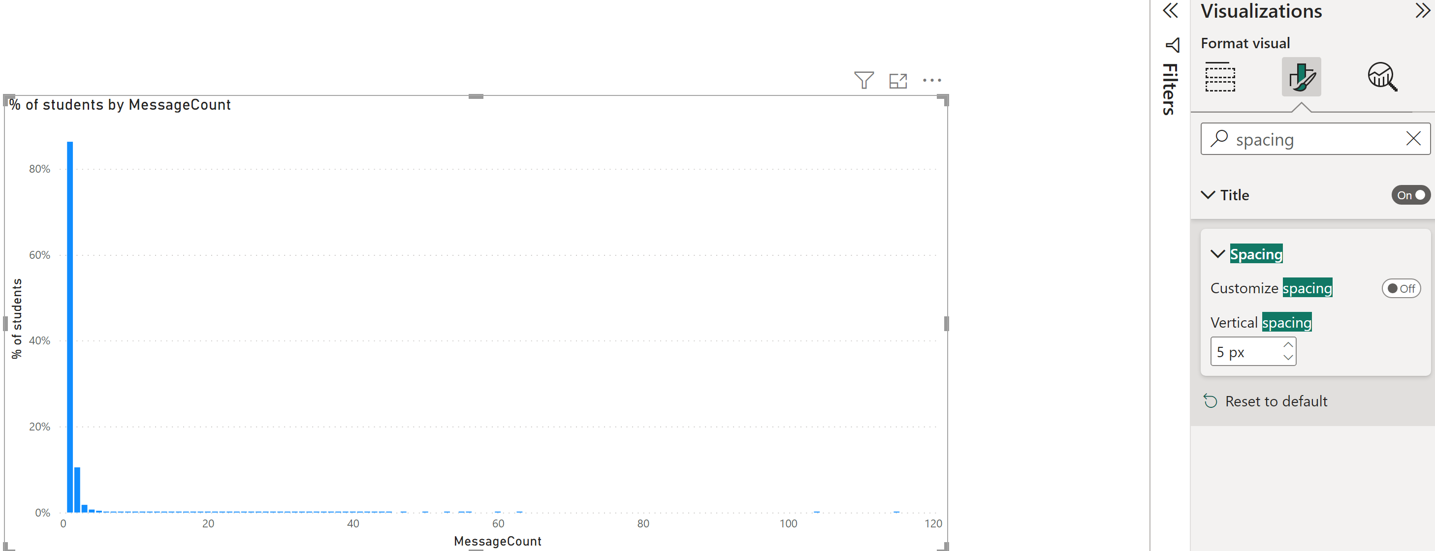
Please try it by clicking on this visual and then got to format option and search for ‘Spacing’ (Column) and increase the Minimun Category Width to 80 or 90. (Please refer below screenshot)
Tips: You can also trying increase of decreasing Inner Padding.
You should be good to go.
Do let me know if that works for you. Thanks
1 Like
I only see this and not as same as your screen-shot
1 Like
@arkiboys Is it possible to share the PBIX?
1 Like
not able to as it is large size and I am just learning…apologies
1 Like
@arkiboys That’s fine.
Could you please confirm which chart type you are using? What are you have on the X and Y axis?
1 Like
@arkiboys Got it, since you have an Integer value on the X-axis that’s why the spacing option is not available.
Alternatively, you can enable the “Zoom Slider” on the X axis which will give you more control over seeing the value.
Let me know if that works for you. Thanks
1 Like
yes, I see it, but perhaps (just a suggestion) some kind of horizontal line on the chart which splits the large bar and the small bars to show as taller bars? I just remember seeing something similar on a visual somewhere on the internet but can not locate it…hope this helps
1 Like
@arkiboys I think that’s small multiple.
Here’s the video link you can explore.
Do let me know if that works for you  Thanks
1 Like
@arkiboys Have you checked my above response yet?
1 Like
carrying out analysis. Will come back to you.thank you
2 Likes
Not what I am after…
but perhaps (just a suggestion) some kind of horizontal line on the chart which splits the large bar and the small bars to show as taller bars? I just remember seeing something similar on a visual somewhere on the internet but can not locate it…hope this helps
Thankyou
Bumping this post for more visibility from our experts and users.
Hi @arkiboys,
Can you provide more details on what you would like to achieve in your visualization so that others can also chime in with suggestions?
If there will be no more activities on this post, we will be closing this thread.
Thank you
I recall a while back I saw a chart visual in SSRS which showed the vertical bars for low and high values.
Basically to have a horizontal line across the vertical bar chart which cuts short the long values and so the smaller value bars can be shown easily as well.
Hope that makes sense.
Thank you
@arkiboys We don’t have this kind of chart available in Power BI (default).
Maybe you can search in the marketplace.
Do let me know if that works for you. Thanks
1 Like
Hi,
Not quite. I will search for the SSRS visual I saw a few years ago and put it here…
thank you for looking into this.
@arkiboys,
Rather than visualizing raw values you could consider
- visualizing rescaled measure(s).
- discretize
MessageCount into groups, e.g., 0, 1, 2–3, 4–5, 6+.
- using plots that are better able to visualize zero-inflated and highly skewed distributions like violin plots, beeswarm plots, boxplots, q-q plots, and so forth.
The point here I think is understanding messaging volume, for instance, how many emails are sent to individual students. You’ve got at least two groups: those that do not receive any messages (that really high bar for MessageCount ==0) and those that do. separating those groups will help with some of these distribution issues you’re facing. Then you can isolate the students that receive some messages and focus on that distribution.