I think we should have a vote up my idea section on here and members and visitors be encouraged to support good ideas for Power Bi feature changes. get support for your forum buddy ideas.
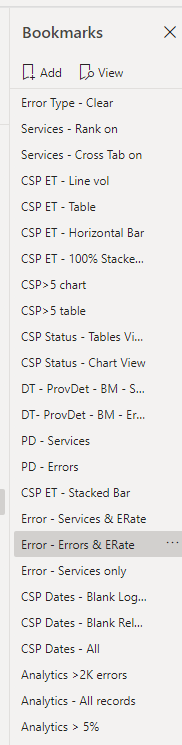
Bookmark management is a pain, and a feature change where they had a page hierarchy for bookmarks, would drastically improve bookmark management. At the moment it is all in one page, and you have to manage through detailed naming conventions. A page hierarchy would assist identify the bookmarks ‘on this page’ and ‘on other pages as named / listed’.
Vote for my feature idea! The more votes, the more chance of action by MS!
Great idea. I will gladly vote for this, but don’t currently see an option to upvote it.
You’ll definitely get a vote from @Greg too, since I know he was trapped in bookmark hell all weekend on his Challenge #7 entry.
Brian
Update: Done. The upvote option wasn’t showing up on my phone, but on my desktop it’s there, and I upvoted it. Hopefully, they’ll consolidate votes on this and a number of other ideas that basically make the same suggestion.
I’m with you on this one @jgriffit, but I also agree that hopefully they will consolidate similar ideas in the suggestions area - some very good ideas get lost in the shuffle because they are spread over several topics
Ill definitely put in a vote for this as well. I think there is room for improvement, but I manage to do very well in this area of Power BI. I’ve done some out of the box thinking for some of my clients to come up with different views of the same slide, and don’t create another page and hide it. I’ll put a video together in the near future with an example.
Yeah that’s what I am getting at. For example, four charts on the same page, hidden / shown by bookmarks etc. I do it, but bookmark management is annoying atm. Would be useful to have bookmarks by page view to locate the relevant bookmarks. 30 bookmarks across a 7 page pbix gets a bit confusing even with naming conventions, especially when you come back to it 12 months after last working on it.
Since we all know that it can take time for these suggestions to actually be approved and added, I thought I’d share with you how I handle bookmark management right now.
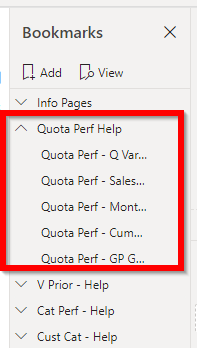
I group my bookmarks by Page - and then I name the groups to match the page name
in this example, my bookmarks actually open up a series of overlays onto the screen to guide my user through the report (this is the first report that was deployed to our sales team, and they were nervous about using the report without my guidance).
The screenshot shows the “Quota Perf Help” group as open, with other groups closed. For me, this makes it much easier to go to exactly the page I want and identify the bookmark I need to work on.
OMG. I didn’t know you could group bookmarks! I knew you could group selections but I recall trying to group bookmarks once and it not being in the menu. Probably clicked the wrong way or something, and have never tried since.
If anyone wants to have a quick play with this data and see how it may be analysed/presented then you are welcome to inspire me. I am just plotting in a scatter at the moment, but thinking about buckets? I am a bit out of ideas on this one as it is fairly simple set. @Heather@JarrettM@Greg@BrianJ ?
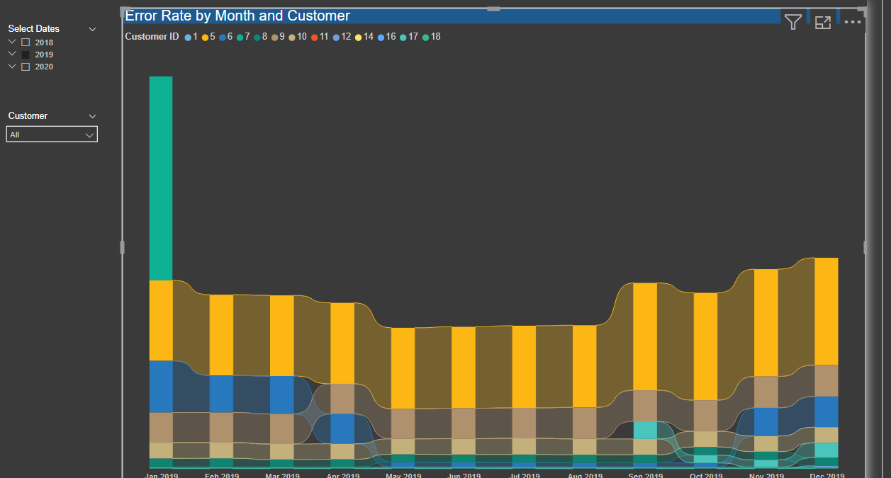
I rarely ever use this ribbon chart, but these data just seem well-suited to it. One thing I like about it is that it automatically creates a pretty epic tool tip with ranking, change in position relative to last month, etc.:
It was nice to get a bite. Thanks @BrianJ. I have never used that visual before but it looks very interesting/promising. I will explore your pbix some more and learn. Thanks for the effort, much appreciated.
John
@BrianJ, I use the ribbon chart extensively for visualizing trends, specifically because of the built-in percent change values (which management always wants) and the visual depiction of change in rank. It works great for money and count trends. One thing I haven’t tried is spacing out the ribbons, so I’m going to have to give that a try!
well @jgriffit
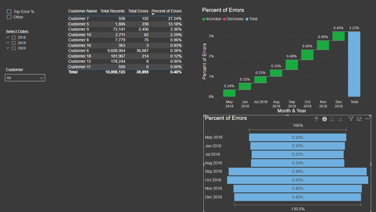
I took a slightly different tack - with the waterfall and funnel charts, and adding in a ‘Top vs Other’ slicer, so you can view the percentage impact for only those accounts with an error rate of 1.5% or greater.
hopefully @BrianJ won’t mind - as I stole his model to add mine
I’m also glad that my info on the grouping helped out - I know that it was a game-changer for me when that was finally added.
Thank @Heather, I like this as well. The month to month waterfall looks great. Is there a way you can not show the total?
Also, re the top versus other slicer, which I LOVE!
Your technique of adding a new column in customers and relating to a measure, Then creating a table that relates to the that column for a slicer is awesome.
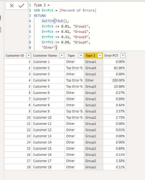
I have done next to no "binning’ or ‘grouping’ like this (so much to do so little time) but this is a great foot in the door. I have extended that concept to a SWITCH(TRUE(), … statement so I can extend to more than one grouping, which i can do now because you showed me how!
I am going to have to wrap my head around time periods and the groupings and when they apply to what. I assume if you have a filter that has 6 month period, it will create the % for the entire 6 month period for each customer, assign each customer to a group, then show the month breakdown of each group.
It also gives me an idea to create a table with those customers with > 5% errors in a particular month (say max(date)), then use that table as a filter for all the data. So you can view say, of those that are >5% this month, what does their historical performance look like.
That is, something like get the VALUES(Customer[CustomerName]) for those customers with >5%, then use those customers as a filter for the DATA table. Exciting!
Sorry for the late reply - I am building out files and prepping for an beginner Excel training session that I’m running for our Sales team. The joy of working in a smaller company.
The method I have used will actually not adjust based on the date filters, because I’m adding the measurement onto the customer table, and the calculated column is created prior to the date filtering that takes place on the page.
In order to make it more dynamic, you need to create a temporary table (with the Type column) in a measure and use a disconnected table for filtering.
Regarding the question on the Waterfall chart, I do not think there is any way to remove the total column. You could make it less visible by making the color match the background - but that’s not a true solution.
good point @Greg - but it still doesn’t solve the issue of the total column taking up space
When using the Waterfall visual, I think the total is actually sort of the ‘point’ of the visual - which is why the standard visual won’t fully allow you to turn it off. Although the color formatting can be done as mentioned, either to match background or with transparency in measure formatting.


 things transparent in Power BI")