I am looking for a solution with a map.
I have about 50 non-standard regions located in half Europe. I drew them in paint and then transferred them to the Synoptic Panel. It looks nice and everything is mapped, but unfortunately I noticed two disadvantages:
Coloring shapes in Synoptic Panel are terrible, as well as color saturation look
I cannot transfer the map to the PBI dashboard, because I get a message that there is too much data to put this visualization on the dashboard.
I would like to professionally make a map like this in Arcgis or something similar.
I am looking for a guide / instruction in which it is described how, for example in Arcgis, to make graphs on the map, then name the areas appropriately (to then map with what I have in PB) and then export such graphs to the appropriate format and read them in PB to visualization called “map of shapes”
Well, this calls for the use of a tool to create the shapes and subsequently import into Power BI.
Do you have an example of the files? How are your non standard regions built, are they composed of postcode zones or actually drawn on a map?
Paul
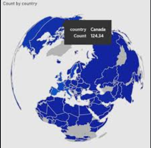
I recommend using Shape Map and using the json file attached. (for countries)
In order to import it, go to Format / Shape and import the json file.
For a nice visual touch, you can choose the Projection = Orthographic
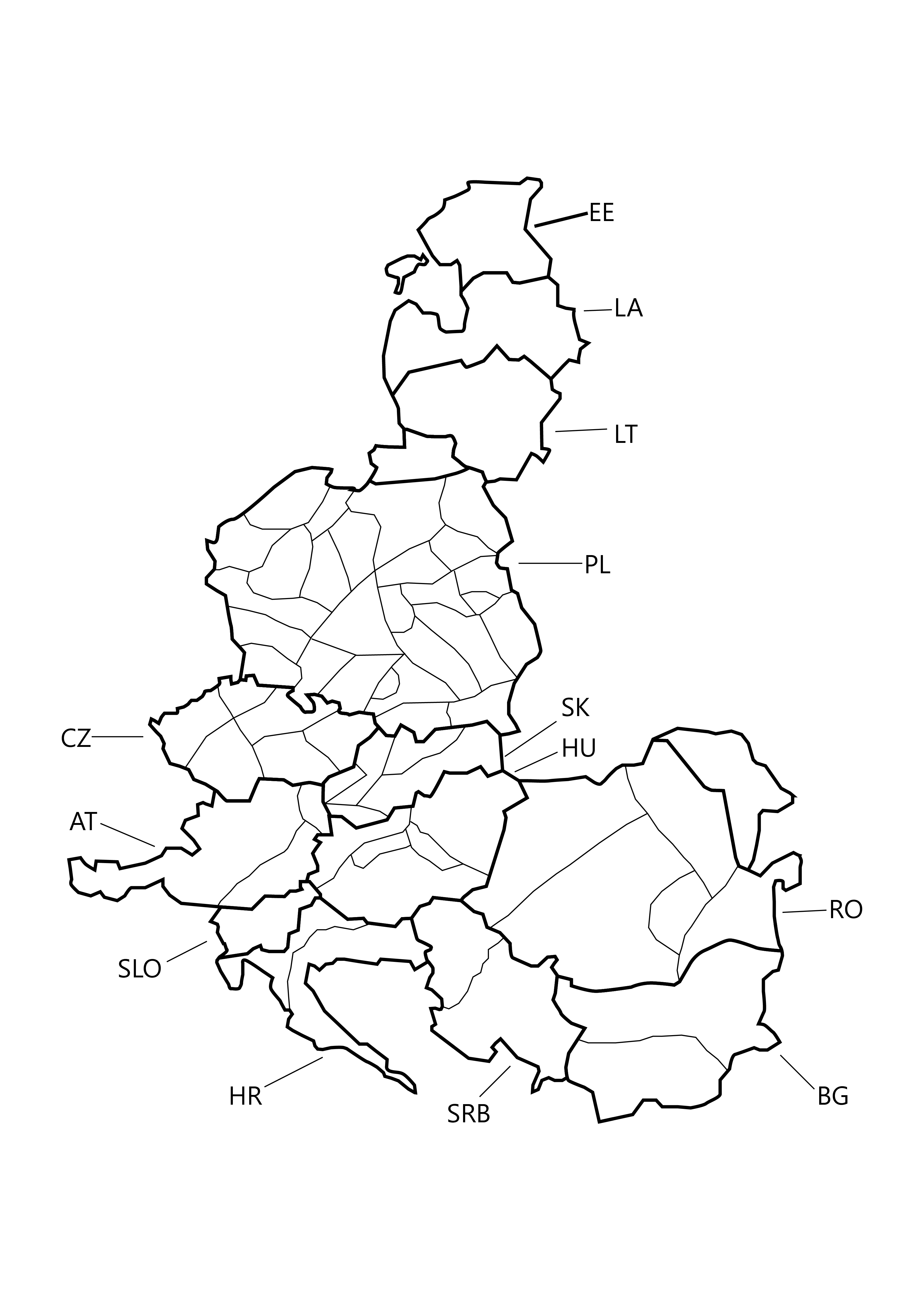
ok, that makes it more elaborate. Nevertheless, it can be done, but you need to “draw” = digitise your shapes in a GIS. If you have Arcgis fine, if not, try QGIS. Create shapes, naming them as you do in your dataset to bind them to the PBI map. Once you have created the shapes, you can export a so called shape file from QGIS. This shape file must be converted, go to mapshaper.org, where you can select to export as topojson or geojson depending on which visual you wish to use. Now it is ready to be used in a choropleth map visual like Shapemap or Filled map. I posted an example before. Map Visualisation Type in Cohort Analysis Showcase - #3 by MAAbdullah47
Paul