Here’s @Martin entry for Power BI Challenge 3. @Martin, would you like to share how you built this dashboard and what your inspiration is in building it?
Yes, sure, thank you. Before we start, I must say that I’ve been working for Germany’s largest market research company for the past few years and surveys were part of their business. So I had a pretty clear picture in mind how to present the result. Especially the horizontal stacked bar charts are very common in this kind of report. If you are working at an enterprise level company you might also know them from employee satisfaction surveys, which is kind of pretty close to this challenge. Plus, working in Germany, I intentionally did not offer a drilldown to employee level because that would be a severe data protection concern here.
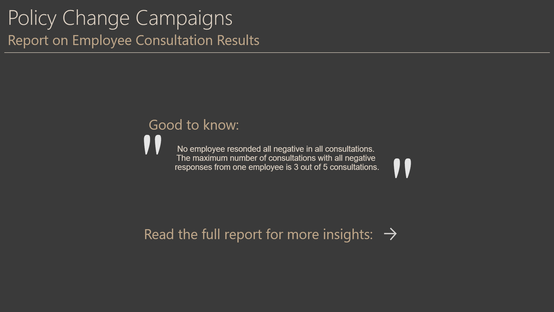
The first page is inspired by the data trend to automatically generate actionable insights. Although it’s not AI yet, the insight is actually a measure. And if there were employees that gave all negative responses, the number would be shown as well. If there are employees that always respond negativ, they could be generally unhappy with their employer, not just with the individual policy change. In HR, such employees would also be called “at risk” to leave the company and if the number is high that’s an important issue for HR.
Page 2 gives an overview of all consultations and for many use cases should answer most questions already. Crossfiltering is active, so looking at individual consultations is possible in place. Tricks worth mentioning include:
Count of negative responses are multiplied by -1 to appear as negative bar from the zero-line
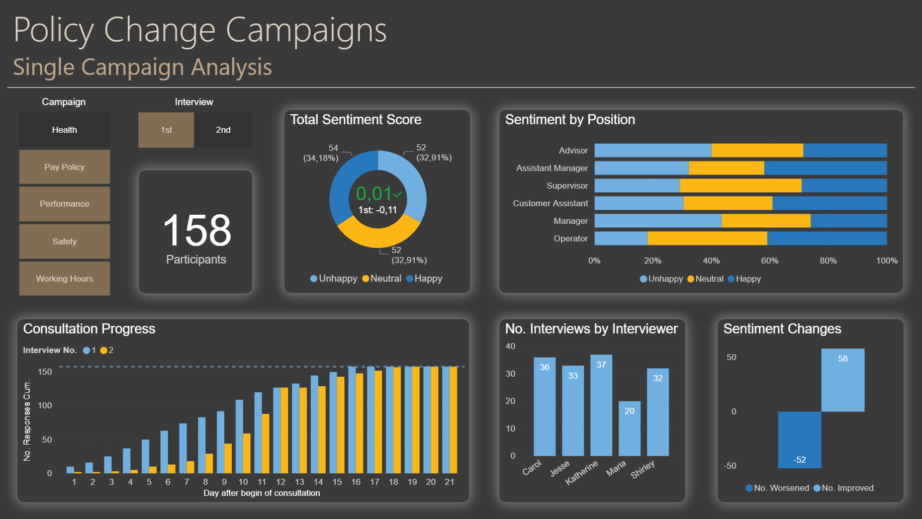
I introduced a numeric score of -1 for unhappy, 0 for neutral and +1 for happy. This would e.g. allow to define an acceptance level before a policy becomes effective. In this data, most consultations did not do well in this aspect.
Page 3 looks at a single consultation. Two things that I wanted to see here in detail are:
Have the results improved from 1st to 2nd interview (the goal visual in the center of the donut chart): This could be a relevant question in case some communication activities or policy adjustments had been made between first and second interview.
The progress chart allows to see whether there are two well distinguishable waves of interviews and whether the interviews capacity was adequate. If the strategy was to make interventions between first and second wave of interviews, I would have expected to see interview wave two starting later than in the data.
Page 3 is als accissible by drilldown from the Roadmap table or the horizontal bar chart in the middle of page 2.
Key for easy generation of the necessary measures was to unpivot the interview 1 and 2 columns of the source data, so I did not have to write individual measures or switch by column name in the DAX code.
I’d be pleased to answer further questions.
Best regards,
Martin
Really well done here Martin. Really enjoyed reading your thought process and techniques for developing this report.
You’ve got many great ideas embedded into this, and you’ve got creative on the data by bringing in numeric scores which I really like. This enables you to take the data to the next level with your sentiment scoring analysis.
I think one of the great things about Power BI is it let’s you take your analysis far beyond the raw data that you receive. It just all comes down to your creativity. Sometimes this is very hard to explain to non Power BI users. I try to do this quite a bit within a lot of course material that we run through so it definitely looks like your picked up some of that, well hopefully you have picked up some of that from the training but maybe you were already there I’m not sure!