INSPIRATION:
My inspiration was more from a back-end and presentation point-of-view than a “pick the best visuals” point-of-view. @BrianJ 's analysis was excellent and had I done something similar, I’m hopeful I could have extracted more insights, but, alas, I didn’t go very deep all with the data itself at all.
HOW:
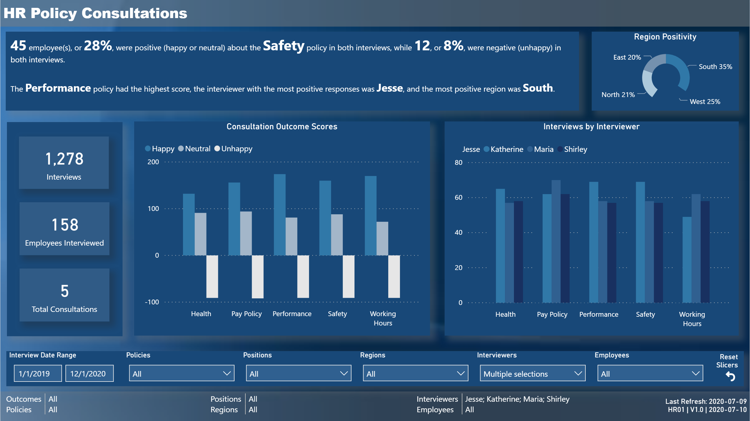
Generated a very clean data model, using the main table as a staging query and multiple references to create all model tables (except dates);
Generated a consistent theme using a image background and partially-transparent rectangles for the header and footer bars:
I wanted a colour-shifting background, so used PowerPoint to take the gradient image I found and mirror it so colours go dark-light-dark (top-to–bottom)
Used eDNA Colour Theme Generator to extract colours from the image background I selected and created a JSON theme;
picked the darkest theme colour to use as the background colour for the grid rectangles and used drop shadows (drop shadows impacted spacing, and in the time available I didn’t find a solution I fully liked)
Included a Last Refresh table;
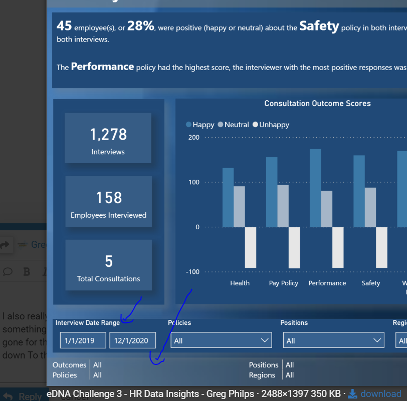
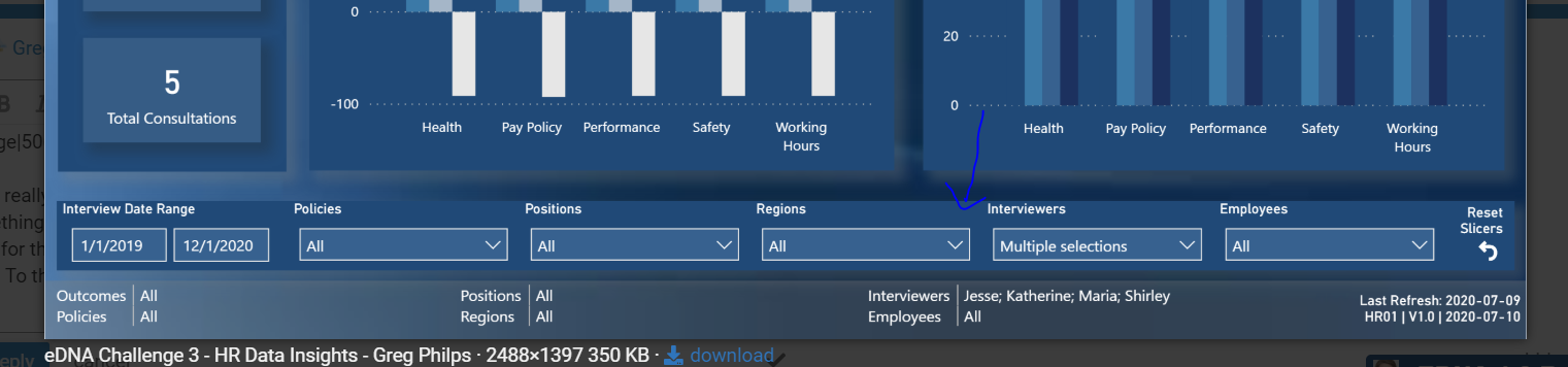
Included slicer selections in the footer and a slicer bar just above the footer:
made the date slicer take-up the minimum amount of space by hiding the slider;
made all slicers multi-select;
included a reset slicers button (to call the reset slicers bookmark
created concatenation measures using CONCATENATEX for all slicer selections, so that all selections are always visible (even if the report was screen-shotted, PDF’d, or printed);
included the last refresh date, report ID, report version, and report version date in the footer, again so always visible, again using CONTACTENATEX, as well as whitespace [UNICHAR(8204)] for the card body and my concatenated admin measure in the card title so I could right-align it;
Added an [Outcome Score] calculated column to the [Outcome] table to permit comparison of policies;
Used the Enlighten Data Story custom visual to preset a small number of the key measures at the top;
I didn’t have the time I wanted to go deep on the visuals to use, and I would have liked to generate more impactful visuals and insights.
Still, a thouroughly enjoyable challenge, and it did give me the opportunity to explore a few presentation ideas I’ve been kicking around for a while. Congratulations to all.
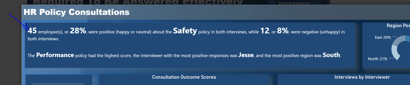
One of the really great takeaways I have is the text that your placed up in the top section of your report. This isn’t something that I would generally do but I really love it here because it tells a really good story up front for the consumer, and I presume that you can actually make those key figures and text dynamic with measures.
So I could see this being used in many great situations where say a decision-maker actually wants to read the text of something to be able to make an evaluation and ultimately a decision. Then they might want to dynamically click through to a different consultation and receive the key facts and figures for that specific aspect of the data.
I also really like how you’ve placed the filters down the bottom here. This again is not something that I have generally done, I’ve always placed them at the top, but I think that you’ve gone for the text and important metrics first and foremost, and then let the user glanced down to the filters below to make their adjustments.
I really like it and it’s given me some ideas for future showcases that I might develop for other challenges or just generally.
Reviewing this in quite a bit of detail I can see there is a lot of small aspects to what you’ve done which are fantastic. I love how you have created a summary of the filters on the report page at the bottom, so the user really knows what they’re looking at. Also, the refresh time stamps are a great value add as well.
Thanks for the kind words Sam … yes, the text at the top is dynamic and uses measures via the Enlighten Data Story custom visual. The inclusion of all slicer selections in the footer is a carry-over from a standard “Parameter Selections” table I always included in my SSRS reports so no matter how the report is viewed (on screen, screenshot, PDF, print) the filters are visible. Thanks, Greg
@sam.mckay just wanted to give some positive feedback on how fantastic the challenge series is, i haven;t submitted a report to the challenges but i am in aw of the submissions by the members they are fantastic and have given me inspiration.
@Greg the dynamic text visual you have used in your submission has solved a problem for me for a report i am working on, it is a Health and Safety report and the data is pulled from our CRM database, the Health and Safety manager would write a summary in a word document each month that i have been copying into excel and uploading into a table, i’m thinking this is a great solution to improve the reporting process, i can create standard text and using the visual input the metrics (measures), this will eliminate the need for the Manager to write a separate summary and one less table to maintain
Thanks for your kind words. I’m humbled you found the solution interesting.
Even easier, you can do this without a custom visual using CONCATENATE in a card as @BrianJ describes in this thread:
or perhaps COMBINEVALUES in a table cell, something like:
Long Dynamic Text with Measures =
VAR _Separator = UNICHAR(10) & UNICHAR(10)
VAR _Sentence1 = "This is the first sentence that contains the value from the [Total Sales] measure as " & FORMAT( [Total Sales], "Currency" ) & "."
VAR _Sentence2 = "This is the second sentence that contains the value from the [Total Costs] measure as " & FORMAT( [Total Costs], "Currency" ) & "."
VAR _Sentence3 = "This is the third sentence that contains the value from the [Total Profits] measure as " & FORMAT( [Total Profits], "Currency" ) & "."

RETURN
COMBINEVALUES( _Separator, _Sentence1, _Sentence2, _Sentence3, _Sentence1, _Sentence2, _Sentence3, _Sentence1, _Sentence2, _Sentence3 )
(In these last 2, you lose the independent sizing but gain “story” length.)