Is there a better way than just “looking” to organize the visuals on the same positions and alignment btw themselves and btw them and borders on all the dashboard pages?
The tab Format > Align does not help on this specifically or is lacking.
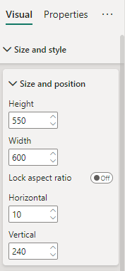
I don’t tend use snap to grid or drag visuals around the page to finalise their positions, I’ll use the direct placement in the formatting pane. Generally I’ll work in multiples of 10 pixels. My left hand graph will start 10 pixels in from the left, and say 40 pixels from the top, my visual will have a width of either 200, 210, 220 etc. Going up in multiples of 10. The visual which will be placed to the right, or beneath this visual, will be placed 10 pixels to the left or below visual no.1.
It’s sooo much easier to work in multiples of 10…"My visual starts 10 from the left, it’s 200 pixels in width, so my next visual to the right is 10 pixels to the right of that so 10+200+10 so visual 2 is placed at 220. After a long day of Power BI’ing do you really want your brain to be going “So my visual starts a 7 pixels from the left, my visual is 277 pixels in width, my spacing is going to be 8 pixels between visuals so that is 7+277+8 and that leaves me with how much space to the end of my page as my next visual is going to be 269 pixels wide blah blah”…I can do this math but why make it more difficult. Maybe that is just my brain, damaged from enduring so many poor Scotland football teams performances over the years, which struggles to do that math at the end of a long day.
Sure, I might drag a visual from one area to another, but I will finalise it’s position by using the horizontal & vertical pixel boxes as per below.
I’ll wireframe my report to understand what will be going on each page and work out my sizing there. There will be situations where I might deviate from this slightly, but that is on a case by case basis.
Totally agree … I’ve never used snap-to-grid or dragging and always used the Format/General (now Size and Position) to manually set values to multiples of 10 as @DavieJoe says.
Greg
By “wireframe”, it means I’ll create an outline of my report either by drawing it on a notepad, create a mock up in Excel or use Figma (a design tool) to help my planning of the report.
Understand how big the rectangle will be, again in multiples of 10, so perhaps, for example have a rectangle of 120 pixels high, cards of 100 pixels high and place the cards 10 pixels inside the top of the rectangle. This will leave 10 pixels at the top and at the bottom so you have symmetry. Then place the image in the middle using the same method.
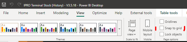
You could also use the alignment features in Power BI, please see below link