Iwona
February 10, 2023, 5:54pm
1
Hi all,
I am trying to create gauge charts. I am struggling with measures.
Could anyone please guide me on how to achieve that, please?
Grateful as always,
Iwona
Melissa
February 10, 2023, 6:21pm
2
Hi @Iwona ,
Give something like this a go. Create a measure for the MIN valueMin Value = 0
Create a measure for the actual valueCount of Emp ID = SUM( 'Sample'[Count of Employee ID] )
Create a measure for the MAX value
Total Count of Emp ID =
CALCULATE(
    [Count of Emp ID],
    REMOVEFILTERS( 'Sample'[Location] )
)
And place them in the visual
I hope this is helpful
1 Like
Iwona
February 10, 2023, 7:17pm
3
Hi @Melissa
Many thanks for your help but something is wrong with my file ( measures).
10.02.23 forum.pbix (41.9 KB)
Could you please help.
Iwona
Melissa
February 10, 2023, 7:22pm
4
Hi @Iwona ,
It would have been helpful if you’d shared this earlier. You’ve added a filter to the filter pane. Update the MAX measure to take this into account:
Total Count of Emp ID =
CALCULATE(
    count('forum 10 02 2023'[Employee ID]),
    'forum 10 02 2023'[Location] IN { 1, 2, 4 }
)
Iwona
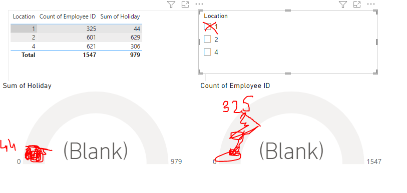
February 10, 2023, 11:22pm
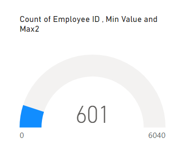
6
Melissa:
Total Count of Emp ID =
CALCULATE(
    count('forum 10 02 2023'[Employee ID]),
    'forum 10 02 2023'[Location] IN { 1, 2, 4 }
)
In my sample dataset, all works fine but in my real PBI file whichever Location I choose, I am getting the full area marked in blue not only a fraction of it:
I have checked my measures twice and still didn’t figure out the reason
Iwona
Melissa
February 11, 2023, 9:42am
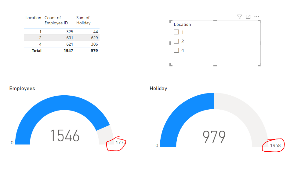
7
Sorry about that, give this a go instead.
Total Count of Emp ID =
VAR _AllLocation = FILTER( ALL( 'forum 10 02 2023'[Location] ), 'forum 10 02 2023'[Location] <> 3 )
RETURN

CALCULATE(
    count('forum 10 02 2023'[Employee ID]),
    _AllLocation
)
1 Like
Iwona
February 12, 2023, 10:16am
8
This gave me what I need.
Grateful as always for your entire expertise and help.