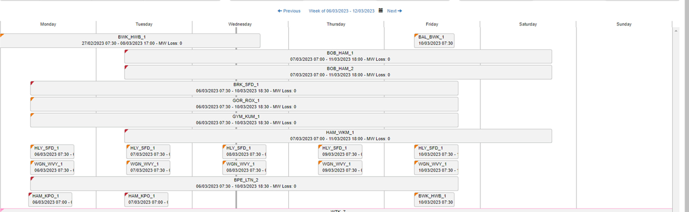
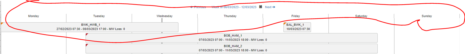
I am looking to get a similar Gannt chart like below. I have 2 datetime columns and I users want to interactively see the overlap of duration etc. Sample file is attached. Thanks in advance for any leads to the solution.
I have explored some custom visuals through Microsoft app store and some custom visuals meet my requirements. However, I am unable to find any visual where I can show day of week instead of date as a header in the visual. Customer requirements are that it should show as a day of week instead of date for easy understanding and their previous tool shows day of week. Is it achievable or someone has done similar project?
I noticed you didn’t provide a PBIX file. Providing one will help users and experts find a solution to your inquiry faster and better.
A perfect initial question includes all of the following:
A clear explanation of the problem you are experiencing
A mockup of the results you want to achieve
Your current work-in-progress PBIX file
Your underlying data file (to allow us to go into Power Query if necessary to transform your data and/or data model – often DAX questions really end up being data modeling solutions)
Please also check the How To Mask Sensitive Data thread for some tips on how to mask your pbix file. Not completing your data may sometimes cause delay in getting an answer.
Thank you for highlighting to include the PBI report. It makes sense as it becomes easy to work on the PBI file. I have done some work, so I am going to mark it as resolve and will open a new thread with the updated issue. Thanks!