Hi Enterprise DNA,
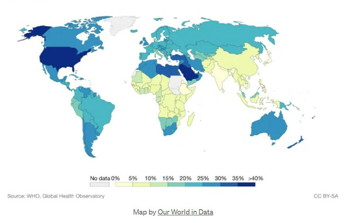
I would like to ask how to plot Choropleth Map in power bi with a data set of Country, Region and Market Share Percent
iwant to create something like this on the abpved sample picture…but its giving me different image when i try to do it in plotly
Here’s my code
import plotly.express as px
import pandas as pd
data = pd.read_csv(r’C:\Users\fadev02\Desktop\MarketShare.csv’)
fig = px.choropleth(data, locations=‘Country’, color=‘Market %’, hover_name=‘Region’,
title=‘Market Share Percent by Country’,
color_continuous_scale=[“red”, “green”, “blue”])
fig.update_layout(coloraxis_colorscale=[(0, “gray”), (0.1, “yellow”), (1, “purple”)])
fig.show()
MarketShare.csv (7.4 KB)
thanks
Bumping this post for more visibility from our experts and users.
Hello @sgrady, would you please upload your work in progress Power BI desktop file.
Also, does the Python code plot successfully when tested outside of the Power BI Python Visual? I did notice that Latitude and Longitude are missing from your data file. The plotly.express.choropleth interpretes according to locationmode and mapped to longitude/latitude coordinates, valid ISO Code or read from GeoJSON data .
Hello @sgrady
We notice that no response was received from you on the post above.
We are waiting for your masked demo pbix file and other supporting links and details so other users can help you in your query.
Due to your inactivity, we’ll be tagging this post as Solved.
Should you wish to add your masked demo pbix file and other supporting links and details, you can reopen this thread.
Thank you!

