My requirement is to create a barchart showing the revenue for pre-covid year 2019 and selected year side by side 2019 as a threhold bar . x-axis - dimension Y-axis- Revenue and should have two bars one for 2019 revenue and other selected year revenue. Can anyone help on this
1 Like
1 Like
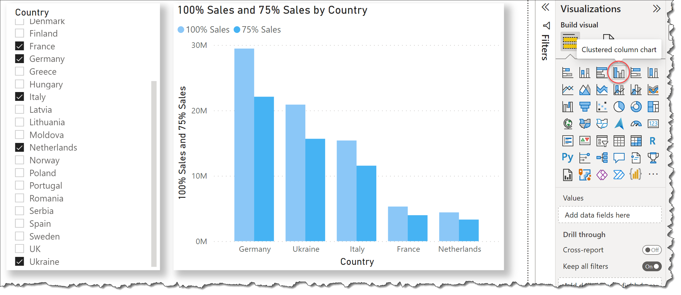
Not sure if you have an example but here is one.
Bar Chart.pbix (43.4 KB)
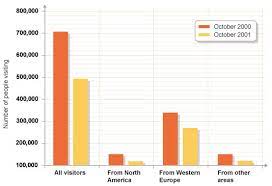
AS an example i want a bar chart where the orange bar is constant 2019 year revenue and yellow is the revenue of selected year .
Thanks , i had a constant line to show up the target value to complete the requirement.