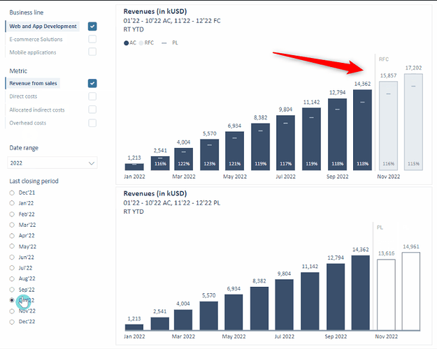
How to add a vertical line in a column chart as shown in the image below?
Hi @vivekdevalkar ,
To add a vertical line in a column chart in Power BI, you can follow these steps:
- Create a supporting table: Add a table with the x-axis category (e.g., months) and a column that marks where the vertical line should appear.
- Add the supporting table to your model: Integrate it with your existing data model.
- Create a measure for the vertical line: This measure will check if the x-axis value matches the desired point for the vertical line and return a value.
- Add the measure to the chart: Include the new measure as a line in the combo chart to represent the vertical line.
This will create a dynamic vertical line in your chart based on your data points. You can refer to Data Mentor for step-by-step instructions and additional support.
DAXCopy codeVertical Line = IF(MAX('Table'[Month]) = "Nov 2022", MAX('Table'[Value]), BLANK())
Data Mentor Queries | Explore User-Created Queries
Browse through user-created queries with Data Mentor AI tools. Witness the power of our platform in action and explore diverse solutions to complex problems.
Cheers,
Enterprise DNA Support Team
