How can I create a trellis chart like this in deneb using vega-lite where the x-axis values come from two different tables in powerbi?
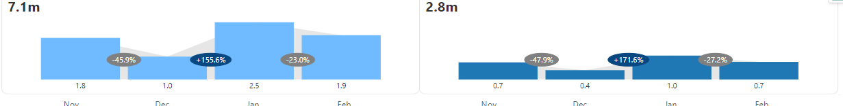
I was able to create it using inforiver as seen in screenshot but is there a way to do something similar with deneb. I know how to do it if the two y-axis values refer to two different categories for the same Y-axis field but that’s not the case here.